
Putting down roots...
We bought a home in Portugal!!
The Portuguese government announced in October of 2023 they were ending the tax program aimed at reducing taxes for retirees immigrating to Portugal called the NHR, we jumped on a plane the next month, right around Thanksgiving, and found ourselves a lovely duplex apartment. We rented it in December of 2023 in order to qualify for the tax program even though we knew it would be months before we could move. We also knew we wanted some time to get more familiar with the city before purchasing a home.
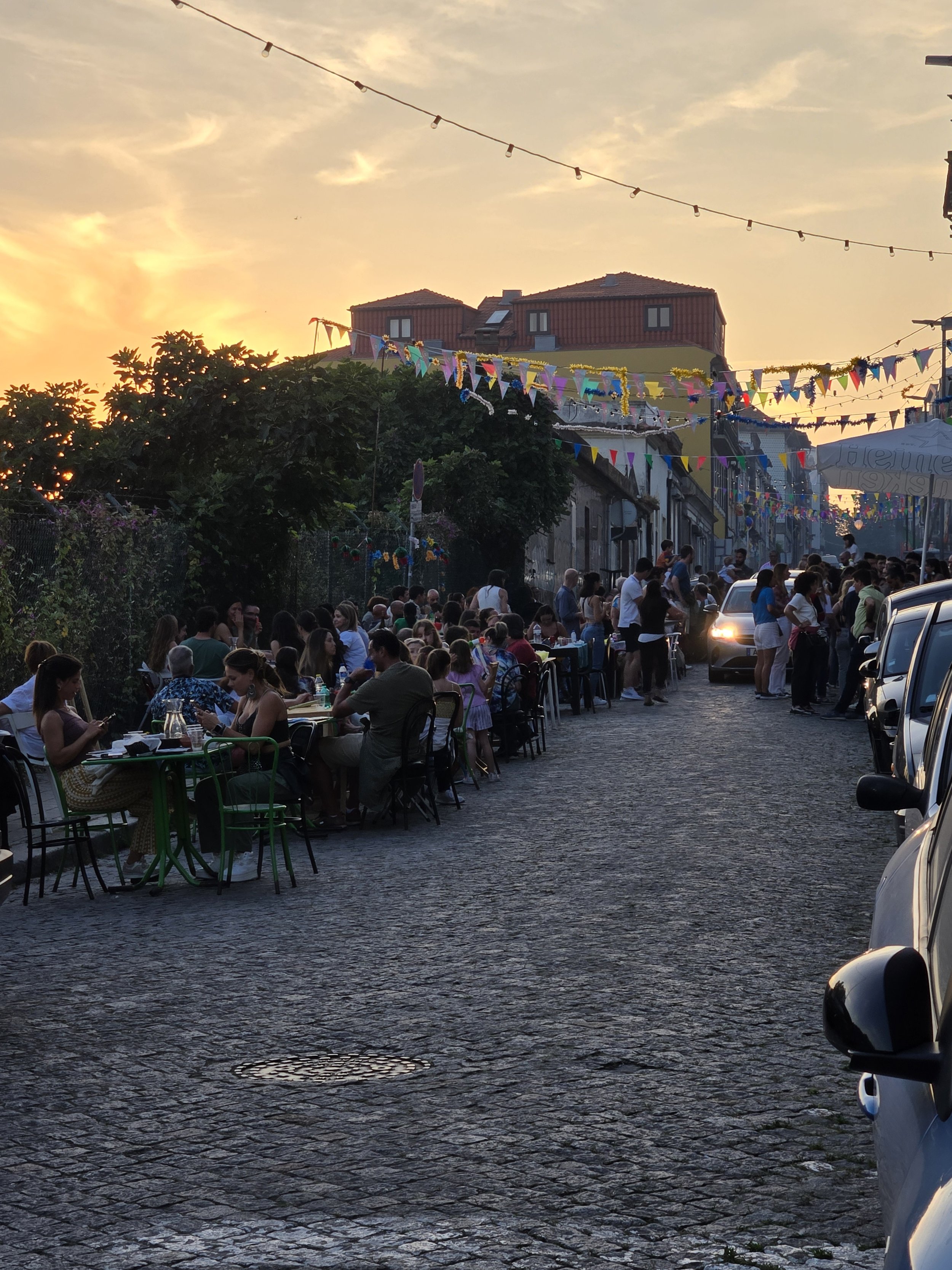
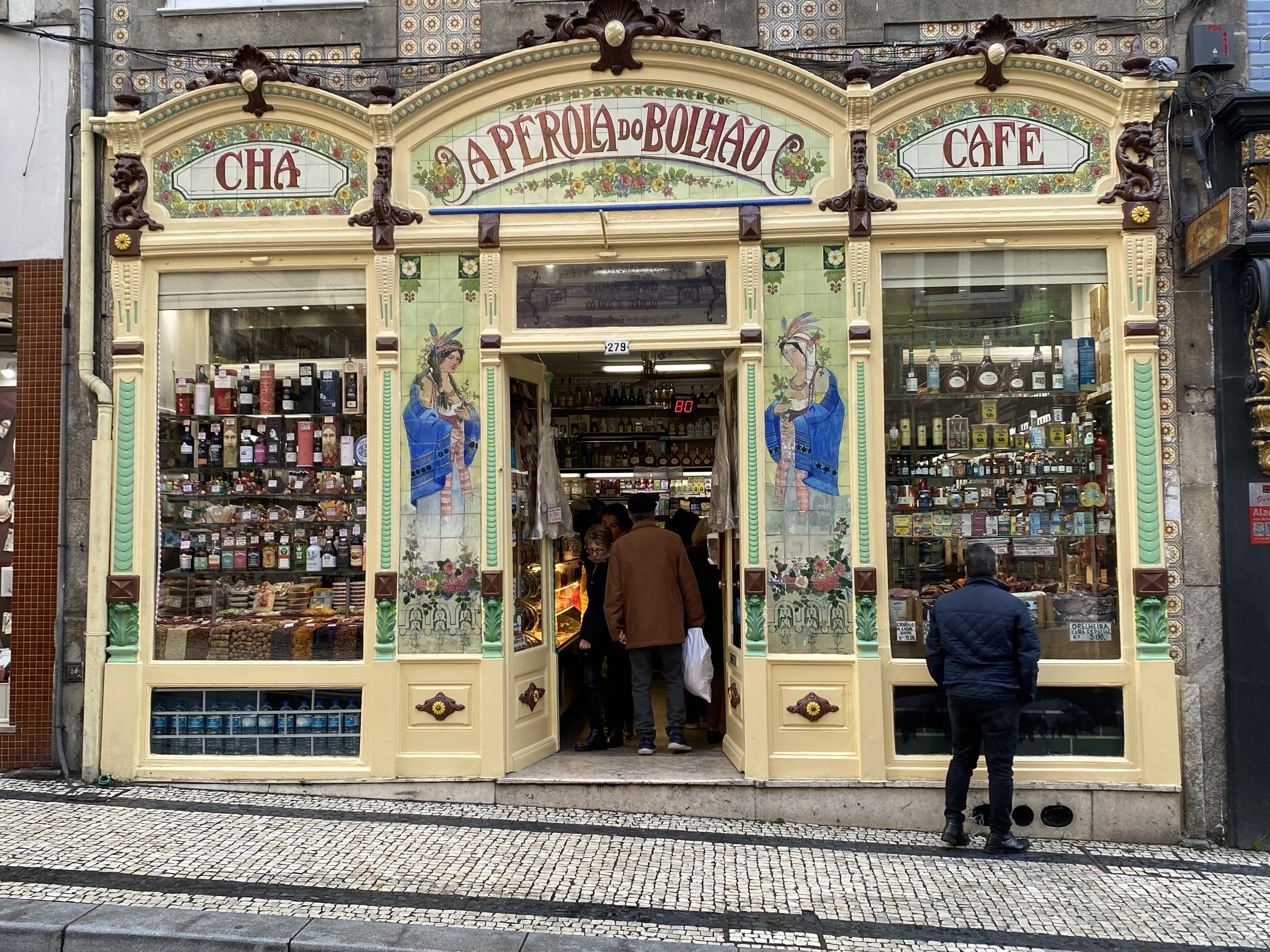
House hunting is challenging pretty much anywhere. Most of the rental apartments we found were better suited to a short vacation stay than a permanent or semi permanent home. The one we chose was in Bonfim a beautiful, tree lined, quiet little oasis close to downtown and filled with charming 2 and 3 story building. We LOVE this neighborhood. Close to the metro, shopping, theater and tons of restaurants. There are parks and a lovely cemetery from the 1860’s. It is quiet and the street we live on gets very little traffic. It’s a picturesque area to walk the dogs and we feel like we belong to a neighborhood not a city, but with the convivence of everything close by.


We hunted like crazy for a home to purchase in this neighborhood. But as a still working artist I need a fair amount of space for my studio, and it needs to have good lighting and easy access to a sink. We also wanted a guest room. We want to make it as easy as possible for our son and his girlfriend to come and visit frequently. We also would like to host other friends from the US and elsewhere. We did not want to have to do major renovations and wanted easy access to metro, grocery stores and restaurants. We don’t have a car here (gasp) and don’t want to have one, so nearby transportation is a must.
And, of course, we had a budget. One of my other requirements was minimal stairs (that ruled out most of those 2 and 3 story houses in Bonfim!)
Real estate here is a bit of the wild west, there is no MLS, no escrow. There is a listing website called Idealista where properties for sale (or rent) are posted, but many agents and agencies keep their listings private and many property owners will not pay an agent commission. We started out viewing properties listed on Idealista and that gave us a fair idea of what was available and the market rate. Prices have gone up ALOT since the pre-pandemic days.
Many properties here are old, and mold is a big issue, long damp winters and humid summers. At several of the places we toured the smell of mold would pummel you when you entered, and that was with the windows wide open. There was one place where the black mold was so thick on the window sill and blinds that I was appalled that people not only lived there but were raising small children in that environment. Even the pictures hanging on the wall had mold growing under the glass….. Another place had wet interior walls in the basement which they were trying to hide and an obvious roof leak 2 floors above!
We found a condo in a new building about 2 blocks from our current place in Bonfim. It was a good bit smaller than I would like and the kitchen was designed for people who don’t cook. But the price was right, we would be the 1st to live in it, the neighboorhood was right, and there was a space that could do double duty as a husband office/guest room. My dedicated workspace would be the bare minimum required but it would work. We made an offer, with the contingency that we would be able to install air-conditioning. I can’t sleep in a overly warm room. Turns out installation of AC was an ongoing debate (argument) with the condo association, and it didn’t look like it would be settled anytime soon. That was in December of 2024.


Feeling a bit disheartened we put our house hunt on hold for the holidays. Our son, Brian came from Los Angeles and we spent a week together in Lisbon including the big fireworks show in the main square followed by another week in Porto where he worked during the day and we hung out at night. Brian and I took 1 afternoon and did a port wine tour and tasting. I have to say I do love a good Port, 10 year Tawny is my favorite.


In Feb we found another place in Bonfim, not quite our neighborhood, but a new build with a HUGE terrace. We have 2 small dogs and a terrace would give them a chance to get fresh air and move around a bit more. Yards are very hard to come by in the city. The condo was on the top floor 4th (european speak) 5th by US standards, here everything starts with 0 floor. Since it was under construction we had to walk the 5 flights up, stepping over construction cables and materials and with no guard or hand rails… yikes! The terrace was to die for and had a fabulous view, but it was about the same size as the apartment. It was listed as 3 bedroom but really it was 2 bedroom and a walk-in closet. The worst part was the master bedroom had a steeply angled roof that made walking on one side impossible and as the agent pointed out, there was no way to hang a mirror above the bathroom sink. Even using that side of the room for a closet wasn’t practical since the slant came down so low.
But the visit wasn’t a complete waste. The agent who happily pointed out the “challenges” with the apartment was Isabelle, a transplant from France and a pull no punches real estate agent, we liked her from the start. She set to work combing her database for things that could work for us and we kept funneling her listings we liked from Idealista. Then began the real whirlwind of viewings Some very lovely but without the bedroom sizes we needed, some with large bedrooms and lots of storage (halleluiah!) but tiny living room (where would we put the dog beds??) and minuscule kitchen There was a new build with 3 available options, but the one with the big enough bedrooms had a tiny terrace, the larger terrace had bedrooms that were too small and a less desirable layout and on and on. We were feeling like our own episode of “House Hunters International”


Isabelle expanded the search area and found us a place in Marques, a nice area, but on a spur line of the metro that doesn’t serve the rest of the city well. But what a place! Brand new, only 2 bedroom but both on suite and the master had a walk in closest (the 1st we had seen) the kitchen was large and had an American size side by side refrigerator/freezer (most had 1/2 size European fridges with only 3 small drawers as the freezer), a dedicated laundry room, small office, very large living/dining room and best of all A BACKYARD! Quite a large one (a bit too large, but..) It also had an attached garage that I would be able to section off to create a studio and storage. My husband and I both loved it.


The catch? It was over our budget by quite a bit, and the monthly condo fees were three times what had been quoted anywhere else. We talked about it for quite a while, crunched the numbers and made an offer that stretched our budget to its limits “If we do this, it may be a while before we can get more/other furniture or landscaping…” The offer was rejected. The builder didn’t actually counter just said he couldn’t take less than a certain amount. We moved on, not in tears but sad.
This is about the time I started getting seriously frustrated by the process. Now everything we looked at was held up next to the over budget place with the yard and couldn’t compete. (Later Isabelle told us the builder had expected us to make another offer, that was his mistake!) ) It was time to change tactics. At this point Isabella took us over to Villa de Nova Gaia. This is across the river from Porto proper. It is where you go to get the great view of Porto. Prices are better there so you get more for your money, but you can still be in the center of Porto via the metro in 10-15 minutes.
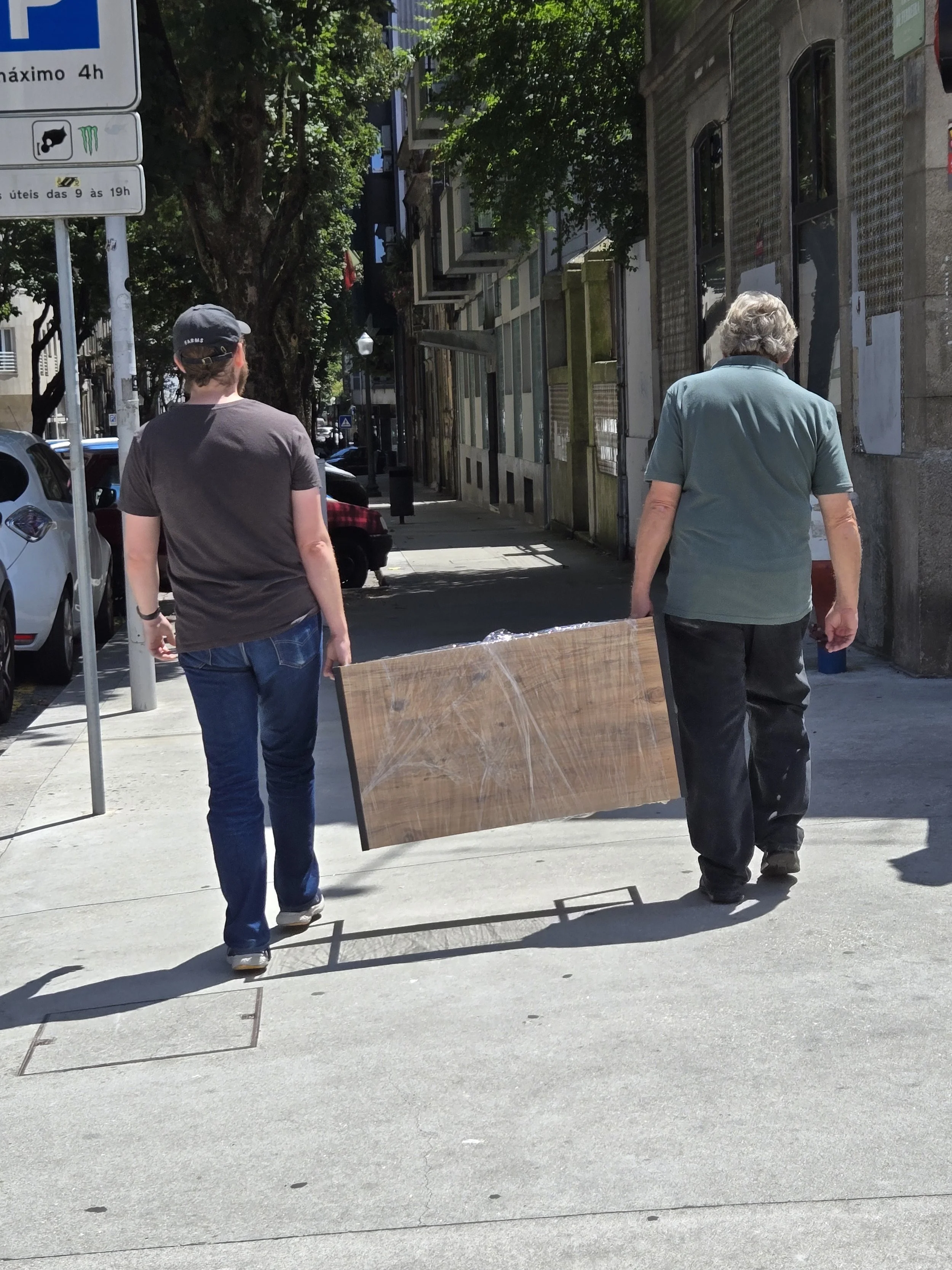
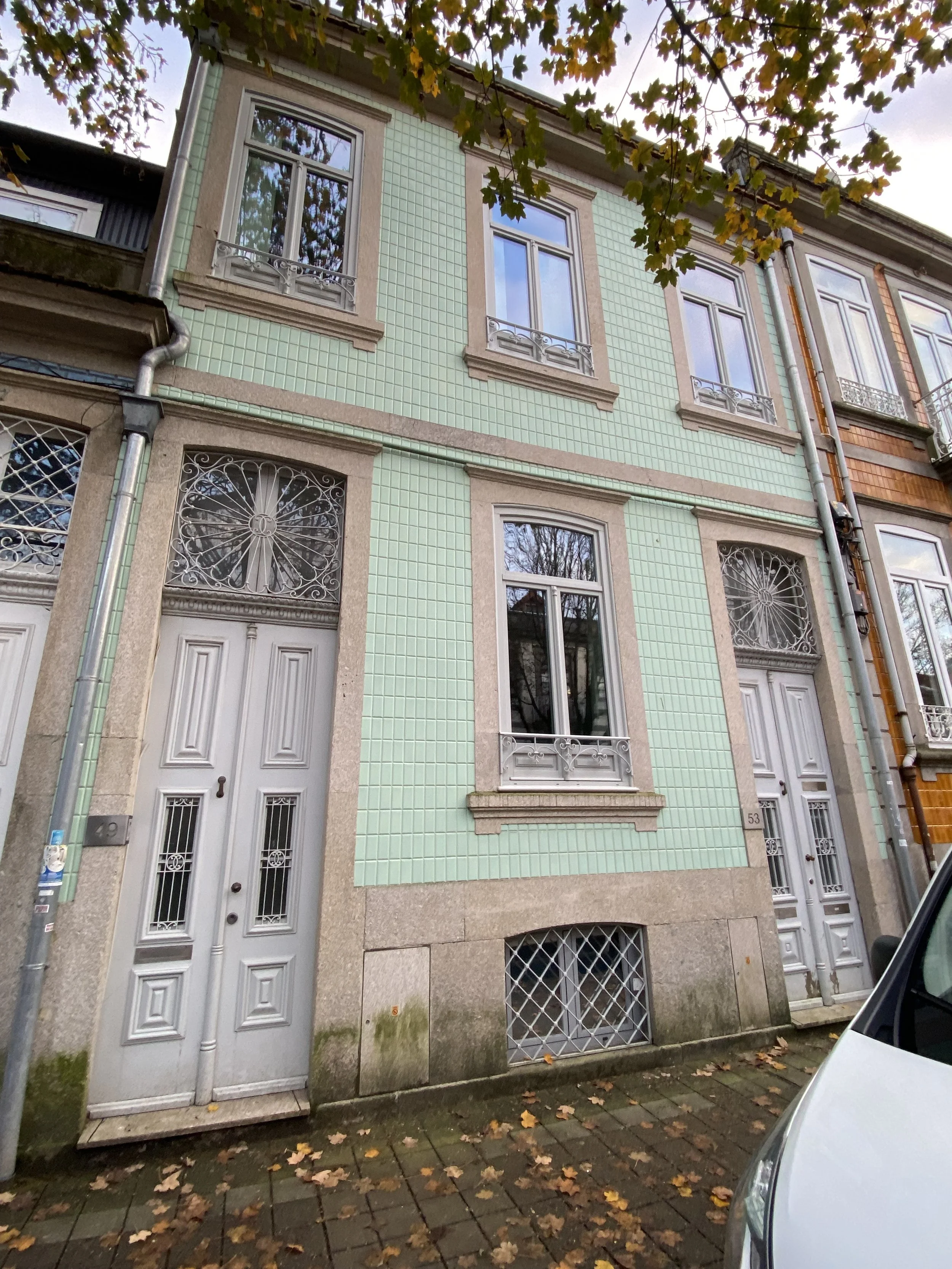
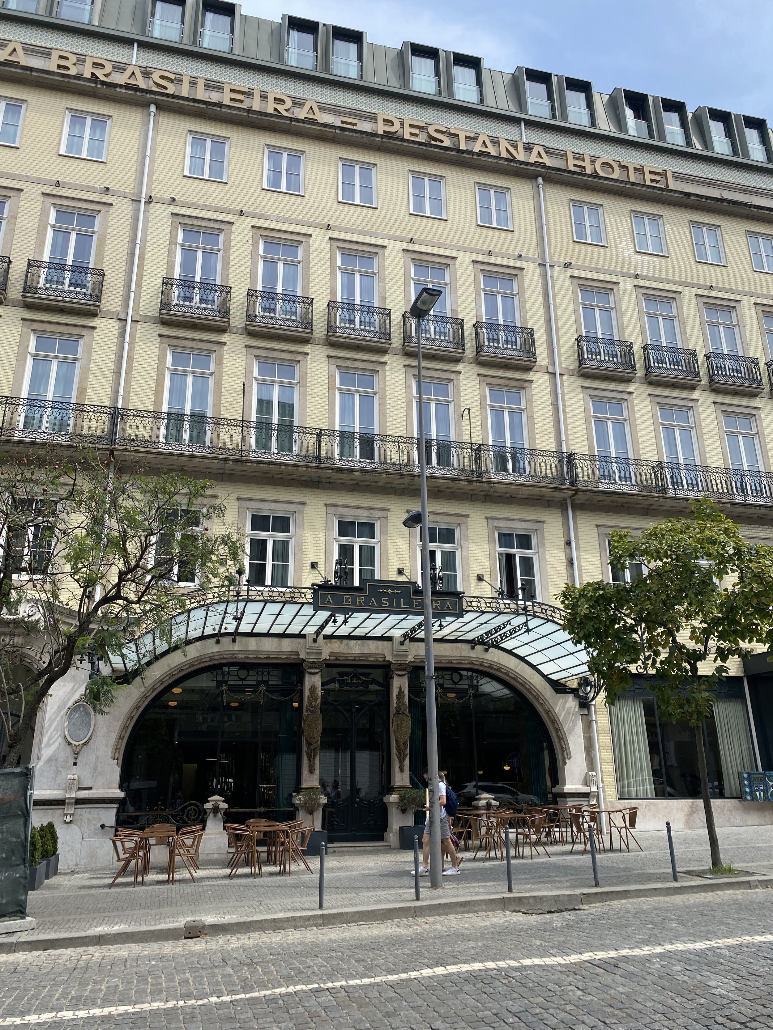
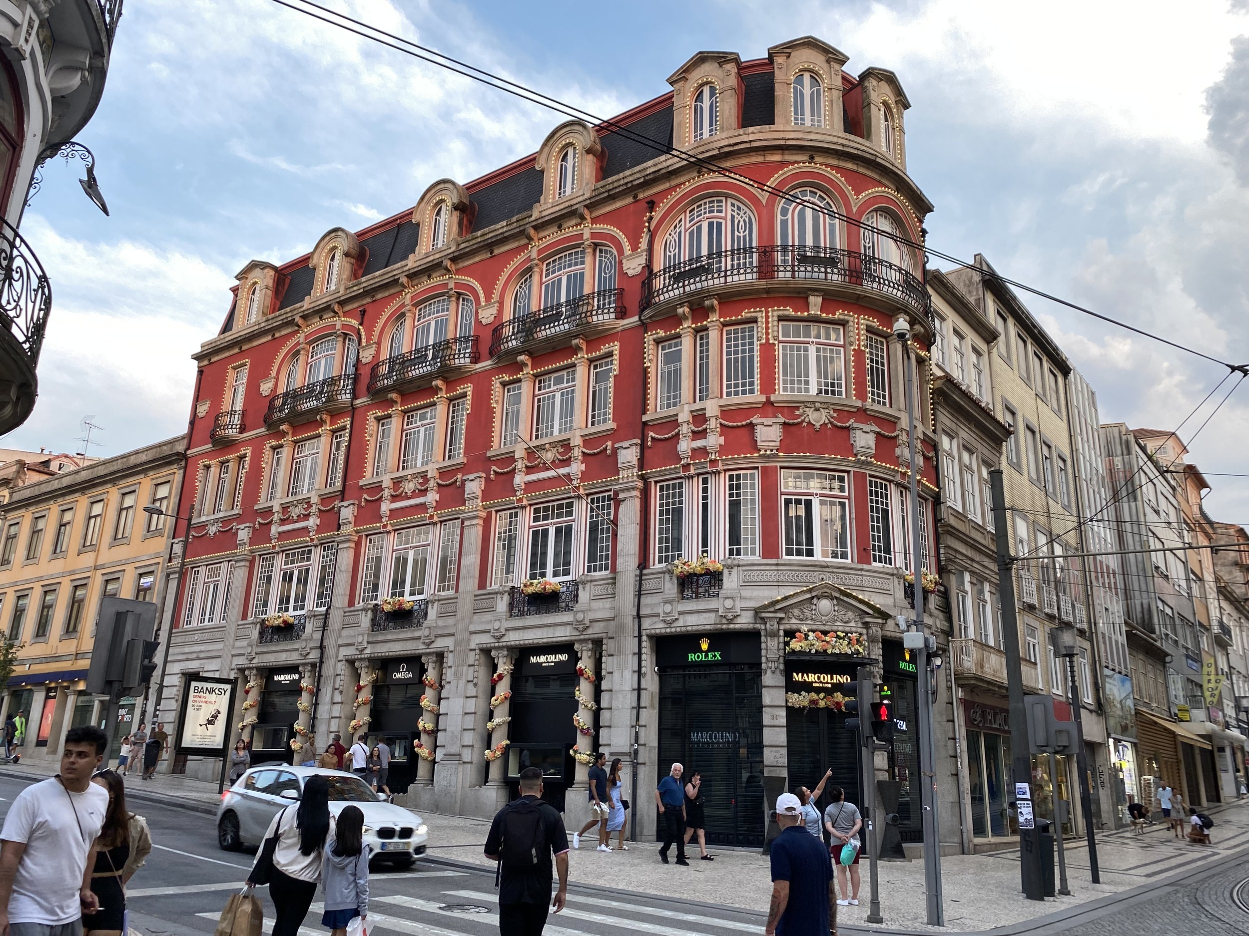
There are plenty of restaurants and shops in Gaia, they have a big mall with a large movie theater complex. Not that we’ve been to the movies yet. It is the side with all the Port wine warehouses and tasting facilities, but it is a bit more “city” has large multistory condo buildings and lacks the charm of our preferred Porto neighborhoods. It was there that, wouldn’t you know it, we found our dream place. The outside of the building is nothing to look at. Built in the 1960’s the exterior lacks the period charm of the 1920’s and 30’s row houses. But unlike the new builds it has S-P-A-C-E. It was originally 5 bedrooms but had been remodeled into a 3 bedroom with office. It has 2 full baths (1 on suite) + a powder room, dining room, good kitchen, huge pantry/laundry/storage area with a sink large enough to bathe the dogs. The master has a walk-in closet. All 3 bedrooms are large so we can set up the guest room with a desk work area in addition to the bed. The guest and studio bedroom both have very large built in closets and each bedroom has its own A/C heating unit. There are 2 small verandas AND 2 large private garages (they call them box garages, as opposed to just a parking space in a open garage). One garage can be used as storage, the other I will set up for taping videos and holding classes and I can set up a large work table down there for when I am working on larger art pieces. I don’t think I will even try to work on my large tree quilt until we move and I have the space to spread it out. It is on the top floor (5th?) in a building with an elevator so no one stomping around above us. The hall even has picture lights, it’s like we custom ordered the place. They reclaimed and refinished the original parquet flooring when they remodeled, personally I’m not a huge fan of parquet flooring but my husband loves it.
We had found another place we also liked a lot, it was 2 blocks from the beach in an area with a really great vibe, it felt very California (but we could never afford a place in CA 2 blocks from the beach) It was considerably smaller than the one in Gaia, 3 bed 2 bath recently remodeled beautifully. It had a large storage room down in the garage with 1 parking space in the open garage area. We would have had to push a wall out into the dining room to make the 3rd bedroom even begin to work as my studio. It also would take 30-40 minutes on the metro to get to the center of Porto. The living room and kitchen were small (takes less time to clean!). There wasn’t a terrace but it did have a shared backyard area with grass for the dogs to run around in + 2 elevators and it was a good bit cheaper than the one in Gaia. We had both places inspected still torn between the two. Do we keep everything small and save money both on the purchase and in upkeep and utilities? Do we get the larger (honestly too large) one in the ugly building and have plenty of space for ourselves and guests, and no remodeling?


We made a formal offer on the larger place in Gaia which was quickly and reasonably countered. We accepted. We met the seller at their agents office to sign the purchase agreement together. Then came the scary part, handing over a very large chunk of cash. In the US you make an offer with “earnest money” 2 or 3 thousand (at least in 2001 when we bought our last place). Here it is negotiable but between 10 and 20 percent of the sales price. We settled on 15%. Wiring the payment meant a trip to the bank to authorize the transaction. Our banker wanted assurances we were not being scammed (at this point we really wanted assurances also, gulp) we told him we were working with professional realtors on both sides of the transaction and had an attorney review the paperwork. (but it still felt scary!) With those confirmations we were able to make the down payment. We now wait and pack. Our closing date is June 19 but it is possible it could happen sooner than that. I am excited to get into our new place. We never really moved into this apartment fully, every time I considered installing shelves and hanging pictures on the wall we would find another place and think why bother if we are moving soon and would only have to patch everything up again. I did hang a design wall with drywall screws but everything else either sits on the floor or was hung using a version of the 3M removable strips.
I’ll be sure to take you on a video tour once we are moved in. Until then here are the photos from the listing. It will look quite zen (another word for empty, lol!) with our very minimal Ikea furniture. With the way the stock market is fluctuating and the dollar diving, it may be a while before we get more or different furniture for our new place, but I can live with that. I will be happy to hang our pictures, spend time on my artwork, and walk around our new neighborhood, thinking about how much I love our new home and how thrilled I am to be living my dream life here in Portugal.


A little side step...
On February 2, 2025 I joined an artist collective here in Porto. When I joined, I discovered that the next exhibit was scheduled to open on March 1 and that the registration deadline had already passed, but just by a couple of days. By the time I emailed and was informed I could still participate I had just over 2 weeks to create something completely new for the exhibit. I promptly set my tree quilt aside and got to work on a new design.

The theme “Tricolor” meant we could use only 3 colors and they needed to be pure saturate colors, with no tinting. We could use pure black or pure white but they would need to be counted within the 3 colors. I almost never use pure color, and since I work in a realistic manner, I tend to use a lot of shading. Clearly my usual style would not work for this art challenge. I pondered a couple of ideas, but time was of the essence. I thought about a project I had started at Asilomar a number of years ago in a class taught by Jane Sassaman. In the class we were creating abstractions from nature. I had developed a design of roses, which I had thought I cleverly invented in the class, imagine my disappointment when I discovered Mackintosh came up with the design before me! I also created some with vines with stylized leaves. I thought this challenge would be a good opportunity to play with those themes again, and maybe even finish my piece this time, fingers crossed! I wanted to do a more natural shape for my roses than the Mackintosh version, so I made a few adjustments there. I liked the leaf shape but made the veins a little more stylized and less natural, and created a half rose between the bud and full open version. I worked the design out in construction paper, before cutting into my precious fabric stash. Here is a portion of the design.

I knew I wanted a black background. I kept the roses and leaves on their own black backing pieces even though I knew their backing wouldn’t show up on the background, I did like that the black “outline” would add separation where the elements overlapped each other and the vines. I have to say it took a very long time to cut out all those fiddly little pieces.

Once the elements were sewn to the background and I had quilted around them, I had about 3 days left to finish the piece. I didn’t know how I wanted to quilt the background yet. I had left a lot of negative space to the right of the primary elements and I needed to do something in that area that would support the theme of the design and also help flatten areas around the primary elements. Since I didn’t have a lot of time left I settled on a trellis design for the background quilting. I did testing on how to fill the space between the trellis slats, to help pop out the trellis itself. A major milestone itself, as I frequently dive in and discover I’ve shot myself in the foot half way through because I didn’t test ahead of time. I discovered that doing all the fill work using free motion quilting was going to take more time than I had available before the deadline. I was telling my husband that I would have to skip the fill, since I didn’t have enough time to do it, when he suggested I check and see if there was a built in stitch on my machine that might allow me to do the fill faster. I have a Janome Continental M8 with a ton of built in stitches, but I NEVER use them so I gathered up my manual and took a look. I identified 7 stitches I thought could maybe work and tested some out. In the end I did find one that filled the area and looked similar to my free motion stitch sample but took only 1/2 the time per square. It was important that I could reasonably replicate the look and volume since the machine stitch would only work on the full squares, it was not going to work where I had to fill in around the vines, leaves or roses. It took a very long time, even with the machine stitch since there was so much to fill to do using free motion around the elements, but I feel it was well worth it since it provided such great texture. The photo here shows the texture well, in reality the background is more black and the texture is less obvious, but that also helps hide the less than perfect fill stitching, lol!

I am happy to say that I did complete my art quilt in time. I call them “textile paintings” or “fabric paintings” when I exhibit them in art shows that aren’t quilt shows.
I used one of my favorite fabric saving tricks to create the stems for this quilt. Rather than cut the stems out of the fabric in curved shapes, I cut the stems on the bias and bent them into shape. If the stems don’t have thorns, I can create diagonal lines right next to each other and have no waste at all. For these thorny stems I had to space them out to accommodate the thorns, but it still took a lot less fabric than it would have if I used the curved cut paper shapes as patterns.
Below is my finished piece “Without Thorns, No Roses” 20” x 24” I’d love to know what you think of it.

Tree (yet un-named) work in progress
Now that the holidays are behind us, and my decorations are finally put away, it’s time to get back to work on my current art quilt. This one is giving me a bit of trouble because it is really too big for my current workspace. In California I had a huge design wall that could hold a queen size quilt and a 4 foot x 8 foot tabletop workspace. The space in my Porto studio is quite a bit smaller and yet my first project was conceived to be BIG.
This project was one that came through a guided meditation, and I saw it as a very large piece, filling the space at the end of a gallery, The tree itself is 40” x 60” and it fits on my design wall, (just barely). Once added to the background the whole piece will measure around 55” x 80” and I have been having to tape the hand painted background onto my bedroom wall in order to see the whole thing at the same time. I think it is time for me to accept my new studio limitations and start making smaller art quilts! lol.
Here is a bit of the evolution: I started with the tree drawing which went through 3 versions. As I would complete a drawing I would then enlarge it. I kept the branching largely the same but kept lengthening the trunk in order to elongate it for what I wanted to acheive.


For a long time when I wanted to enlarge my images to create a pattern, I would take my drawing to Staples and have them print out a large copy on their printer for architectural drawings (the ones they used to call blueprints) but as my local Staples got busier and they couldn’t print them out on the spot, I searched for another option. I found it with Rasterbator.net an online service that allows me to upload a photo of my drawing and then I can print it out any size I want on my home printer. It uses a fair amount of paper and ink, something I am more aware of with the dinky printer and ink cartridges we bought here, but still a very convenient way to go.
This project is turned edge applique for the tree. I didn’t want to have to reverse the design and I wanted to make it easy to remove the freezer paper, so I pressed the freezer paper to the RIGHT side of the fabric and drew a 1/4 inch extension to press under. I then carefully turned the edges under so only the freezer paper showed from above, clipping the curves and inside corners where needed. I used a hot iron and a light application of acid free glue to keep the turned edges in place. Where one section of trunk butted up against another I turned the piece that would go on top but did not turn the edge of the “under” piece. I used a very small zig zag stitch to sew the trunk areas together (here shown in black so you can see it) matching the thread to the fabric. Once sewn I turned the pieces over and trimmed away the excess fabric.


The root section was created using fewer fabric color changes and required more painting, but was still done with turned edges. Here you can see it with the freezer paper pieces still in place, and the painting progression.


The leaves are painted Tyvek and modeled after those of a crabapple tree at the end of my block in California. I created 2 shapes in 2 sizes and then reversed the pieces to get 4 leaf variations. I stitched the vein lines onto the leaves before cutting them out, then they will be attached to the tree in a way where the edges can flutter to add movement and changing reflections. The leaves have been painted with metallic paints and will change color as they go from one side to the other, moving from gold to red to represent how we are born with perfect knowledge, are indoctrinated by society and “formal learning” and then, hopefully, gain wisdom.


I still have a lot to do before this one is finished and have given myself a deadline of Feb 15 to have the top completed some of the quilting done, so I had better sign off for now and get back to it. I’ll fill you in on the rest of the process once the quilt is finished.
Lights and Mulled Wine… the Holiday Season in Portugal
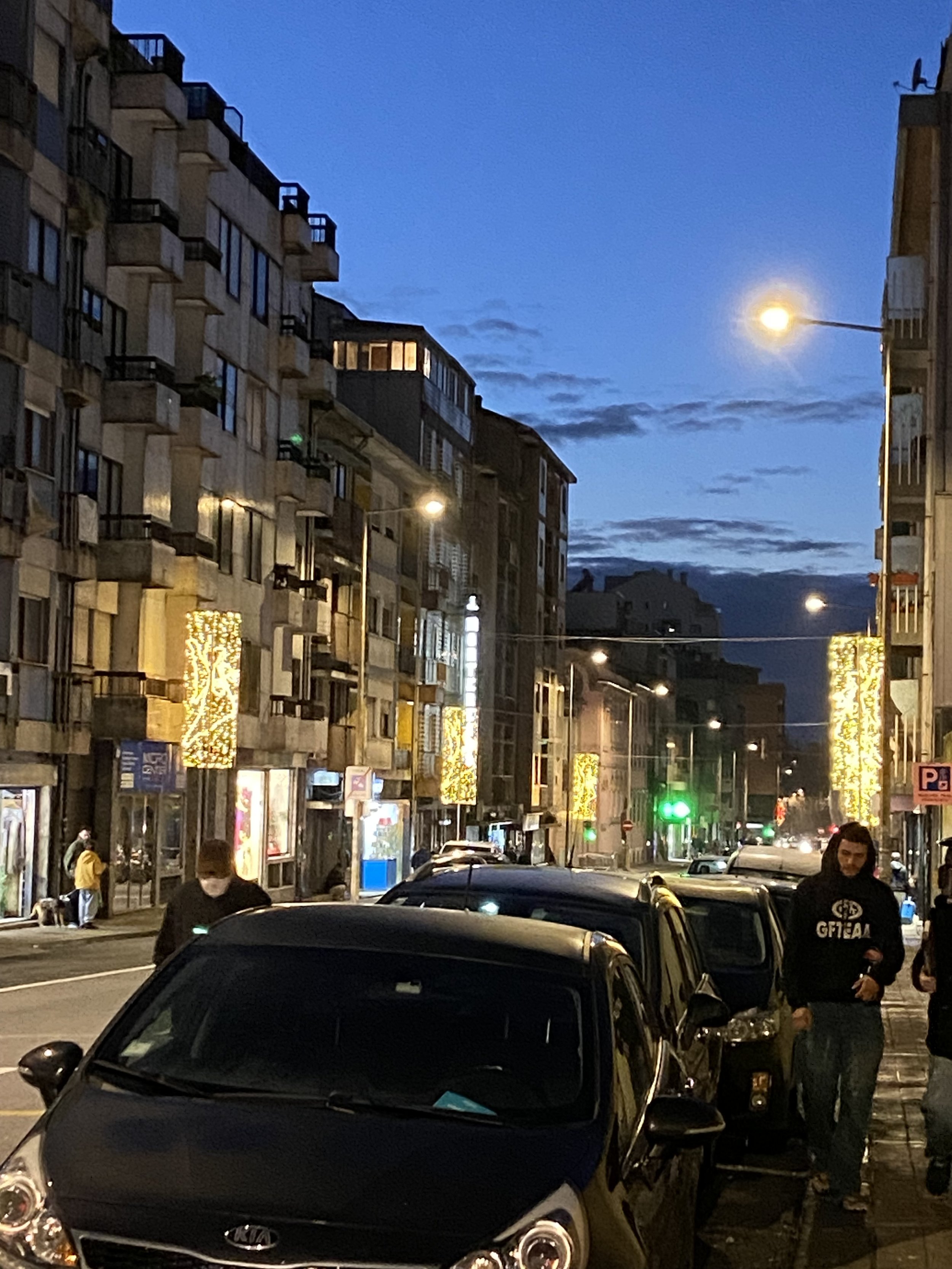
November 30 was the official kick-off to the holiday season in Porto - the city holiday lights were turned on, the giant tree in front of city hall was lit, a concert in the city hall square where a large stage has been erected and fireworks! The Portuguese take their holidays seriously, always happy to get out and spend time with family and friends.


It’s colder here than in So. California so when the hubby and I went to the Christmas market on Sunday, I went in coat, hat and muffler. By the time we were finished warm gloves as well. At the market I enjoyed a couple of firsts, my first mulled wine (yes, please!) and a special treat called a bombocas, not a cake as I had guessed, but a gooey, marshmellowy filling surrounded by chocolate and sprinkled with coconut. The contrast of the crisp chocolate coating and the gooey center was lovely and lets just say, it’s a good thing they only show up for the holidays or I would be in big trouble!


As we made our way toward the metro station we discovered our favorite nata shop has a second location in Porto - that called for a stop. Pastel de Nata - a yummy custard treat in a flaky pastry shell is the official dessert of Portugal. They are everywhere. I like mine with a dusting of cinnamon. At Manteigaria they make them by hand all day long and they are always fresh, but this was the 1st time I had one so fresh that the filling was still hot, OMG best nata ever!


It was lovely walking through the city seeing all the lights. The streets each have their own designs, ornaments, angels, bows, celestial planets and it is a delight as you move from street to street seeing them festooned. The Aliados metro, near city hall, was our destination but we couldn’t help but stop to enjoy a bit of the free concert taking place on the stage. They were singing pop Christmas songs and everyone from toddlers to grannies were singing and dancing along. I got a few more pictures of the city hall plaza tree and lights then it was time to get back home and curl up with the pups.


Our apartment is small, with almost no flat surfaces, so this year decorating took no time at all - unlike the week or more it took me to do just the inside at my Glendora home. We do have a small tree and I still want to add ornaments (I had a plastic tote box full of my most prized ornaments included in our crates from California) but I’m sure I will get that done this coming weekend.
Baking cookies has been a bit of a challenge, no Nestles chocolate chips or Hershey’s baking chocolate to be found, but I have been testing substitutes and have gotten pretty close to the flavors I remember. I’ll also need to make my cream of mushroom soup for green bean casserole from scratch and the green beans are large and flat…. but we adapt. Life is good here.
I wish you all the joys of the season and a happy new year.
Porto the first big bumps....
No matter how good the marriage, the honeymoon has to end sometime. Or so they tell me. I am still in the honeymoon, but that’s not to say there haven’t been a few bumps along the way.
Moving to Portugal requires applying for a visa in person at the consulate office, in our case in San Francisco, followed by an in-person visit to the immigration office in Portugal. We were somewhat lucky in that our immigration appointments were scheduled before we left California and were included in our visa’s. Portugal has had a change in government officials and has changed the entire system for immigration since we started preparing for our move and many people are still waiting to get an immigration appointment even scheduled.
My husband was scheduled for the immigration office in Lisbon (the capital city 3 1/2 hours away from Porto) at 2:30 on July 10, I was scheduled for my appointment at 10 am on July 11 in Santarem, about a hour from Lisbon. Because of the language and cultural challenges we hired an attorney to accompany us to our Lisbon appointment. We traveled to Lisbon the day before our appointment so we would be sure to be on time. There we were, on time, sweating like crazy - it was sooo hot that day, but feeling worse for our attorney who was in a business suit. Made our way up to the window only to be told that all the afternoon appointments were cancelled! Apparently, each appointment is booked for 15 minutes but takes 1 hour to complete. Once the people scheduled for the morning have arrived it takes until the end of the day to complete their application processing. Highly disappointing, but we had been warned by our attorney it could happen when he met us at the immigration office. I personally can’t say it was a complete loss, the hotel was pleasant, had good AC and we discovered a FABULOUS Italian resturant nearby where we had both dinner the night before and lunch that day, it was that good.
Disappointed but not totally dejected, we gathered up our luggage crossed our fingers and headed on the train to Santarem. We hired a bolt to take us to the hotel (their version of uber) went to check in and found they didn’t have a reservation for us. I panicked just a little since they had no rooms available, then my husband realized he had mixed up the hotels - we were actually booked somewhere else. Back in a bolt…
I will say Santarem is adorable! Once we got to the correct hotel we had time to explore a bit.


The train station had tiles depicting buildings and scenes from the city and history. It was fun to then see some of them in person.
Fortunately, my visit the next day went fine and I was approved for my residency. We were warned that it could take up to 3 months for my residency card to arrive but I was delighted to receive it in the mail 3 weeks later. Unfortunately at the time I received my card, we were still waiting for them to re-schedule my husbands cancelled appointment. Which meant, I was now free to leave the country, but my husband wasn’t.
A fun thing we did do while waiting… for a new appointment, for our pallets, for our couch, was attend a craft festival in Villa do Conde a town about 30 minutes or so north of Porto and one we have talked about possibly buying a home in. The festival held in a large park, has artists and crafts persons from all over Portugal, representing the various traditional arts. Pottery, lacemaking, wool felt, basket weaving, leather work, shoe making, and more. I resisted purchasing anything I couldn’t eat. With our stuff yet to arrive and still not much furniture, I didn’t know if there would be room for anything decorative. But it was fun to look! The town boasts a roman aqueduct wall, and we went with our new, super fun friend, Gwen.


6 then 8 then 10 weeks passed and still no pallets. It wasn’t a huge deal, but I was getting very tired of the few clothes I had packed in my suitcase and didn’t really want to buy more just in time for our stuff to arrive. Also the 45 day deadline for our couch had come and gone and no amount of phone calls or emails was getting us anywhere.
It was August, vacation time in Europe and evidently EVERYONE stops working. We knew our pallets had arrived in Rotterdam, but we still didn’t know how long it would take to get them to Porto. Another 2 weeks passed and we received word that they had cleared customs and they gave us a delivery date. Hooray!
The moving company we had planned to use was of course ON VACATION, but in the perfect alignment that sometimes happens, a woman had given me the number for her moving company that morning - apparently our pallets were on the same ship! We arranged to have 3 guys to unpack the pallets and take the plastic packing boxes upstairs to either the 1st floor living area (2nd floor in the US) or the 2nd floor bedrooms (3rd floor US) and no, there is no elevator. About 1/2 the shipment was fabric and supplies for my sewing room not to mention my rather large sewing machine! We re-arranged our schedule and waited anxiously for our things to arrive. And waited, and waited. Nothing. No call. No truck. My husband was able to determine that one of the pallets was missing and appeared to be somewhere in Spain. He was afraid to tell me which one. I tried to remain calm and let him sort it out. The next morning he woke me up early saying “I think the pallets are here”. Again, no call or warning, and now we had no one lined up to unload. My husband managed to reach the mover who had been on standby the day before. The owner was literally boarding a plane to Greece but bless him, managed to get 2 guys to our house in an hour. The pallets were delivered 1 at a time so we were more or less able to get 1 unloaded before the next arrived so we didn’t run out of space on the sidewalk.
Below is my new sewing studio before and after the arrival of our pallets. It’s a bit more put together now. I’ll share that in the next blog post.


By now we had added a dresser and nightstands to the bedroom, dining table (its own Ikea adventure) a glass fronted cabinet in the living room, dining chairs as well as a desk and tables for my sewing room (some still needing assembly), but at least we had someplace to put the things that arrived on the pallets. But, still no couch.
I did point out that it would have been much harder to find someplace to put all the plastic tubs and boxes from the pallets if we did have the couch, but my husband did not find that a convincing argument. We were all tired of sitting in chairs. I would sit in a chair with my feet up on another chair and our terrier Stitch in my lap. In other words I WAS THE COUCH. It was getting very old. Finally one of our Portuguese friends took pity on us and took things into her own hands. Funny how none of my calls or emails got any results. However once Alexandra got involved I had a call with a firm delivery date within 24 hours. Not only did they deliver it on the promised day, she insisted they assemble it for us for free. (pity she didn’t get the delivery charge refunded, but let’s not quibble)
So now September 6, 3 months after we ordered it, we had a couch. Our pallets arrived August 27, 3 months after they were picked up in Glendora. It took longer than expected but we were beginning to feel at home.
Porto, stage II
When we packed up our 2 1/2 pallets of things we wanted to ship to our new home. U-pack We ship quoted 4-6 weeks delivery in Portugal. Now after a month in our new country, we find that the pallets are still in South Carolina waiting to be loaded onto a ship.
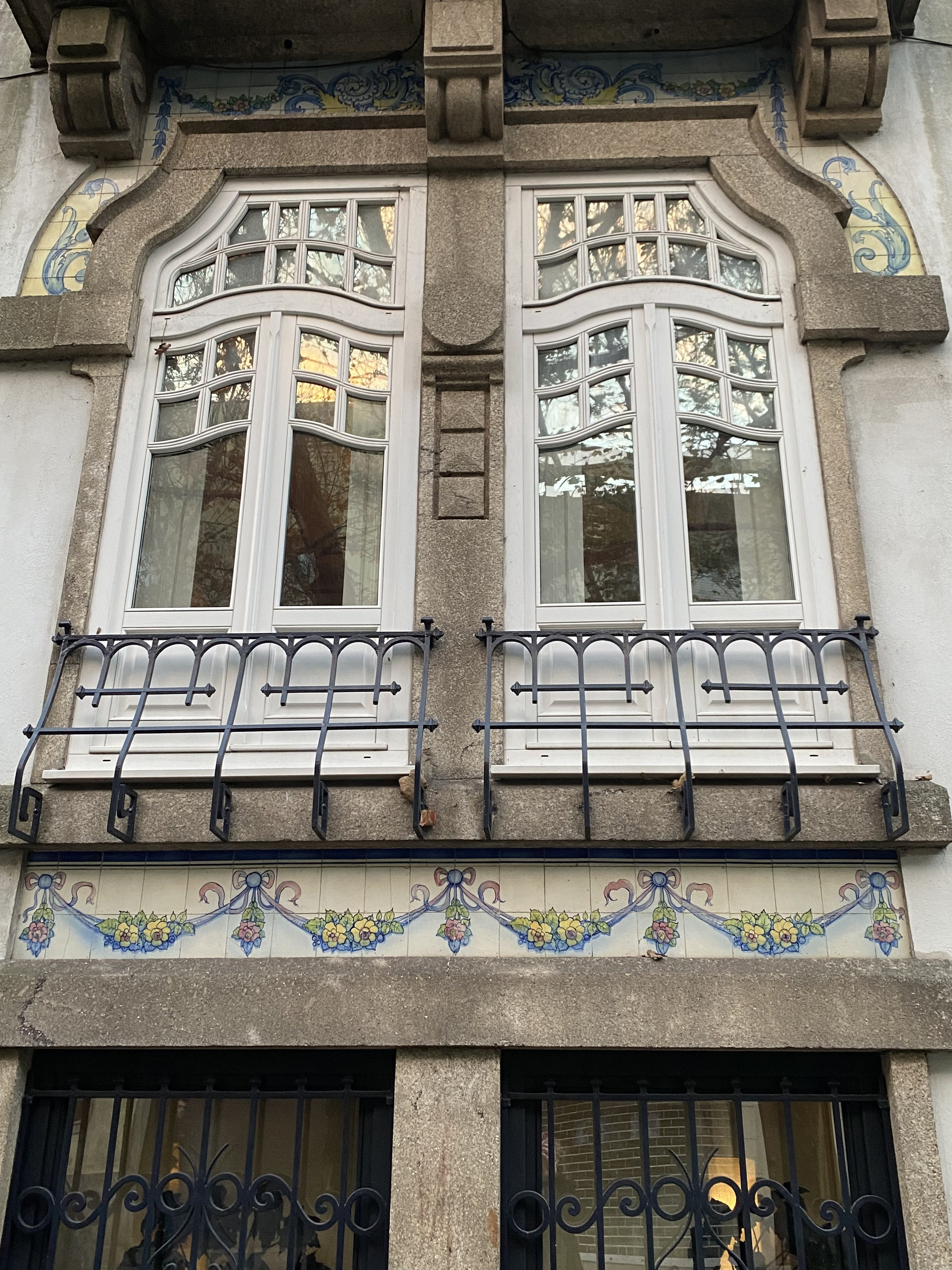
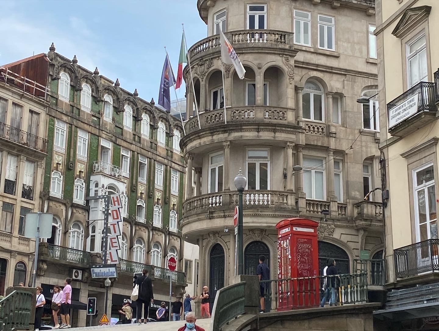
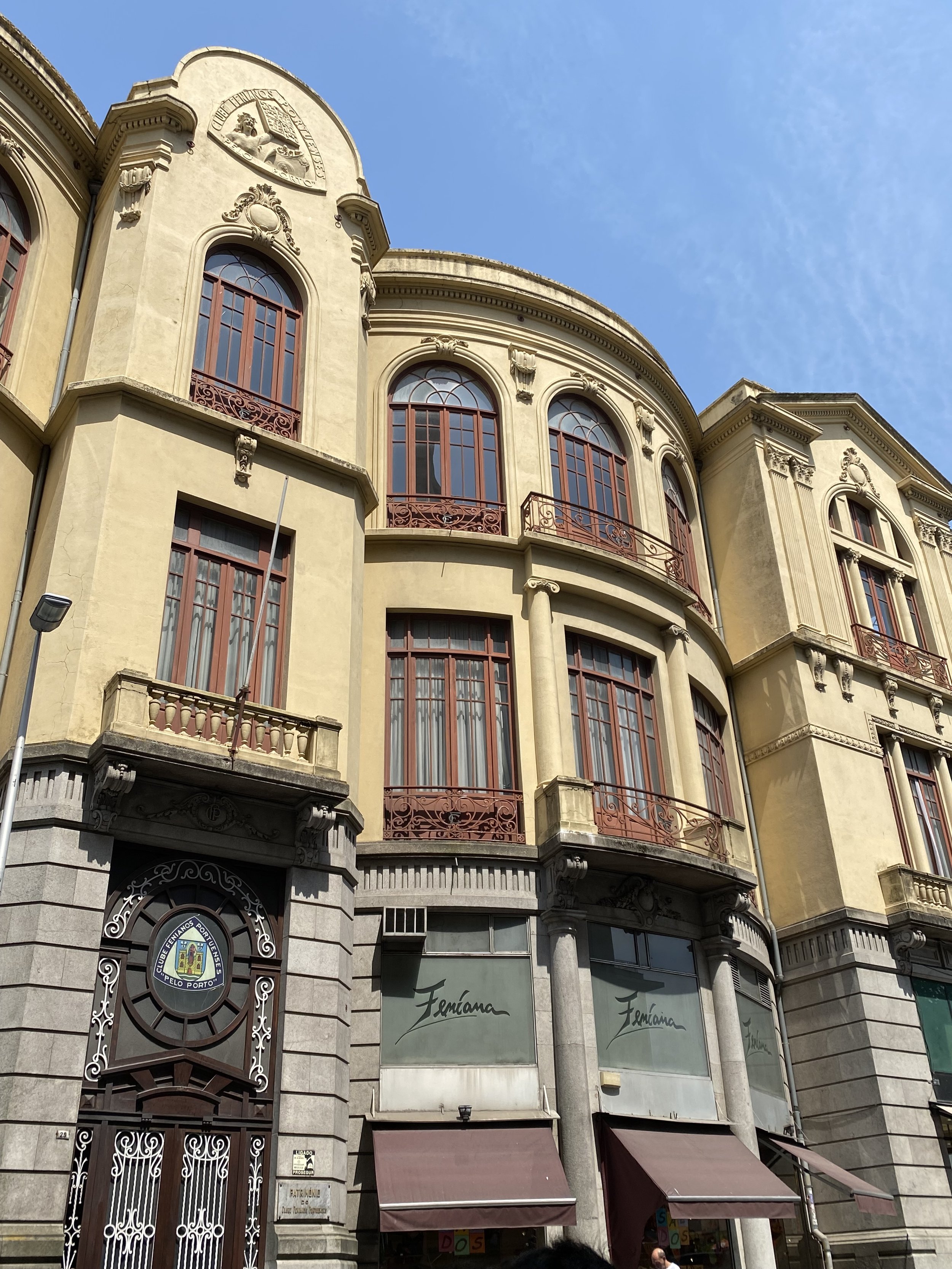
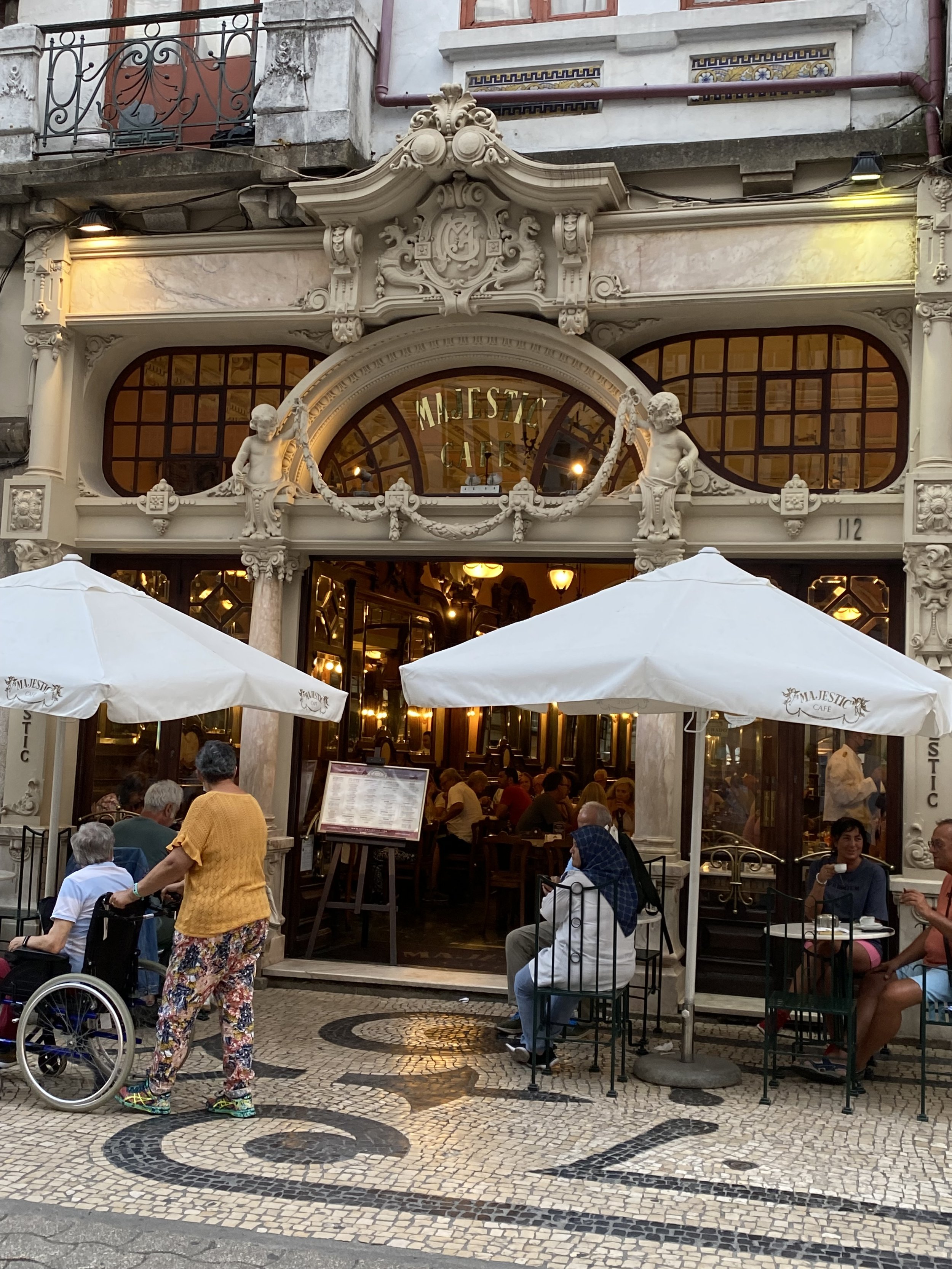
We are continuing to go out shopping nearly every day, either for food or items for the apartment, but we are taking some time out to visit friends and see a bit of our new city. I love architecture so my camera roll fills quickly on our jaunts around town…


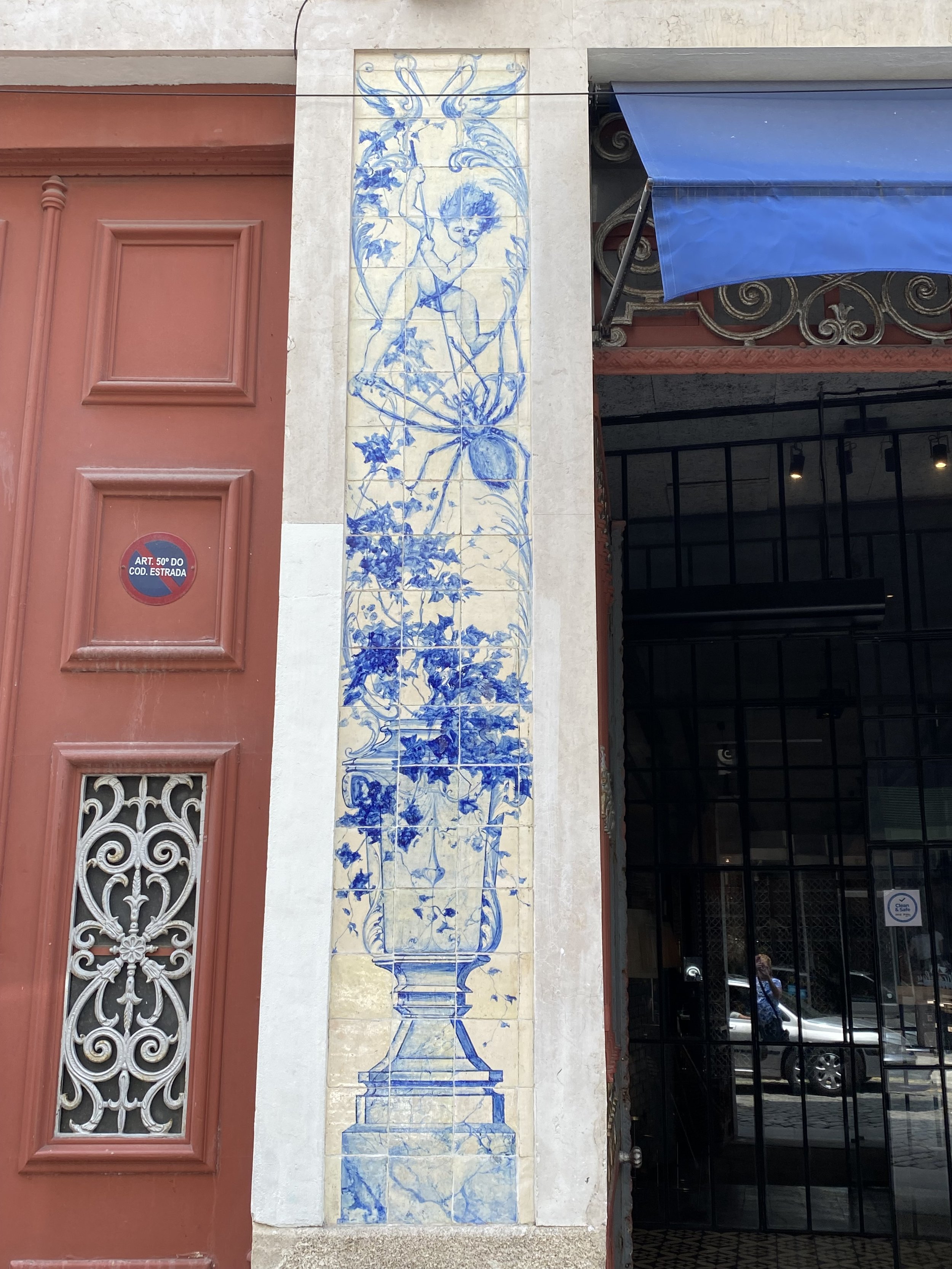
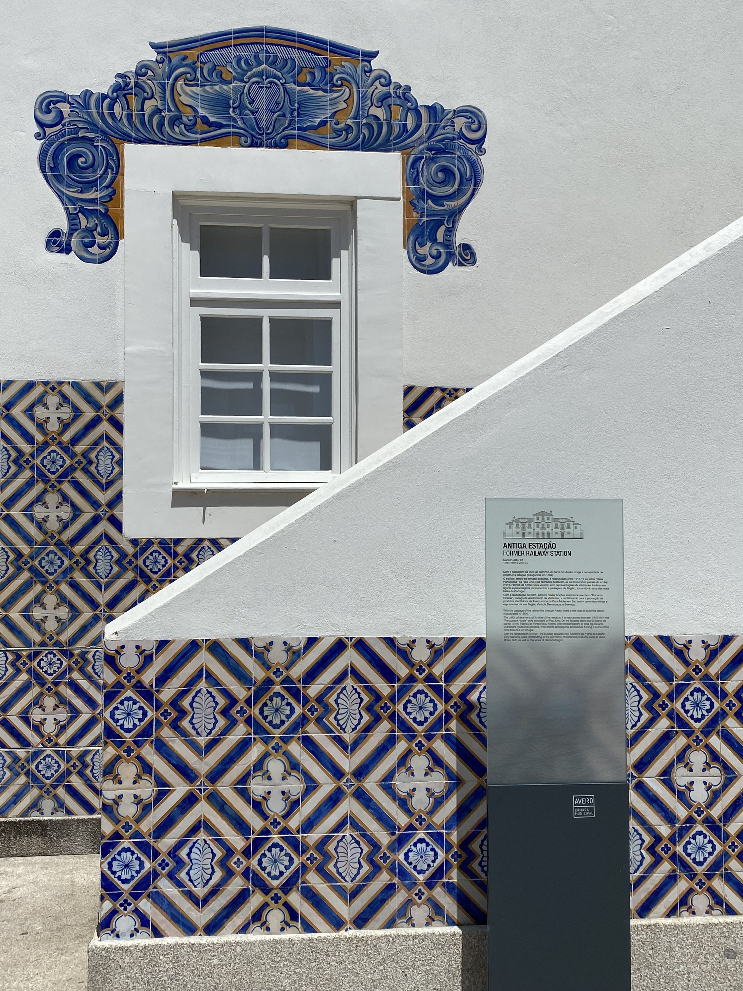
…not to mention my need to photograph all the pretty tiles that cover the buildings.


One of the many reasons I wanted to make this lifestyle change was to be able to spend more of my time on my artwork. One of the first things I did when we arrived was look up art galleries for openings we could attend. The first gallery that caught my attention was an artist collective that was having an opening that weekend.
I was a little nervous to attend since we don’t speak more than a couple of words of Portuguese. I took a deep breath and attended anyway. As I suspected, most everyone was speaking Portuguese. I did catch one conversation and when it reached a lull, I piped in “I’m afraid I was eavesdropping - I heard you speaking English - I just moved here and I don’t speak any Portuguese” It turned out the woman I had eavesdropped on was the artist’s daughter. After a brief conversation she insisted that we meet her mother, Maria Manuela Silva, who’s art, sculpture - watercolors - photography, was surrounding us. Maria (pictured below with my husband) is a warm, lovely woman who introduced us to several of her friends in attendance who could speak at least some English. In addition to the artwork on display, Maria had invited a vocalist to preform, named Aswin Barros (below in black and white) and he did an excellent medley of what he called “spiritual music”.


For a large city, Porto feels like a small town. Later that night Aswin and his crew, arrived at the same resturant where my husband and I were having dinner, 5.5 kilometers from the gallery where we met. Two days later, I ran into him on the street around the corner from our apartment. Since the day of the opening both Aswin and Maria have become good friends.
A week or two after we met, Aswin invited us to another event he was in. This time a combination of art and fashion where he would be acting as a model. Images of the paintings were printed onto fabric, fashioned into clothing and then were modeled runway style during the exhibit of the art. That is where I learned to be careful about what is being served… I poured a standard glass of what I assumed was red wine, only to discover when I took my first sip - it was PORT! For those who aren’t familiar, Port is a fortified wine, somewhat closer to hard liquor in alcohol content and usually served in very small glasses (it’s also very tasty and somewhat sweet - my preference is a 10 year tawny)


Since arriving in Portugal we have become far more social. Back in Southern California our friends were spread all over. Our Son lived an hour away, my best friend was 30 minutes by freeway (without traffic) getting together with friends needed to be planned a week or more in advance. I suppose it also helps that most of the friends we are making here are also retired.
I have joined a very active expat community and my husband belongs to a different one. Between the 2 groups we attend “meet-ups” 4-5 times a month, and could attend 4-5 times a week easily if we wished. As one of the organizers said “If you are bored in Porto, it’s your own fault” in addition to the 2 art events I mentioned we’ve attended 2 concerts, a cider tasting, an opera, 5 more gallery exhibit openings, the grand opening of a Mexican resturant, and had coffee, lunch or happy hour get togethers with friends both old (from previous trips) and new.


Glendora, where we lived, was about a hour drive from downtown Los Angeles, 45 min from Hollywood, even the nearest resturant was a 5 minute drive or 20 min walk. Here so much is in walking distance. After the Opera, it took less than 15 minutes to walk back to our apartment.
I will admit I’m not thrilled with carrying my big bags of groceries home and up the stairs and one day I did complain that after I go to the butcher, the bakery and the grocery store I don’t have any energy left to cook. Not to mention having to go to the laundromat or figure out how to vote in this so important election. Oh, and then there was the surprise I felt when I saw the pork being delivered to the butcher (the image may be triggering to those of us who are used to our meat being parceled and cello wrapped).


All that considered, I delight in the lifestyle. Things are slower in a good way. I love that we are beginning to be recognized as part of the neighborhood. Just the other day, one of our neighborhood butchers waved to me, he was spending his break in the corner park as we were walking the dogs.
Having dogs is a great ice breaker - everyone loves to stop and give them a cuddle. Walking them gets us out into the city every day. We have a small park at the end of the street and a larger one about 15 minutes away.


Our Son was able to visit us in July - he works remotely for his company in Los Angeles and we were able to see him for at least part of every day he was in town. He introduced us to some brew pubs and helped deliver our TV stand (another thing that is challenging when you don’t have a car) we were able to celebrate his 34th birthday and watch the opening of the Olympics while he was here. We had 2 actual chairs + our folding chairs, now we could entertain! No, that wasn’t his real birthday cake, my husband has a quirky sense of humor.


Every great adventure contains at least a couple of hiccups… I’ll tell you about those in the next post.
Porto, the first month....
As I am writing this we have been in Porto just a bit over 4 months. I am going to break it down into segments, unlike my rant about the final months in California before the move.
We arrived in our new city on May 28th quite blurry eyed from the flight. Bringing our two pups, Lilo and Stitch with us meant we had to have a veterinarian check them at the airport in Porto. Our little Stitch was grumpy from the long flight and wouldn’t let the vet touch him. But, the kind Vet let us depart the airport with stern instructions to see a local Vet and get their check up and dog passports faxed to him within the week!
The apartment we rented in Porto was unfurnished, except for a bed, so we stayed in an AL (a VBRO in Portuguese) for the first 3 weeks. It was tiny but did have a couch (not one big enough for all 4 of us) a kitchen with plates, pots and pans, plus sheets and pillows for the bed. As we had none of these things in our apartment, we needed to figure out where to shop and get busy!


Porto is full of inexpensive cafes and restaurants so for the first week we mostly ate out. It still blows my mind that we can go to a traditional Portuguese sit down resturant and have a lunch consisting of a generous entree with sides, wine and dessert for 10 Euro, that’s less than a meal at McDonald’s in LA! Summer in Porto is lovely, with temps in the high 70’s to low 80’s, there is considerably more humidity than Los Angeles, my T-shirts stayed in the closet while I relied on loose cotton and linen tops and capris.
Grocery shopping was the first thing to conquer, we had visited the country a few times and did some cooking then so it wasn’t brand new. We knew we could get some favorites like Hellmann’s mayonnaise and sliced ham and cheese. They cook much more from scratch and don’t have a lot of frozen entrees or canned goods. The first thing I purchased for our apartment was an Instant-pot. I had one in California, but rarely used it since I also had a crock pot, rice cooker and even a pressure cooker. But with a much smaller kitchen having one multicooker made much more sense. I managed to purchase some beef at the butcher (an adventure in language limitations in itself) and wanted to make a pot roast. Humm, no French onion or cream of mushroom soup. No Campbells at all. Google to the rescue! Once I figured out how to make mushroom cream sauce from scratch, I couldn’t help but think about all the years I wasted using the inferior canned stuff!
While we were figuring out how to cook, we were shopping! We needed everything, furniture, dishes, bedding. I never thought I could dislike shopping, but it WAS uncomfortable. I had just spent the last year NOT buying anything because I knew we would be moving and selling almost everything we already had, I had no reason to buy more. Now, having to do so much shopping was a shock to my system. The first thing my husband bought was a TV, I simply let him get what he wanted. Everything else became a negotiation. I’d forgotten what it was like to try to furnish a home, with us both having different styles… it’s rough! Now we had an empty apartment with a TV … progress?


Initially we tried to purchase Portuguese products. Simple enough for our dishware (pictured above) but the stores don’t stock furniture, generally it has to be ordered and takes 6-8 weeks for delivery. Not so great when you have nothing. We found a couch at a Portuguese shop and ordered it, with the promise it would be ready in 45 days max, we paid and additional 89 euros to have it delivered upstairs to our living room (ouch!)


The weekend we moved into our apartment coincided with the festival of Sao Joao. It is a major street party with children and adults carrying large plastic hammers and bonking each other on the head with them. I have no idea what that has to do with St. John! The kids are up late and once the sun goes down (around 9 pm this time of year) people light paper lanterns and send them up into the sky. I made a wish on mine and sent it up from our tiny balcony. (Then prayed it wouldn’t get caught in the trees!) You can hear bands playing and the smell of sardines roasting on small grills fill the air. We still didn’t have any real furniture, but we did have 2 folding chairs, towels and bedding, some kitchenware and an organized cutlery drawer, we were on our way.


Portugal, continued...
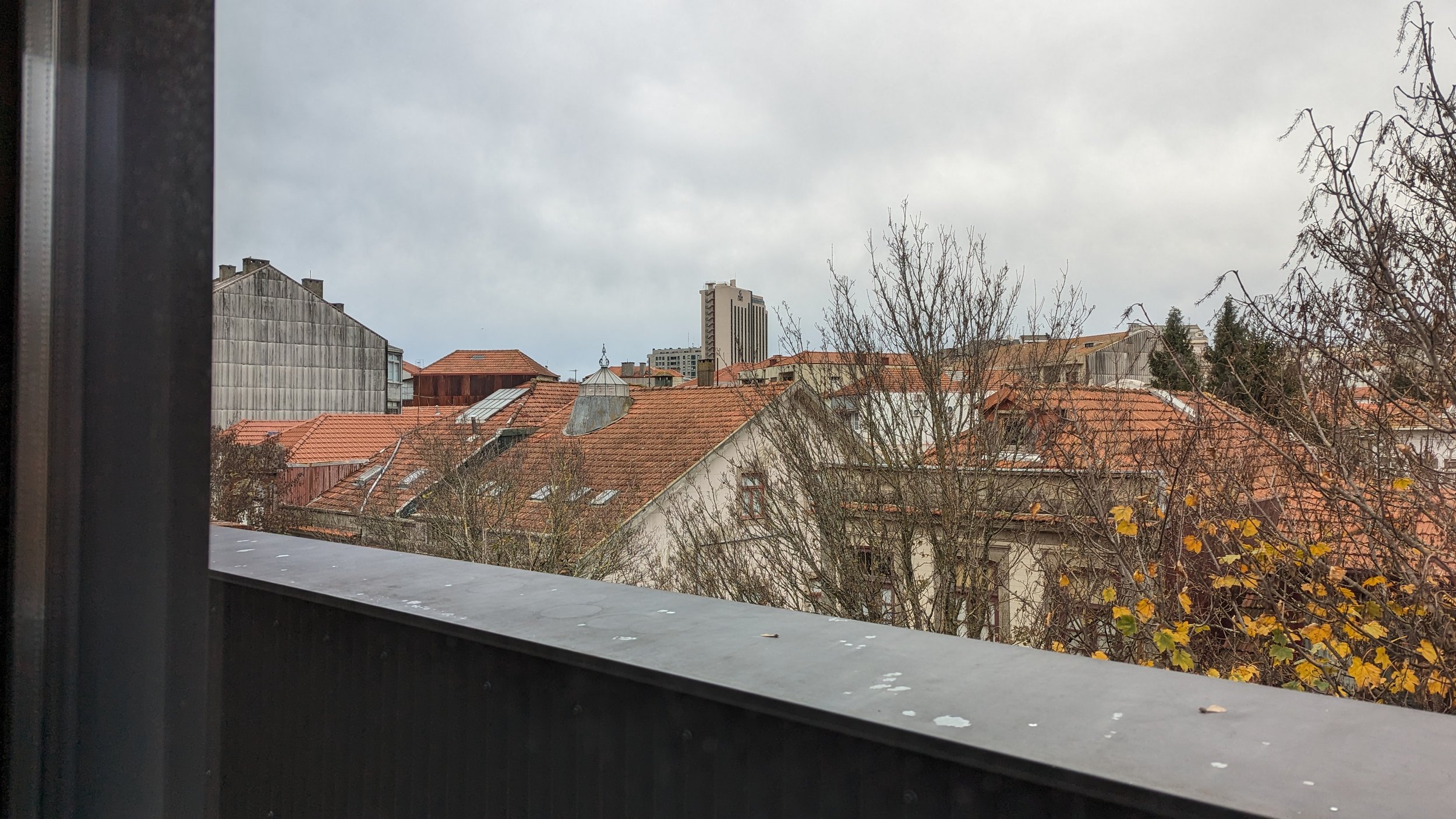
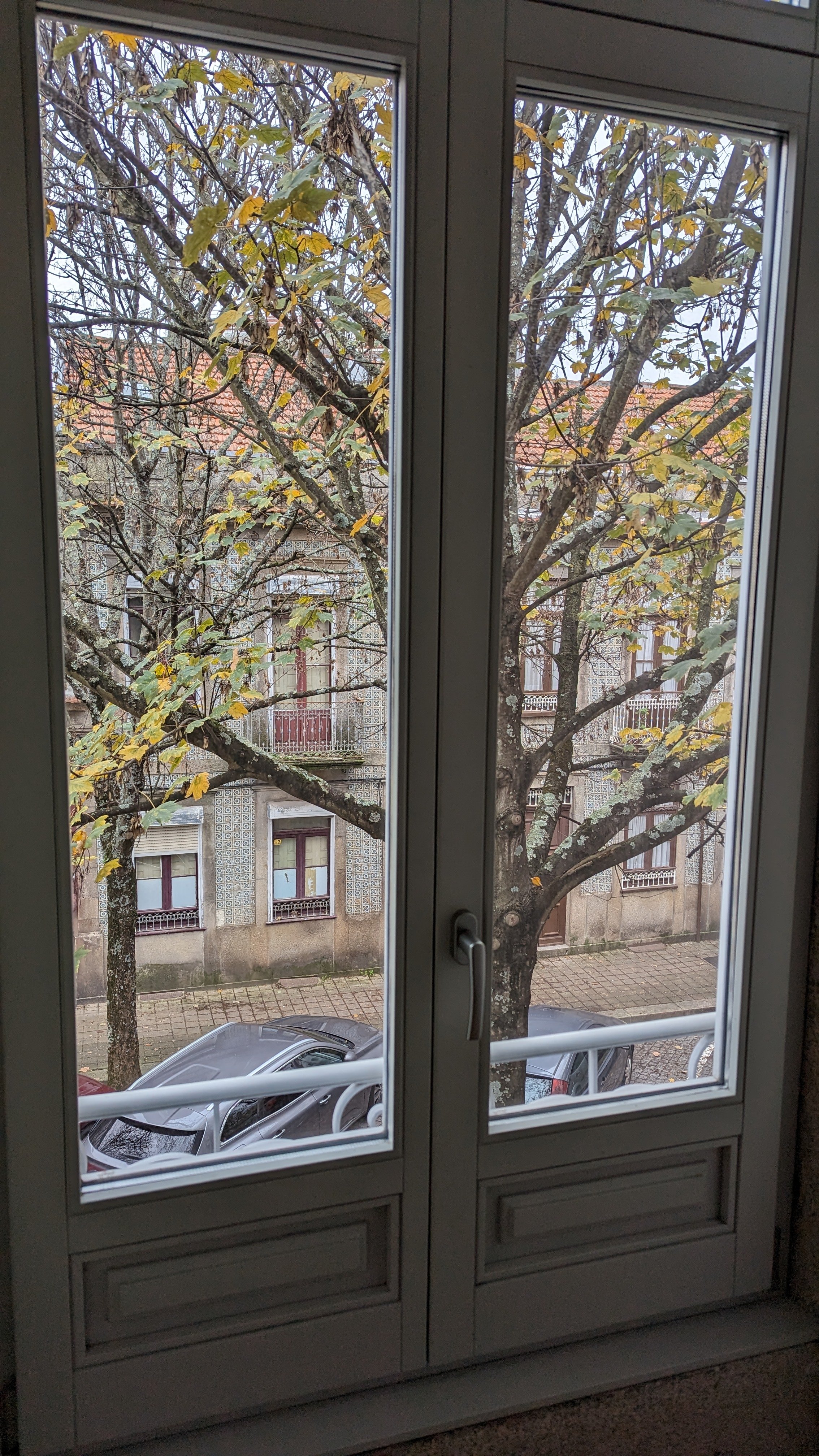
We have rented an apartment and established residency! In November David and I traveled back to Porto to apartment hunt. We had to kiss a lot of frogs, which took up most of our time there, before we found our lovely apartment. We had a wishlist and this one ticked nearly all the boxes and had the plus of being in a lovely 3 unit vintage building in an ideal neighborhood. Our unit is a duplex on the 1st floor (2nd floor in US vernacular) so we have the 3 windows that look out on the trees. Its like being in a treehouse. The bedrooms (2, one for sleeping, one for sewing!) are on the top floor, which is set back a bit so you can’t see it from the street, it has a very small balcony and a view of the rooftops. The apartment itself was fully renovated 2 years ago.
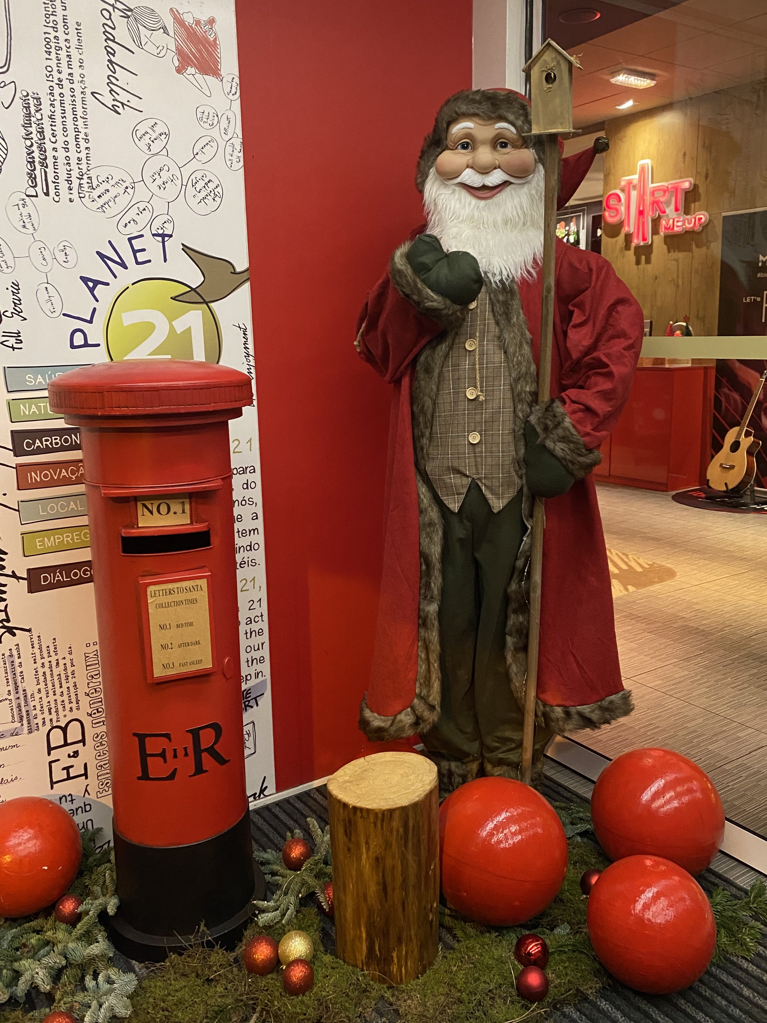


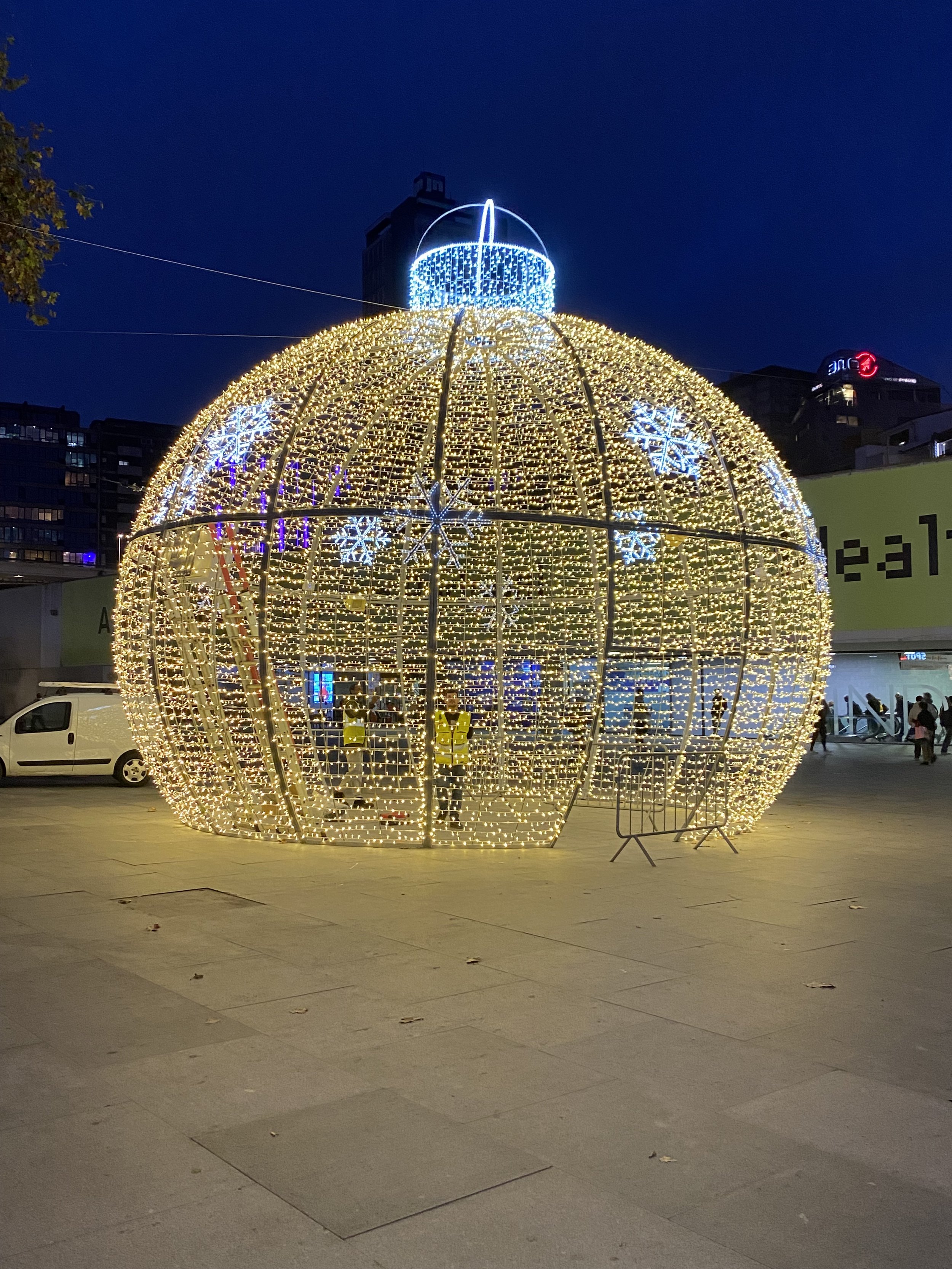

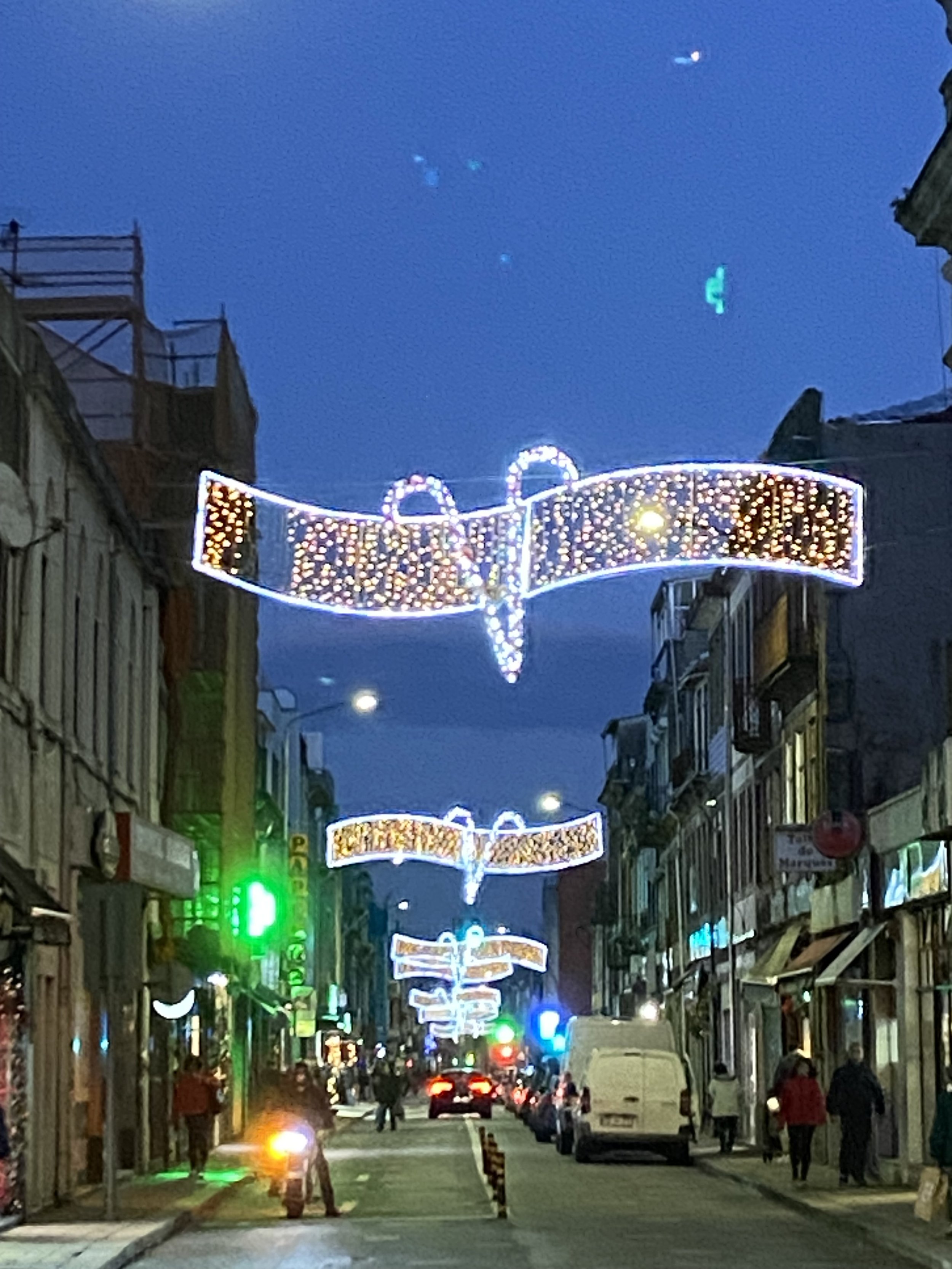
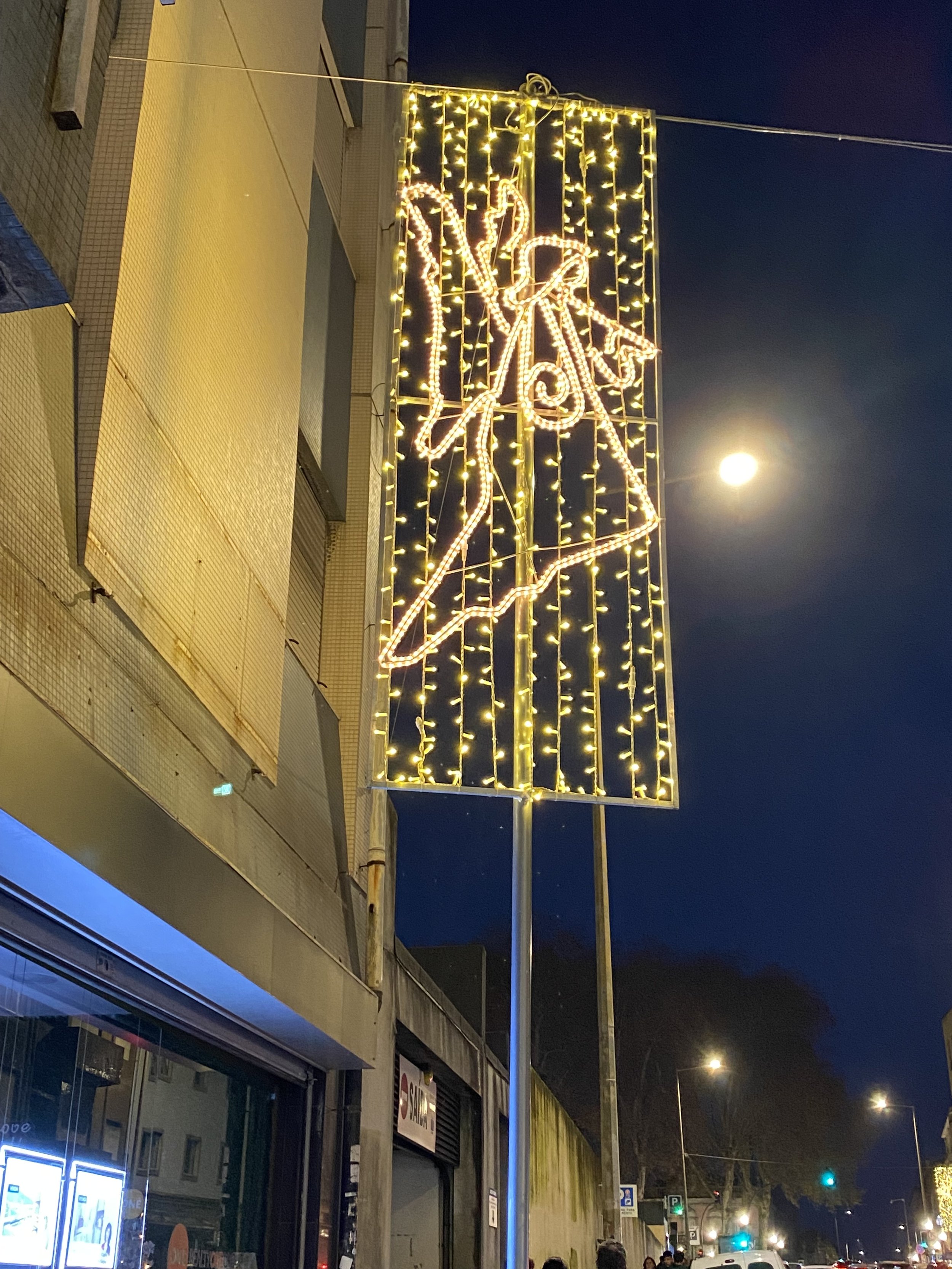
We did manage a bit of time to visit with friends and see more of the city. The Portuguese take the Christmas holiday seriously! We arrived a few days before Thanksgiving and the trees and decorations were in full swing (which I feel fine about since they don’t celebrate Thanksgiving) then on December 1, the city’s light displays are turned on. The square in front of city hall comes alive with a huge tree that has a changing light show and white lights wound through the trees lining the square. Throughout the neighborhoods there are white lights that swag over the streets, lighted images attached to streetlight posts and oversized light up trees and ornaments everywhere you look. The weather is crisp - but it doesn’t snow. We did get some rain but just enough for me to get to use my beautiful umbrella with the Tiffany glass, poppy design that I bought at a museum store in Cleveland, Ohio when I traveled there to tape my Quilting Arts episodes.
If you geek out on architecture like I do, it’s hard not to bump into people on the street while rubbernecking one beautiful building after another. We still have details to attend to in California, I am currently packing up and preparing the house for sale. The painters come next week and there is still much to do to clear the decks for them. There are also more things to do for our visa but I have faith all will come together in the end. I have so many more photos and videos I wish to share with you, but painters don’t wait, so I guess you will have to, until then….
Hugs!
Re-post of Easy Snap Bag
Re-posted from November 2017
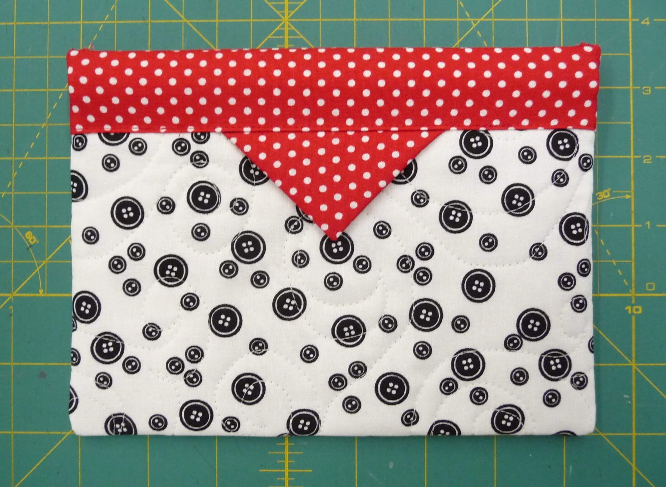
I love to make these little bags from the quilted fabric left over from making my “Cutting Mat Tote Bags”
you can make them any size you want. The instructions that follow make a “snap bag” approx. 5 1/2″ x 7 1/2″ finished.
Snap Bag
To make your snap bag, you will need:
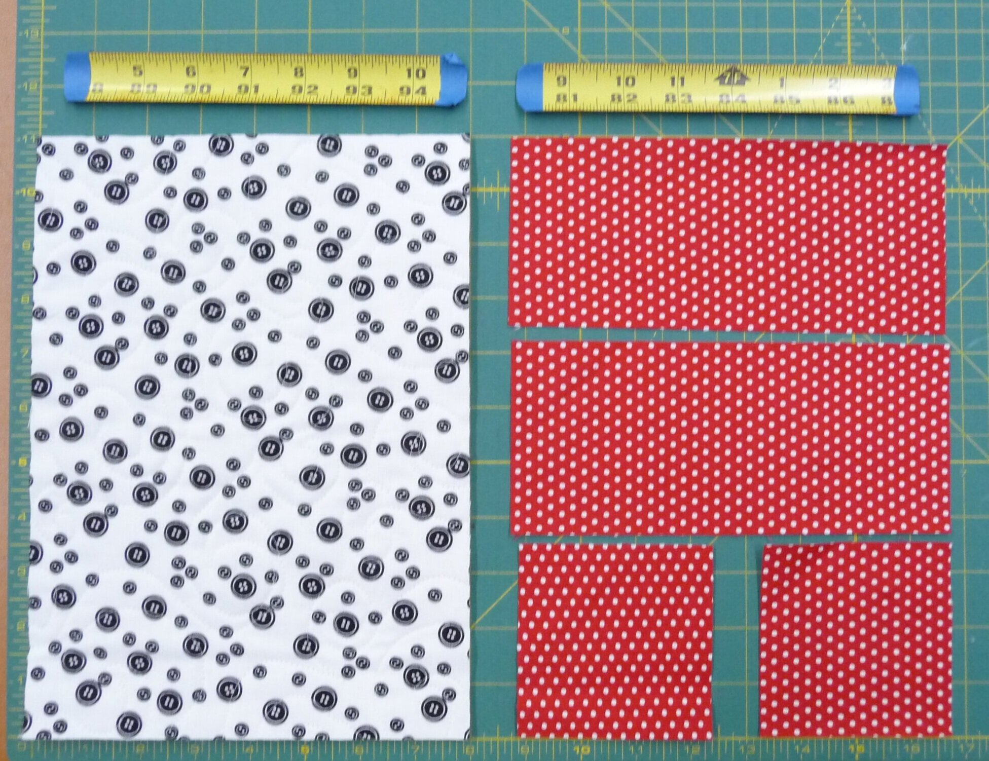
1) 1 piece of quilted fabric 8″ x 11″ (my quilted fabric is the same design on both sides)
2) 2 binding fabric pieces 3 1/2″ x 8″
3) 2 prairie point fabric pieces 3 1/2″ square
4) 2 pieces of 1″ wide metal tape measure 7 1/4″ long with the ends rounded and cut edges taped

Start by folding your binding pieces in half lengthwise and pressing.
Take your prairie point pieces and fold them in half lengthwise. Press.

With the raw edges facing up fold each edge in to the center to form a triangle.
With the “wrong” side of the 8″ x 11″ fabric facing you on the table align the raw edges of your folded binding strips up with the raw 8″ edges of your snap bag, pin in place and stitch with 1/4″ seam allowance. (not shown)

Press stitching to set then press binding up. Binding shown stitched and pressed.

Turn your quilted fabric over and wrap the binding around to the front pinning in place. The binding should come down over the front edge about 1 1/8″ find the center and tuck the prairie points under the binding edge about 1/4″ and pin. Top stitch close to the edge of the binding to stitch binding and prairie points. Reverse side should have a finished edge (not raw edge) of about 1/4” of binding (see finished inside photo below)

Photo above shows correct direction of curved side of tape measure, but it is easier to sew the 1st side and then insert as described below.
Fold your snap bag in 1/2 “right sides together” aligning the binding edges.(not shown) On one side only Stitch 1/4″ seam. Insert each of the metal tape measure pieces under the bindings sliding them all the way into the pocket. The rounded side of the tape measure needs to be on the outside (right side) of the snap bag, so working from the the inside (wrong side) slide it in so the inside curve faces you and the outside curve faces the front. Make sure its the same for both sides of the snap bag.
Stitch the other side closed using 1/4′ seam allowance. Finish by zig zag stitching the raw edges.
Turn right side out and carefully poke out the corners to make nice and flat and square.
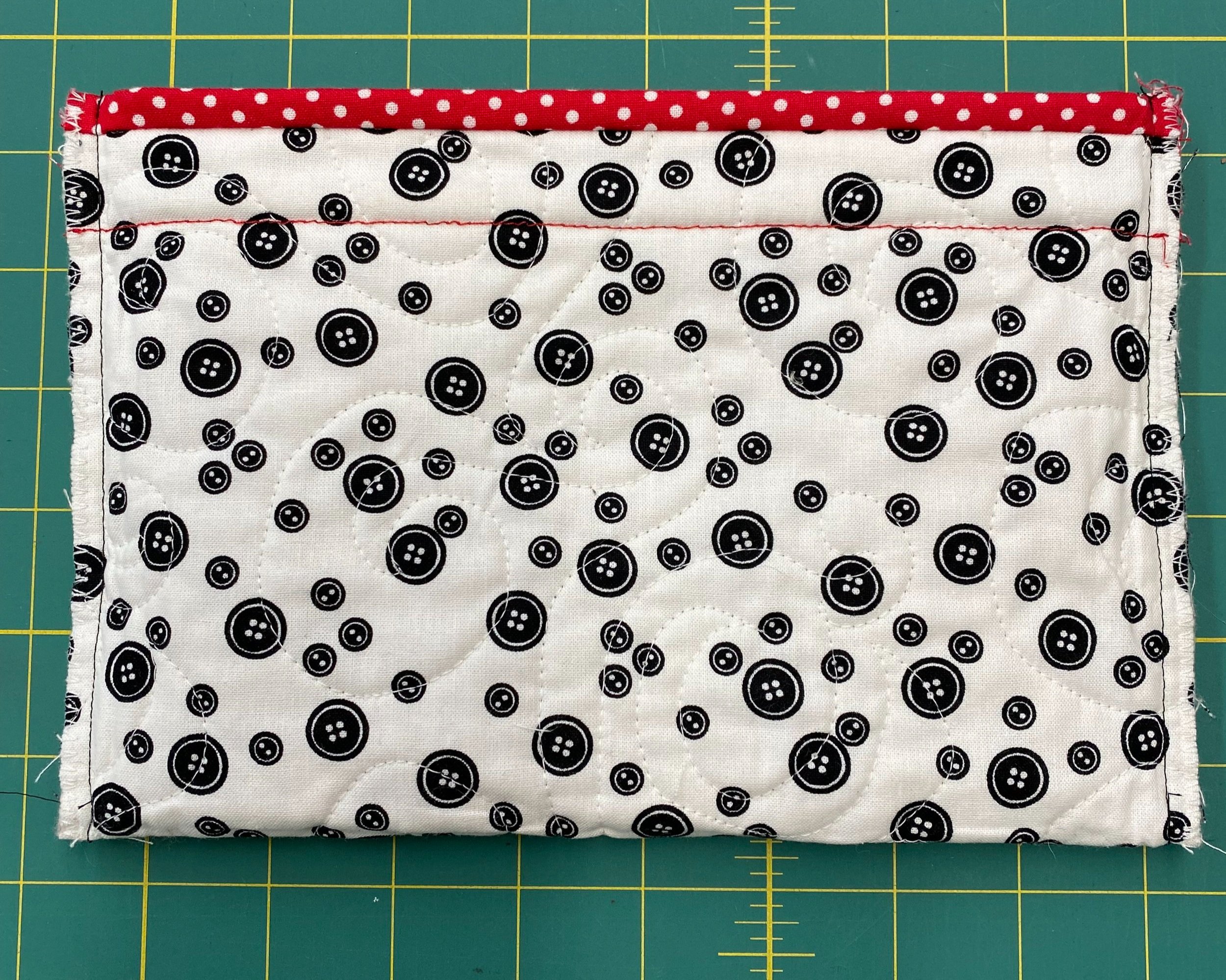
Photo of inside of bag, straight stitched sides with edges zig zag finished. Ready to turn right side out. Red stitch line shows the topstitching of the front binding edge approx. 1 1/8” down from the top edge.
These little bags are great on the go and make terrific gifts. I have one I use as my binding tote with scissors needles and binding clips. They make great make-up bags and travel bags. I’ve make them in the size of eyeglass cases and have one I use as a pencil case. You really can’t have too many. Enjoy!
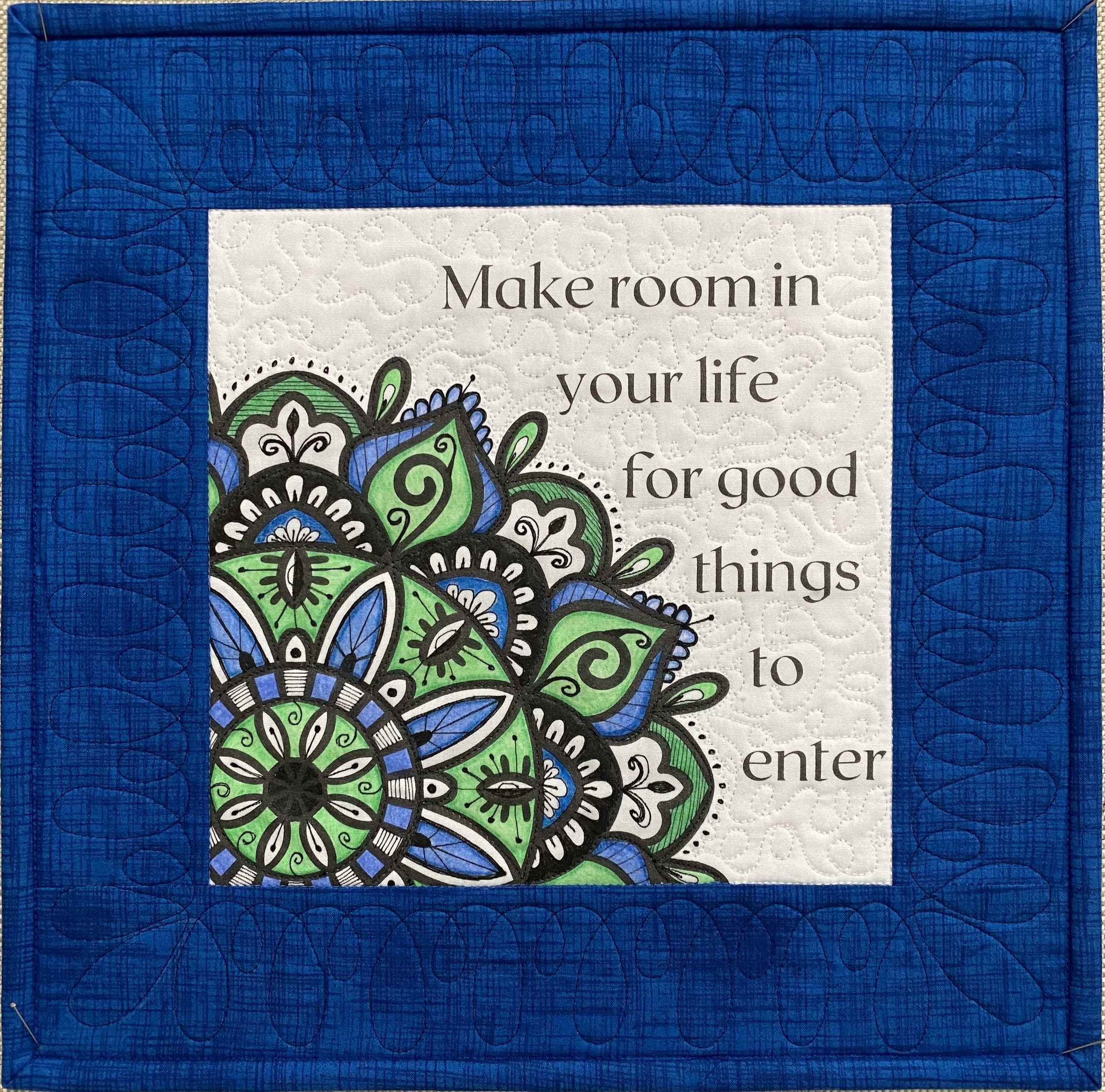
Make room in your life for good things to enter
This months mini quilt is my “prompt” for 2023. As my husband and I move forward with our intention of relocating to Portugal in 2024 we will be downsizing to live a bigger life. Making room will be our mantra in the coming months as we empty our house of belongings, of lots of “things” that no longer serve us and that we would not even consider taking with us. After nearly 22 years in this house there has been a lot of accumulation! Our cabinets, garage and my studio are all packed solid with “stuff”.
My studio also contains a lot of unfinished projects. 2 years of my online Rettabug’s UFO Club have helped me to complete a big chunk of those projects. This year as I make my list of 9 projects to finish by the end of November, I’ll be looking at my remaining projects (still quite a few more than 9) and asking the same questions I’m asking about all my possessions, “Do I LOVE this?, Does it spark joy?, Would I take it with me when we move?” only projects that pass this 3 question test are going on my UFO Club list. We draw the 1st number for this years round of UFO Club on March 1, so there is still time to join us if you have projects you want to finish with a “support group” you can find the details here. Rettabug's UFO Club
I created this mandala design with room to add not only color but some of your own personal expression within the mandala itself. To test out my ideas for adding additional “flair” I printed the design on paper, and looked at mandala designs on Pinterest to get ideas for the details - the swirls, lines and dots that I added inside and outside of the original image. I tried a few things I didn’t like (that’s why working ideas out on paper is a good idea!) but I did achieve a design I love and feel adds to the overall look. I then added colored pencil to my paper drawing.
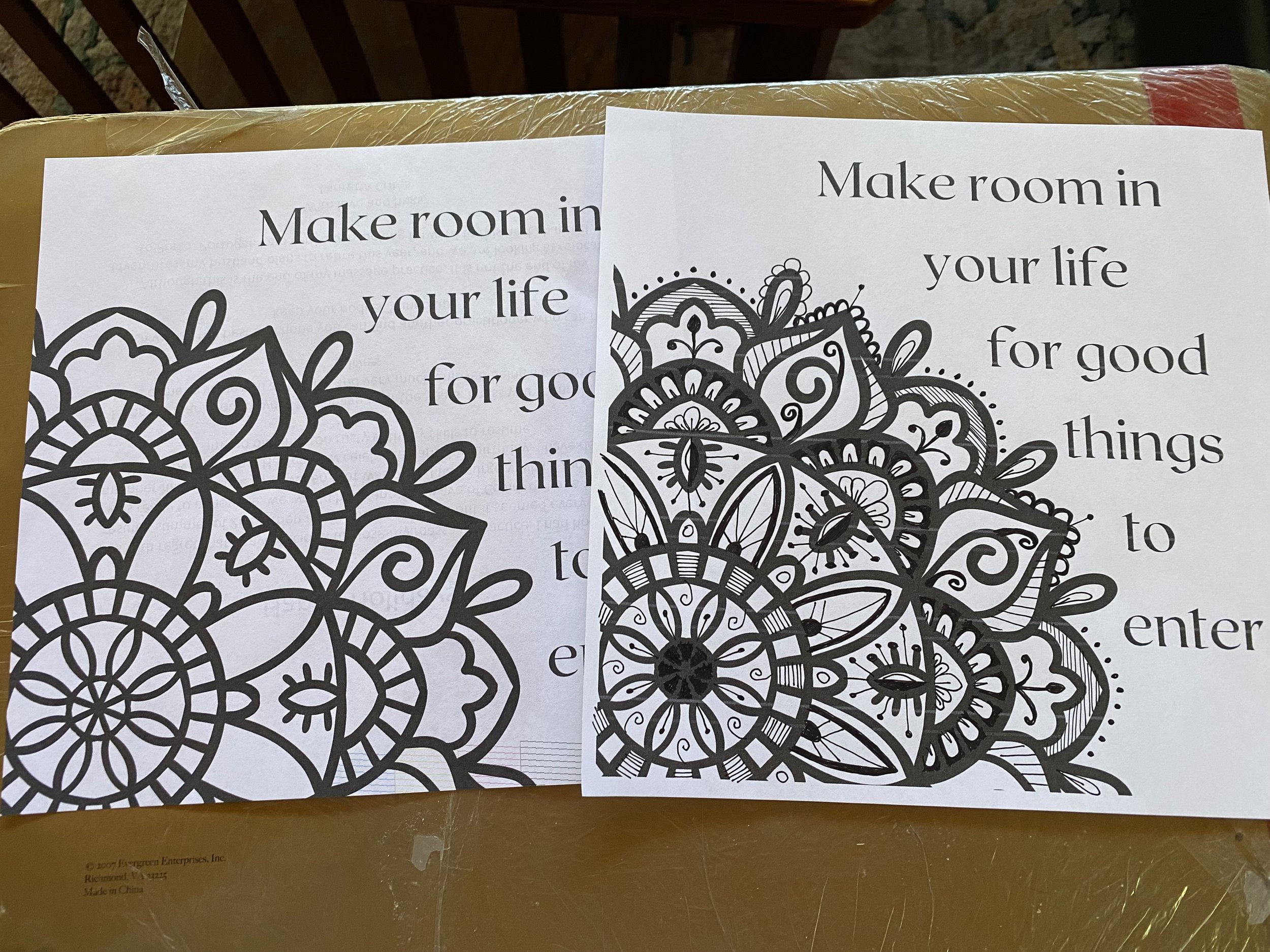
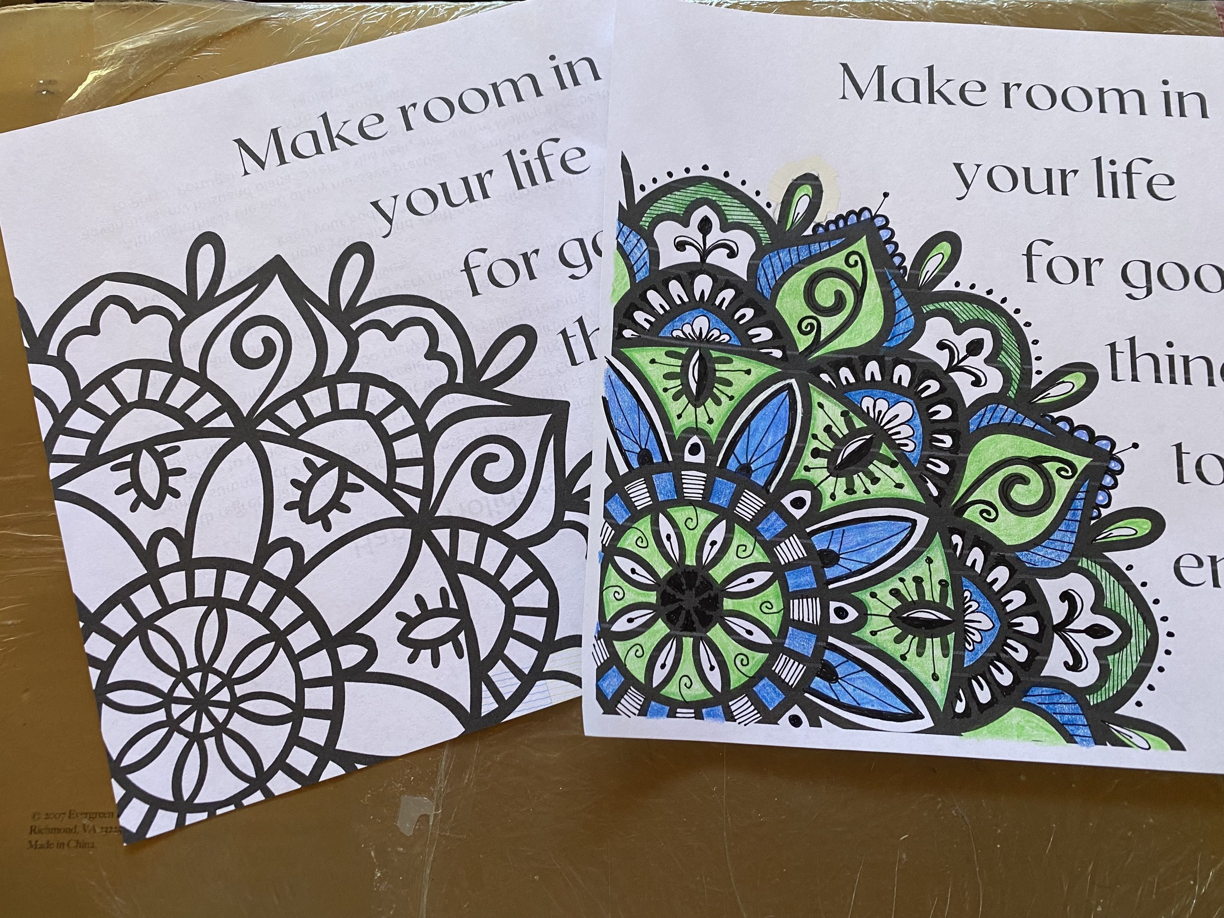
I almost always color a paper version before the fabric one, for the same reason I tested the ink designs on paper, paper is much cheaper than fabric. I’d much rather make my mistakes on paper! I printed the design onto the inkjet printer sheet, then I used a micron pen to draw the details I had decided on, moving quickly to avoid bleeding. When the ink designs were complete I covered the image with a piece of parchment paper, my preferred “press cloth” and pressed the ink to set it. I didn’t want to take a chance the ink would smear when I colored over it.
This is the way I typically audition mini quilt border fabrics, I fold them into a roughly 12” x 12” square and place the trimmed mini quilt design on top. For this mini I auditioned 3 different fabrics for the border and I had a hard time choosing between the middle fabric and the one on the right.
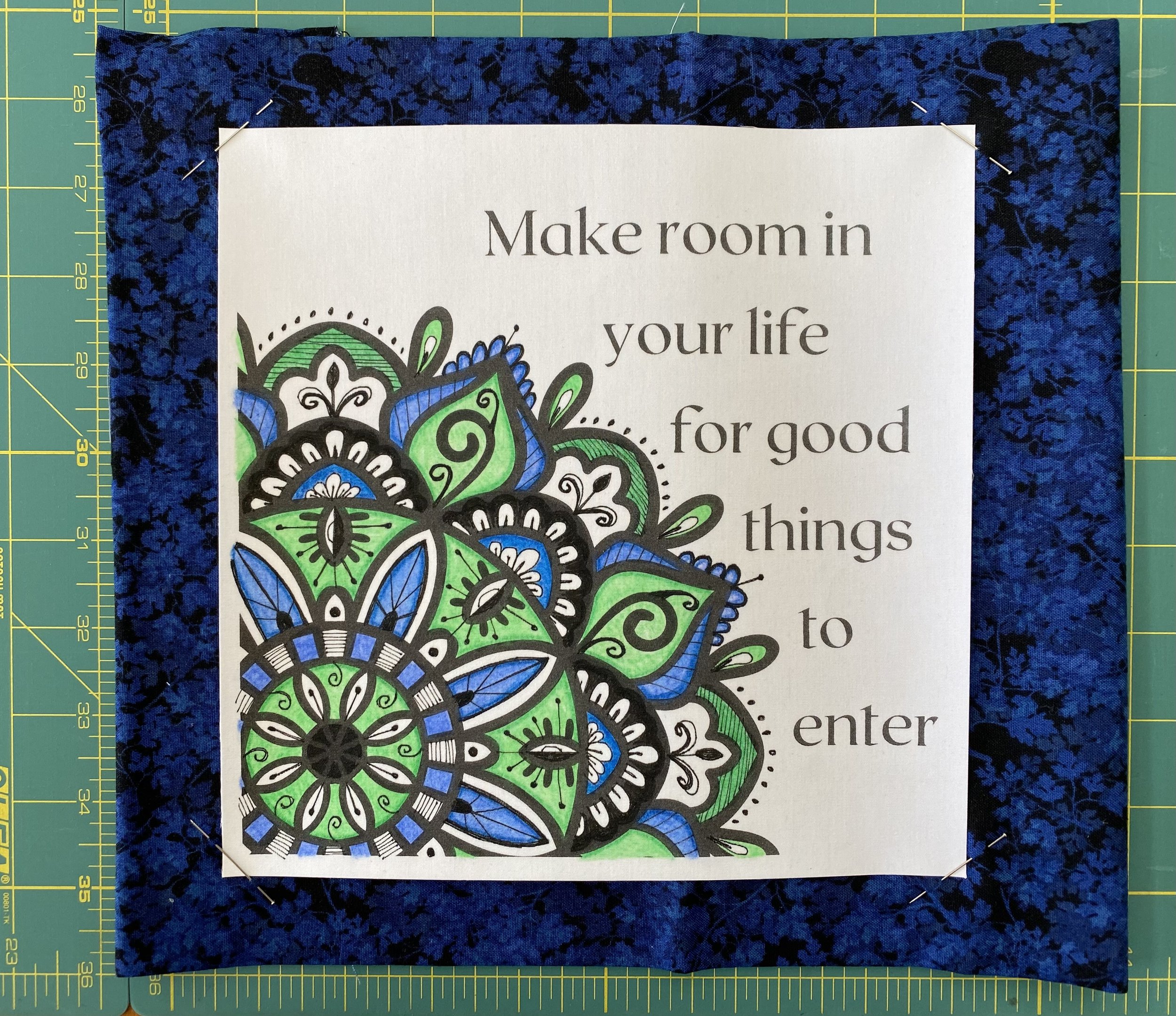
In the end I felt the fabric on the right, made the design “pop” just a bit more and that made the decision. All the ink and coloring was done on a Friday afternoon. Choosing the fabrics, adding the borders, layering, quilting and binding was done the following afternoon. I find it so satisfying to be able to complete a project, especially one that flows and comes together easily and well.
If you want to create space for new projects to come in or just make space in your sewing room with fewer boxes or bins of unfinished projects, please join us in UFO Club. It’s fun and there are prizes, but the true prize is the space you will create and the projects you will finish.
My mini quilt will be displayed where I can see it everyday to keep me moving toward my hearts goal, to make space in my life - and I look forward to the good to come.
Portugal, the beginning....
To begin at the beginning. Sometime in June… or was it May? My husband mentioned that a coworker of his and their wife, were traveling to Portugal to scope it out with the intention of moving there in a few years. That caught my attention in a BIG way. First, I know the couple and consider them very savvy, if they think it’s a good place to retire, then it’s a good place to retire. Second, I LOVE Europe and it has been a dream of mine to live there since my 1st visit to Switzerland in my early 20’s. Digging a little deeper into Portugal we see it is a fascinating place with a great deal of history and beauty, and a population that is aging out. Politically stable, extremely safe with a highly rated health care system all very important to, well I’ll admit it, seniors like me.
My husband is getting ready to retire in the next year and has been mumbling about moving out of California, as much as we love it, but to where? So, in July we arranged a 3 week visit to scout out various cities with the idea in mind, would we want to live here?
The short answer is YES, not completely decided yet, but pretty firmly in the camp of yes, we will be moving, ideally to Porto, Portugal. Come along on our adventure.
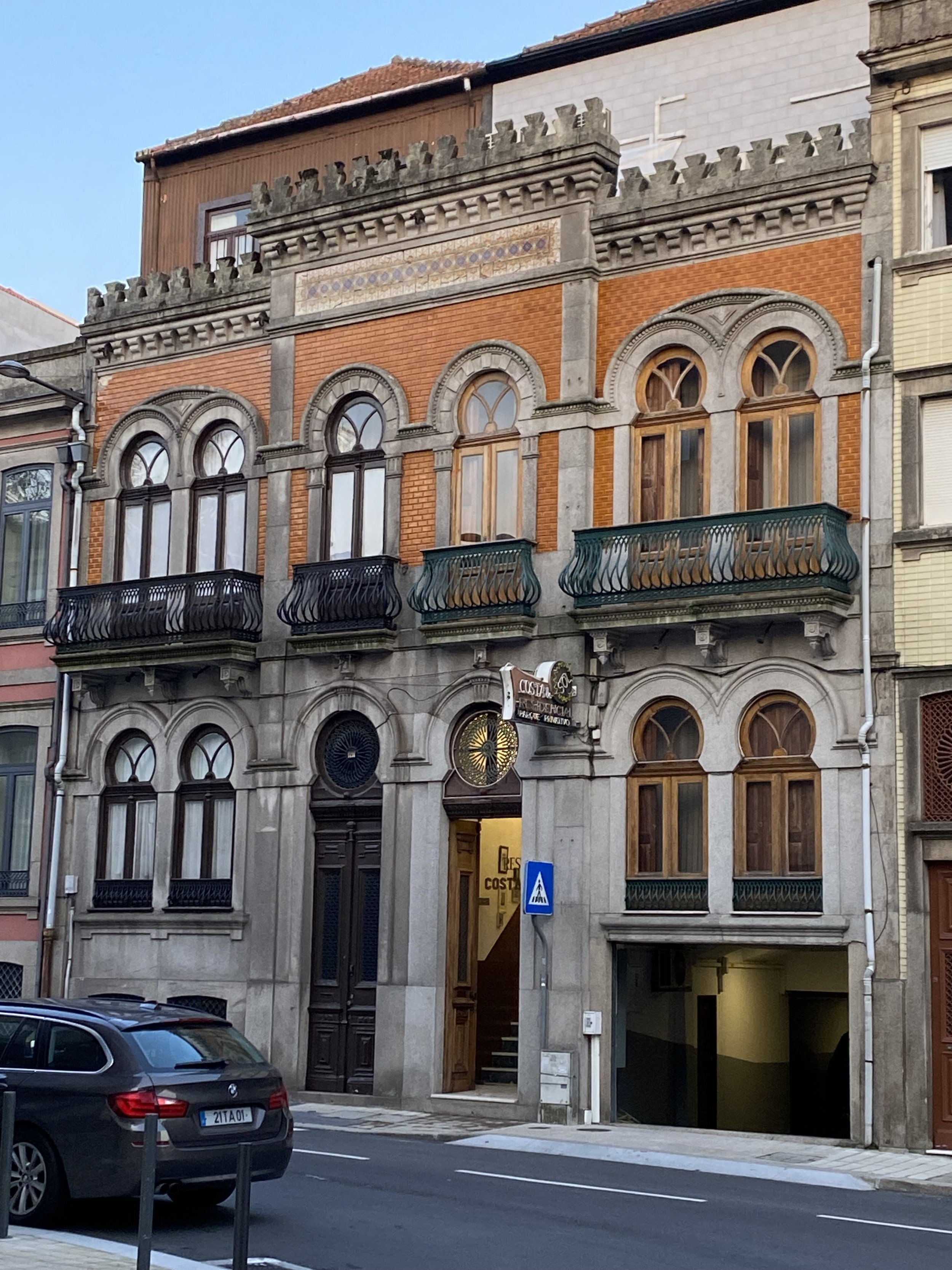
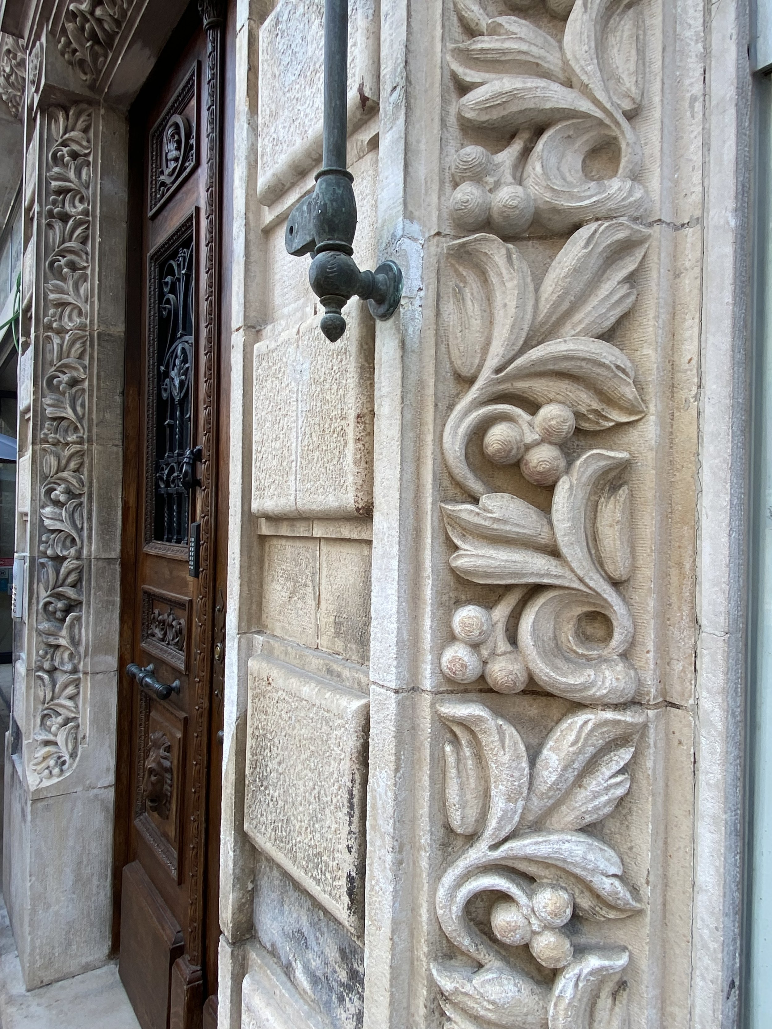
Porto in particular is known for its Art Nouveau architecture, much of the city being built during the rise of its famous beverage, Port wine. There is a mixture of older and newer buildings as well giving it that delightful European flavor.
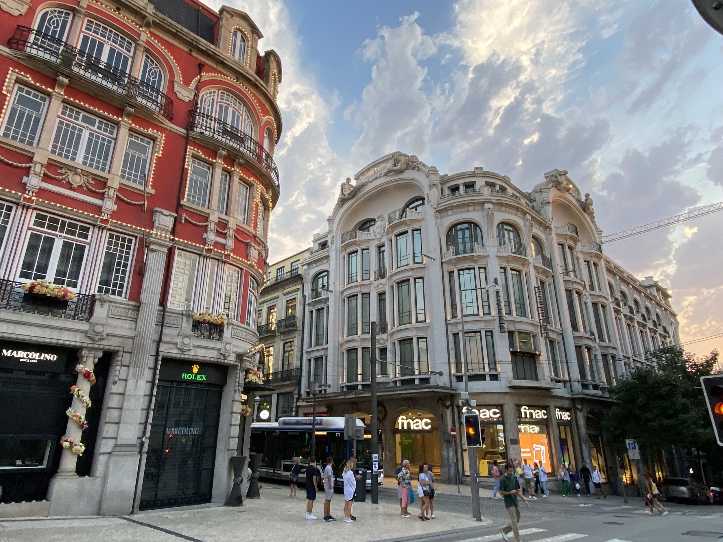
We are all wired differently, I’m the kind of person who loves art, and architecture, given the choice between visiting Manhattan or Juneau, I’ll take Manhattan. I am far more interested in the man-made, over the natural. I think also, since Los Angeles is as I like to say, “about 15 minutes old”, and most of it built up in the last 60 years, I am fascinated by places where buildings constructed 300 years ago, and more are still in use. I love the slower pace in Portugal, where people take the time to really enjoy life. Where not everything is about work, job prestige, what kind of car you drive. Or for that matter needing to drive at all. Where I live, you need a car to get anywhere. I’m looking forward to living in a walkable city. Porto is a big little city, more like Pasadena in feel than Downtown LA, with trolleys running up and down the narrow streets and situated on a river. This California girl never likes to get too far from water.


The buildings with their tile facades are like jewel boxes, each more beautiful than the last and their patterns and designs sends my quilters heart aflutter. I see endless possibilities in them for both traditional and art quilts. There is one drawback I did find, quilting itself has not been a Portuguese art form. I did find a couple shops on the internet, luckily one charming one in Porto itself, but the vast selection of fabrics available to me where I live, well that is not the case there. As the shop owner said, quilting is just getting started there. Which is an opportunity to get in and help them expand quilting.
So much of what I saw in Portugal really set my quilters brain on FIRE! Everything from the designs in the cobblestone walkways to the tiles on the walls screamed quilts to me.
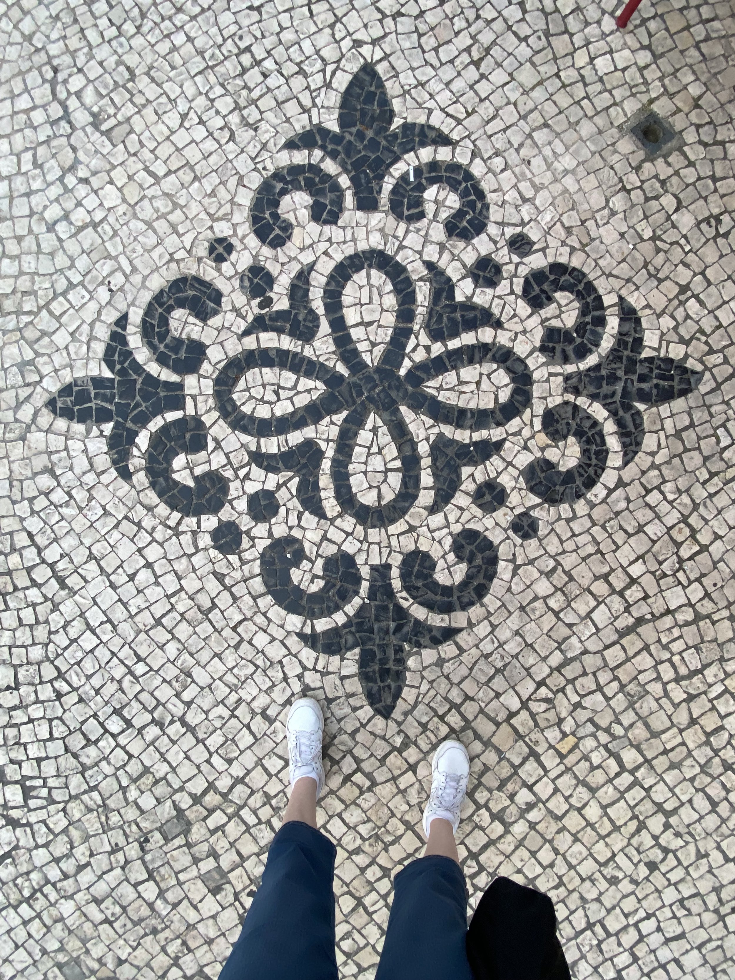

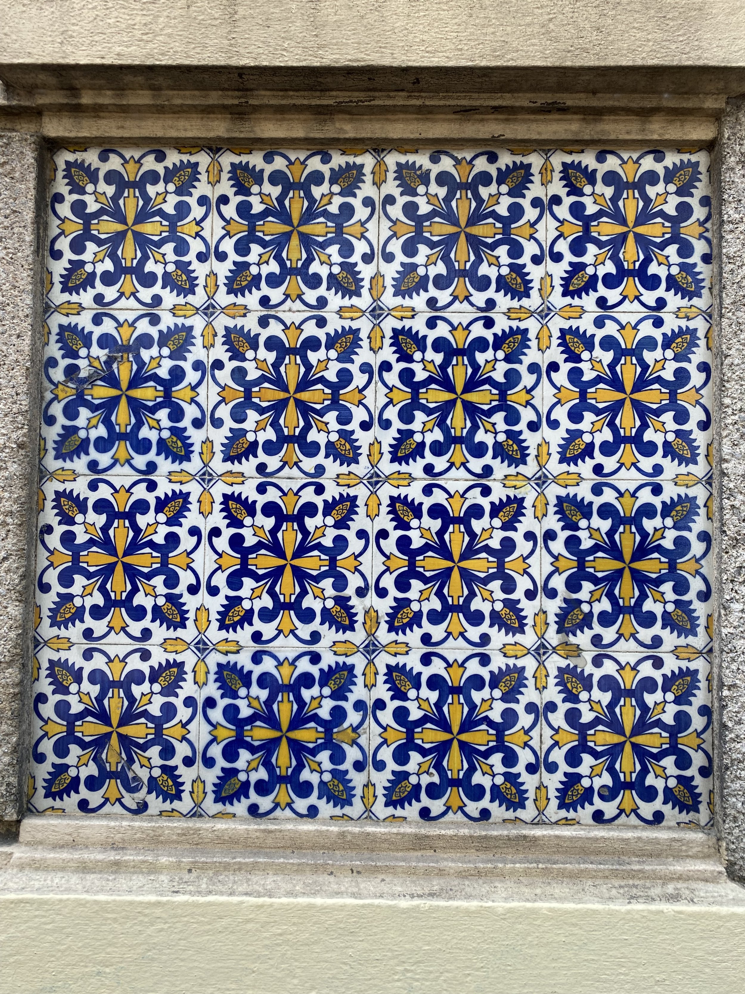
Some of the designs I saw at the tile museum which were many hundreds of years old ARE traditional quilt designs used today and a few that aren’t could or should be!
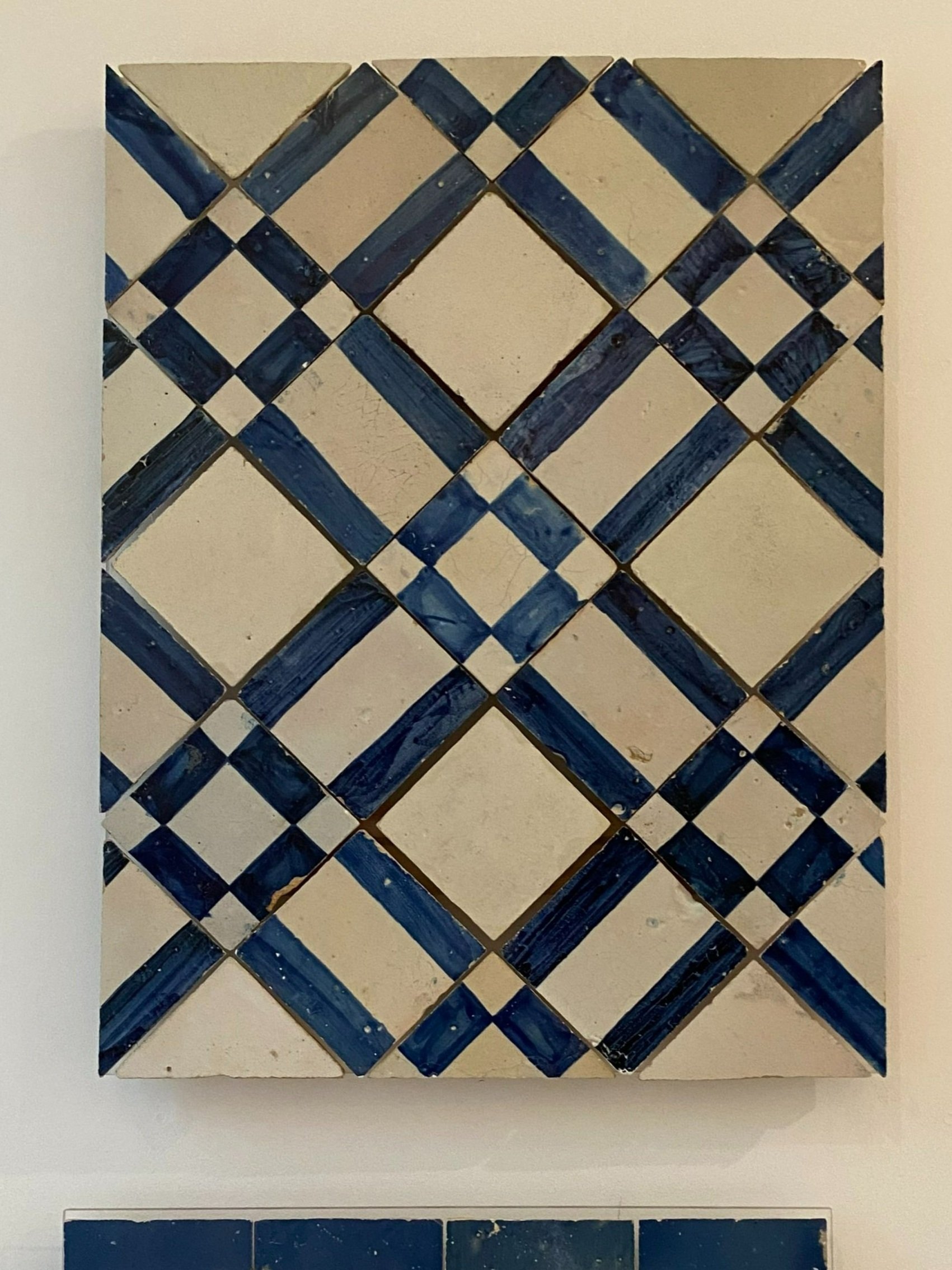
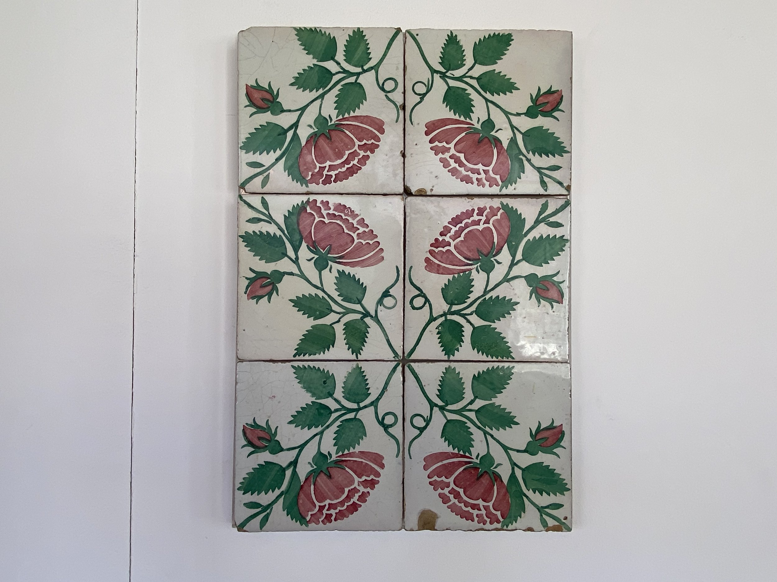
You know I am an art quilter at heart, but some of these have me excited about making bed quilts and throws again! I’m a sucker for chain designs but photos 4 and 5 have me intrigued 4 would be simple enough to do, 5 a bit more challenging but worth it!!!
I am preparing a video tour of the tile museum in Lisbon, Portugal. Make sure to subscribe to my YouTube cannel so you don’t miss any of my tutorials and tours. lauretta crites - YouTube

Painted Tyvek Lecture, Quilts Inc. Virtual Quilt Festival
Virtual quilt festival
I will be presenting at Virtual Quilt Festival this week, for the 1st time!!! I’m very excited to get to share everything I love about this fabulous material, especially since I have been stuck in the house for nearly 2 weeks with covid - feeling better - no symptoms other than the one day feel good next day on couch again back and forth but… still double lines on the test stick! Bummer. At least virtually I can’t spread the virus.
I was EXTREMELY disappointed that I had to cancel my trip to Nevada to teach at Quilt Show Reno. The kits were cut, and nearly all my prep was finished on my way to leaving early Tuesday AM. But… on Saturday, while on an outing with the family, I started feeling far more tired than the activities warranted, took the test just to make sure… and DANG!!
If you would like to check out my lecture “Using Painted Tyvek in Art Quilts” I will be presenting live Thursday June 16 3:30 CST. For registration start here: Virtual Quilt Festival - Quilts my presentation will be recorded, and you will have access to the recording for 2 weeks. I hope to see you at Virtual Quilt Festival!
I’m pretty sure I picked the virus up at the Eagles, Hotel California concert in Las Vegas Memorial Day weekend, despite being fully vaccinated with 2 boosters!!! So, keep sanitizing and stay safe, learn from my mistake, it’s still not time to let your guard down!

Remembering to smell the flowers
Just as most of my pattern designs were created because of my personal need for a purse, bedspread, or better way to carry a cutting mat, my mini quilts are frequently the result of what I need to remember or to practice.
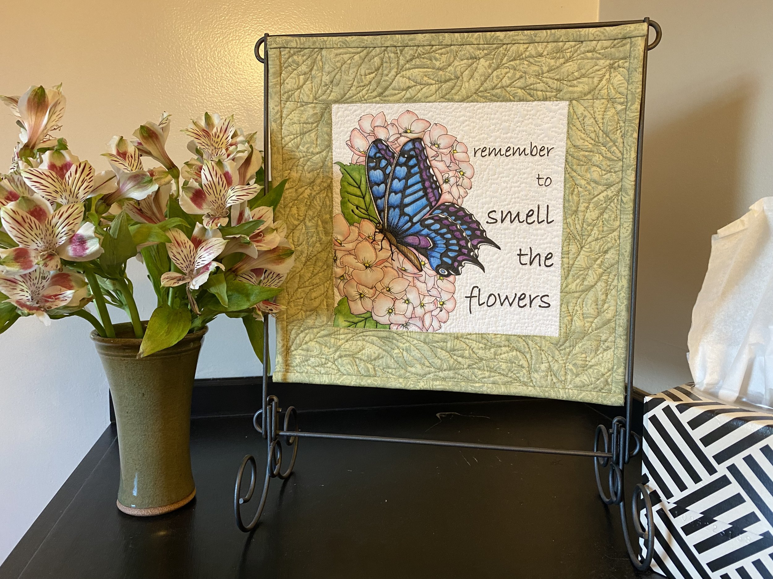
With the roller coaster ride that the last 2 years have been, and the uncertainty of the world around us it becomes all too easy to get caught up in the news and the events and forget to really take in the beauty, the love and the blessings in our everyday lives. It becomes easier and easier to focus on “what is” the rising gas prices, the war in Ukraine, the supply chain challenges (no McMuffins at McDonalds?!?) Remember to smell the flowers is a message to myself to remember to hone in on how I want to feel, and of how important it is to focus on what is good and right in life. To remember that, even when it seems there is turmoil all around us, we have the power to be joyful.
The ROAD Report
I will admit up front, I debated heavily whether to attend the show this year or not. Los Angeles County was still having high rates of infection from omicron and I really didn’t need anything having attended Quilt Show Reno in June and Houston Festival in October. Evidently, I wasn’t the only one who decided to stay home, and after getting attendance reports from my former A Couple of Old Broads business partner, Cindy, who was there with the booth, I decided to brave it.
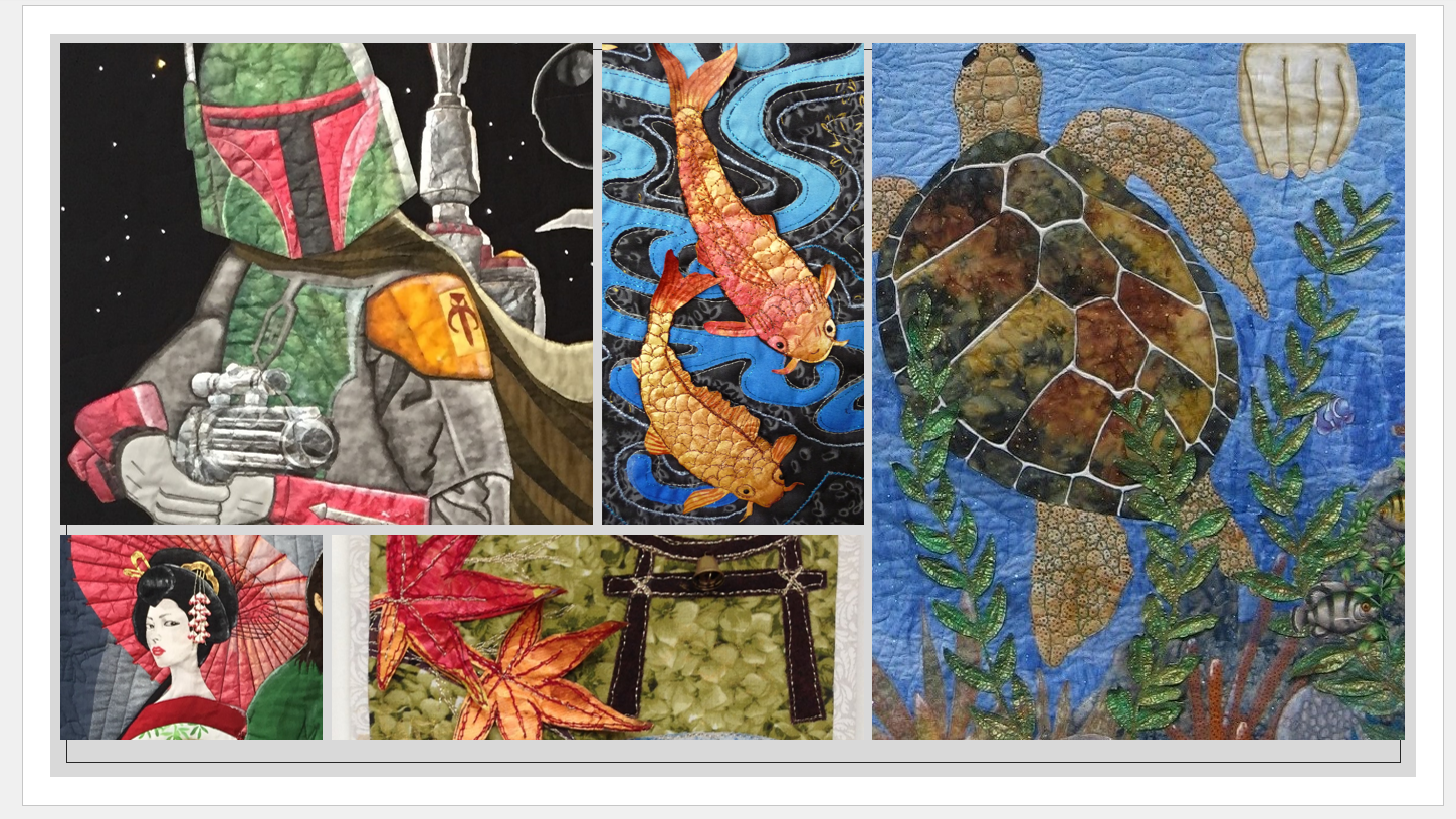
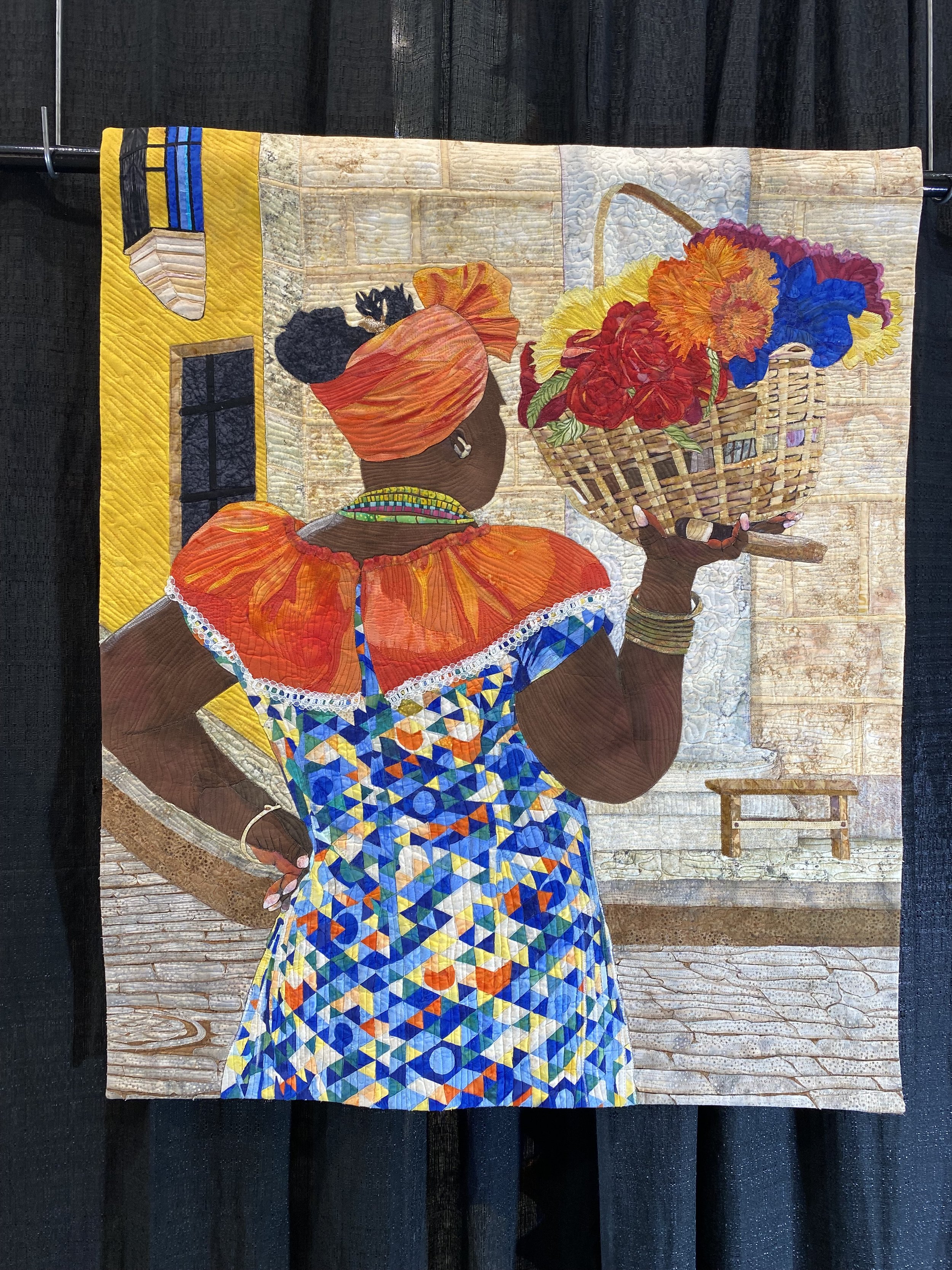
Don’t expect a balanced gallery of quilts - I’m an art quilter and I mostly photograph what I like! That being said I hope you enjoy these photos of quilts that caught my eye at the Road to California Quilt show this year.


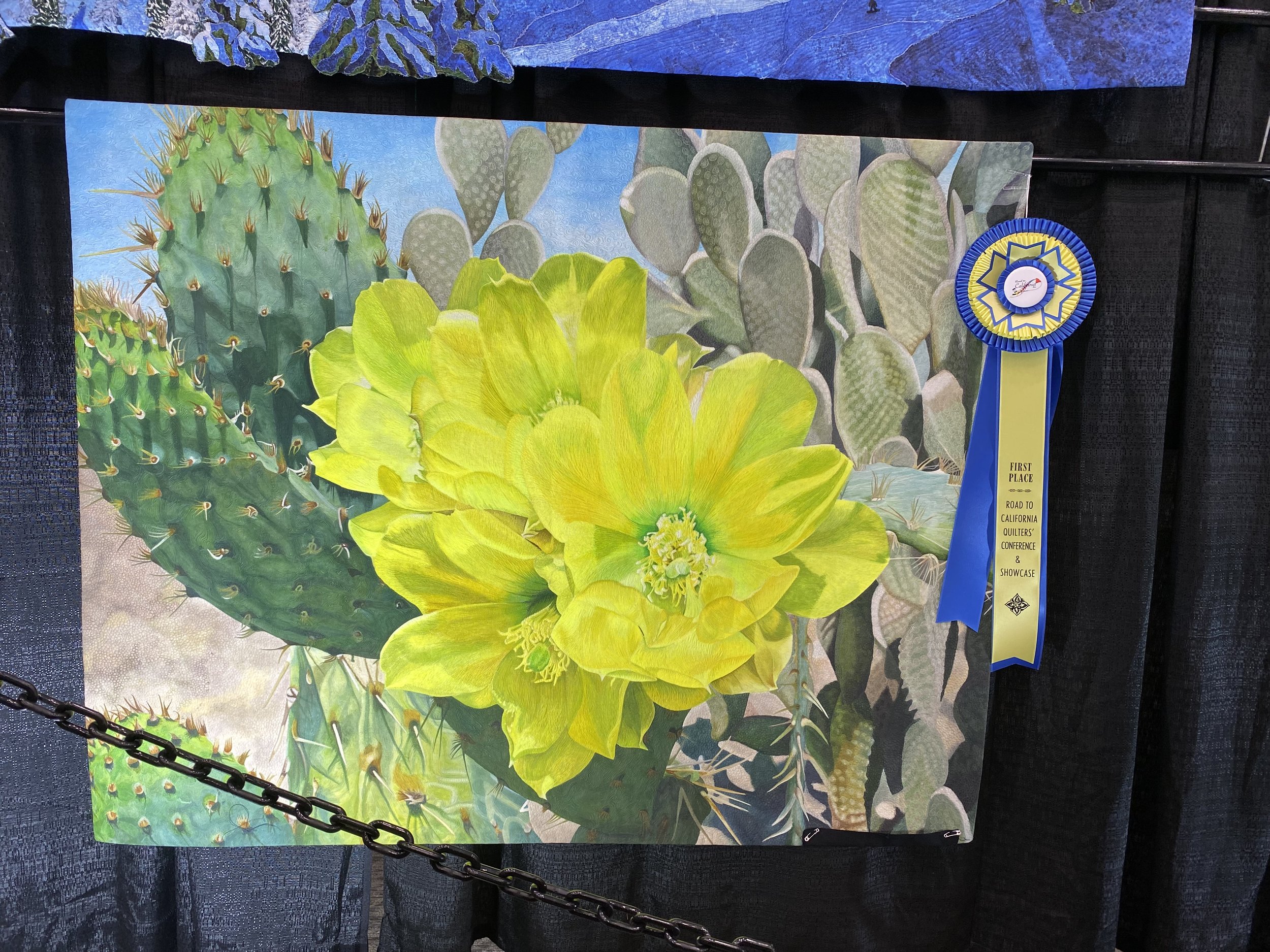
Top row: Not Today - Kestrel Michaud, W. Melbourne, FL; In Perfect Harmony - Sandra Mollon, Valley Springs, CA; Woodland Wilds - Ann Horton, Redwood Valley, CA.
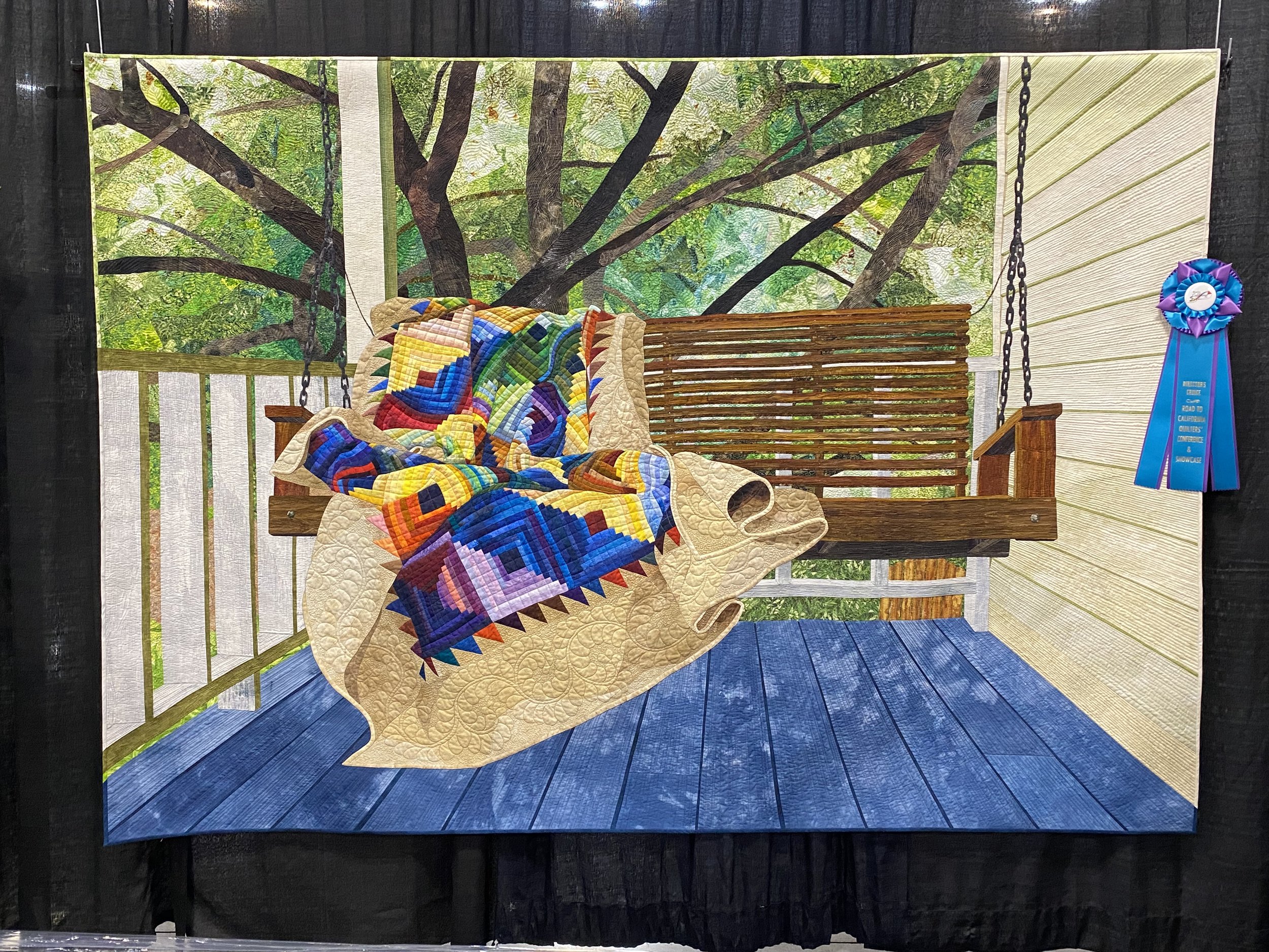
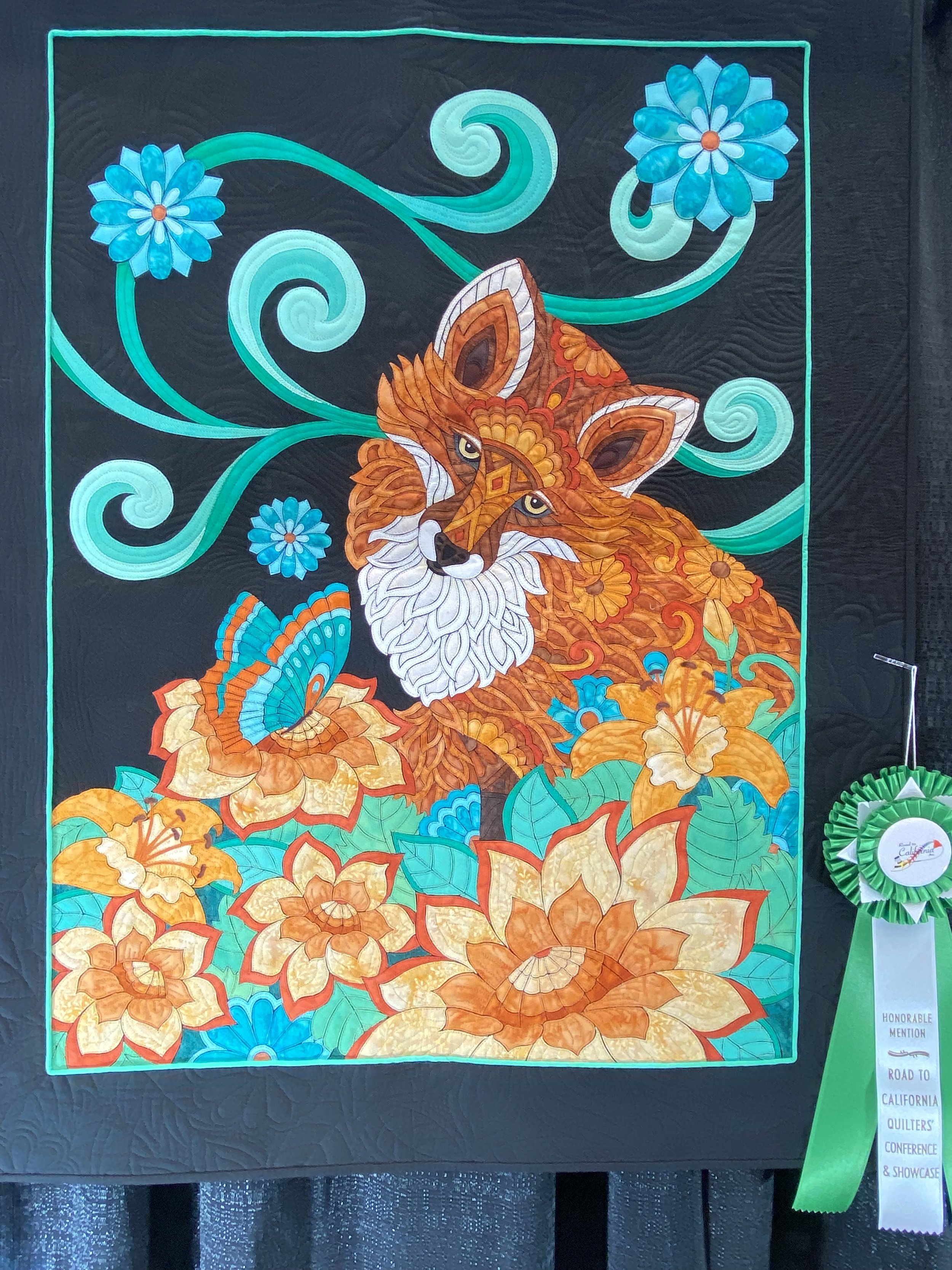
Second row: Desert in Spring - Andrea Brokenshire, Round Rock, TX; The Memories That Remain - Lynn Czaban, Eugene, OR; Welcome Home - David Taylor, Fort Collins, CO.
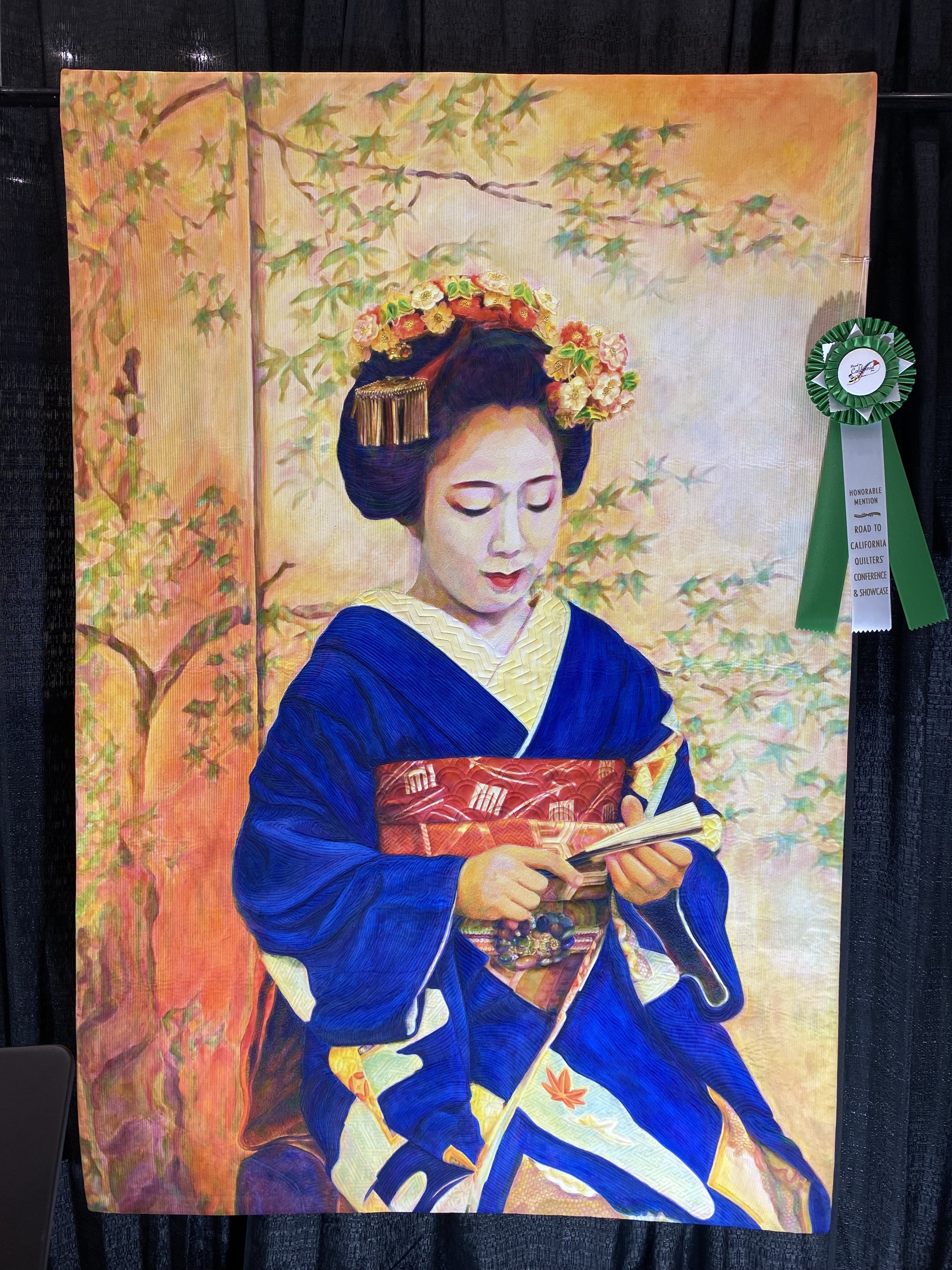
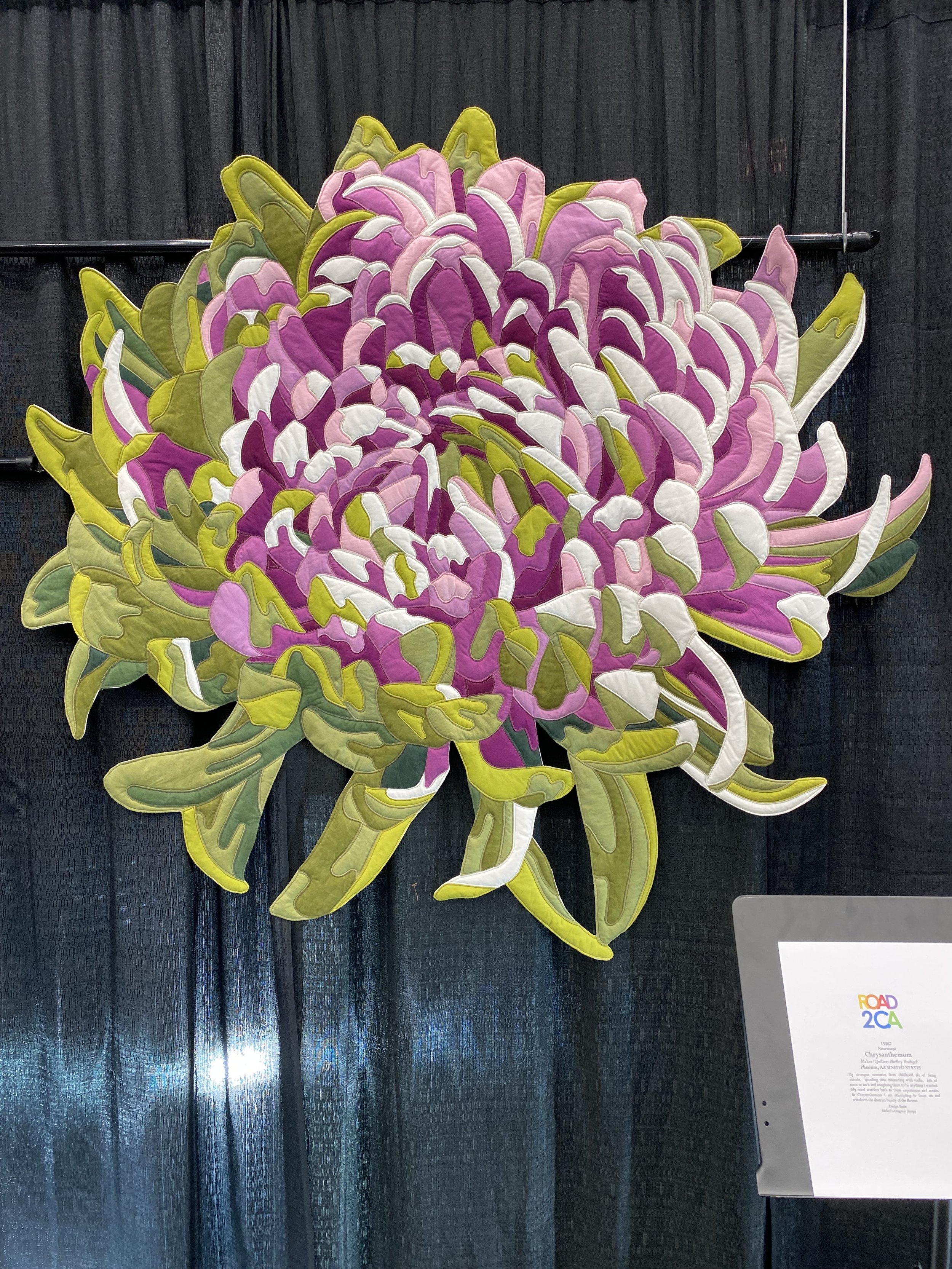
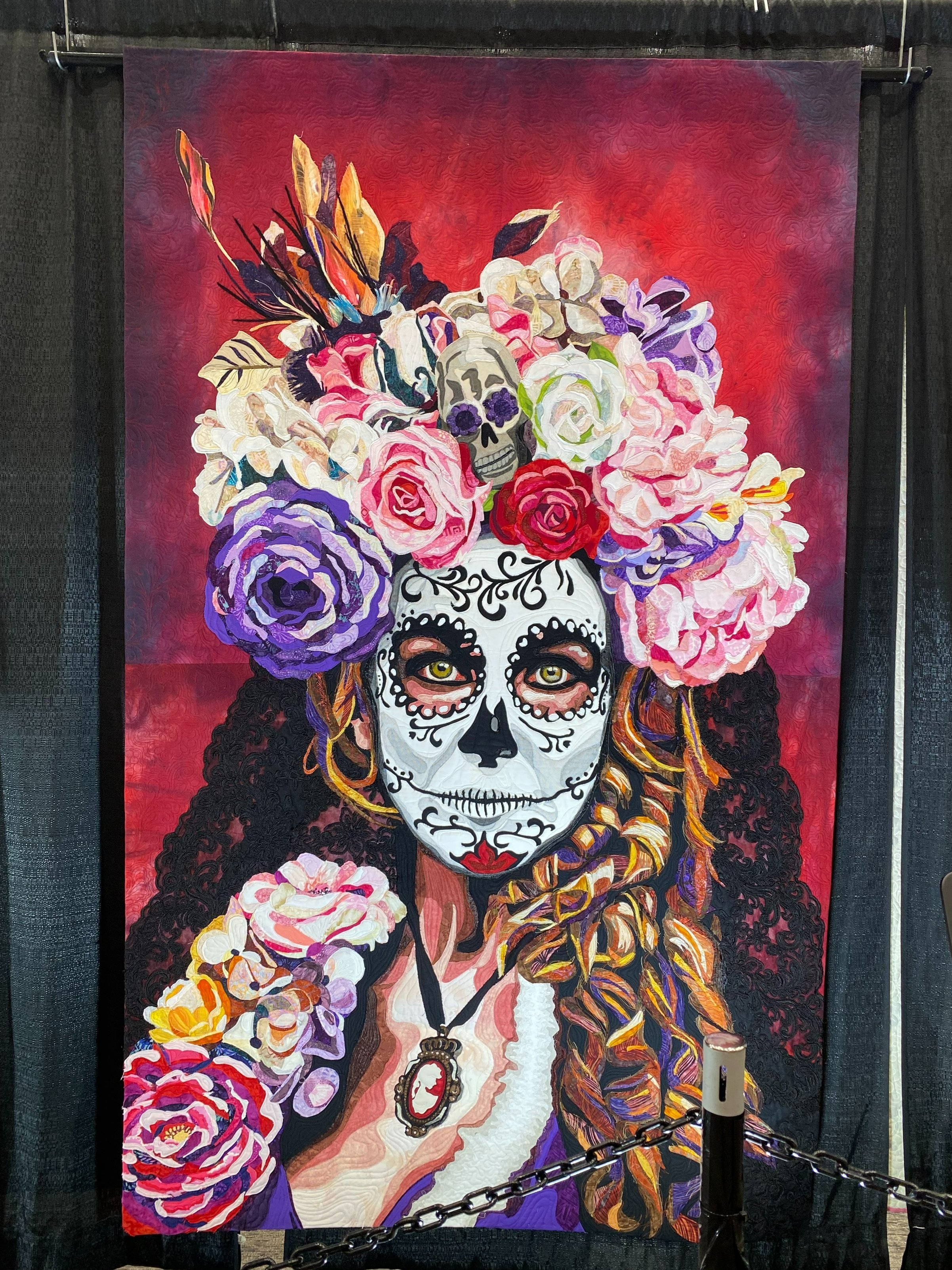
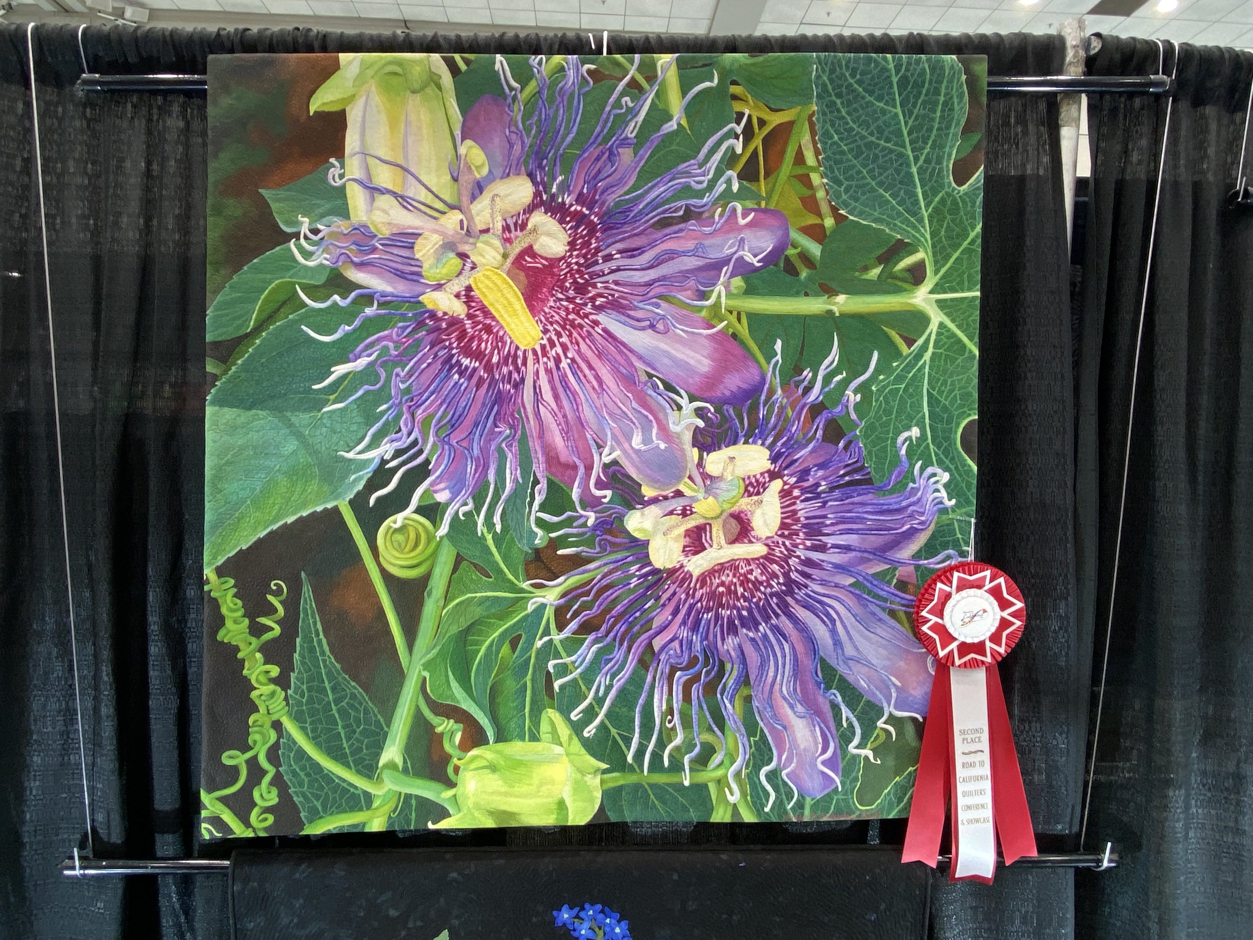
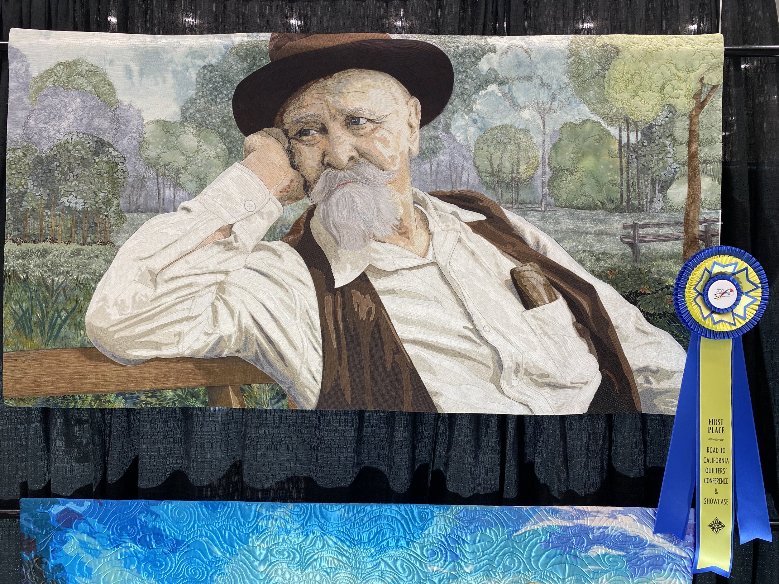
Top Row: Memories of a Maiko - Melissa Sobotka, Richardson, TX; Chrysanthemum - Shelley Rothgeb, Phoenix, AZ; La Catrina - Cindy Stohn, Chandler, AZ; Passiflora - Find Joy, Live your Passion - Andrea Brokenshire, Round Rock, TX
Bottom row: Do You See What I See - Lise Belanger, Trois-Pistoles, QC Canada; Sassy Lady - Judy Crotts, Long Beach, CA; Red Bird - Karen Kay Buckley, Carlisle, PA with Judi Madsen; Hang in There, Sally Freeberg
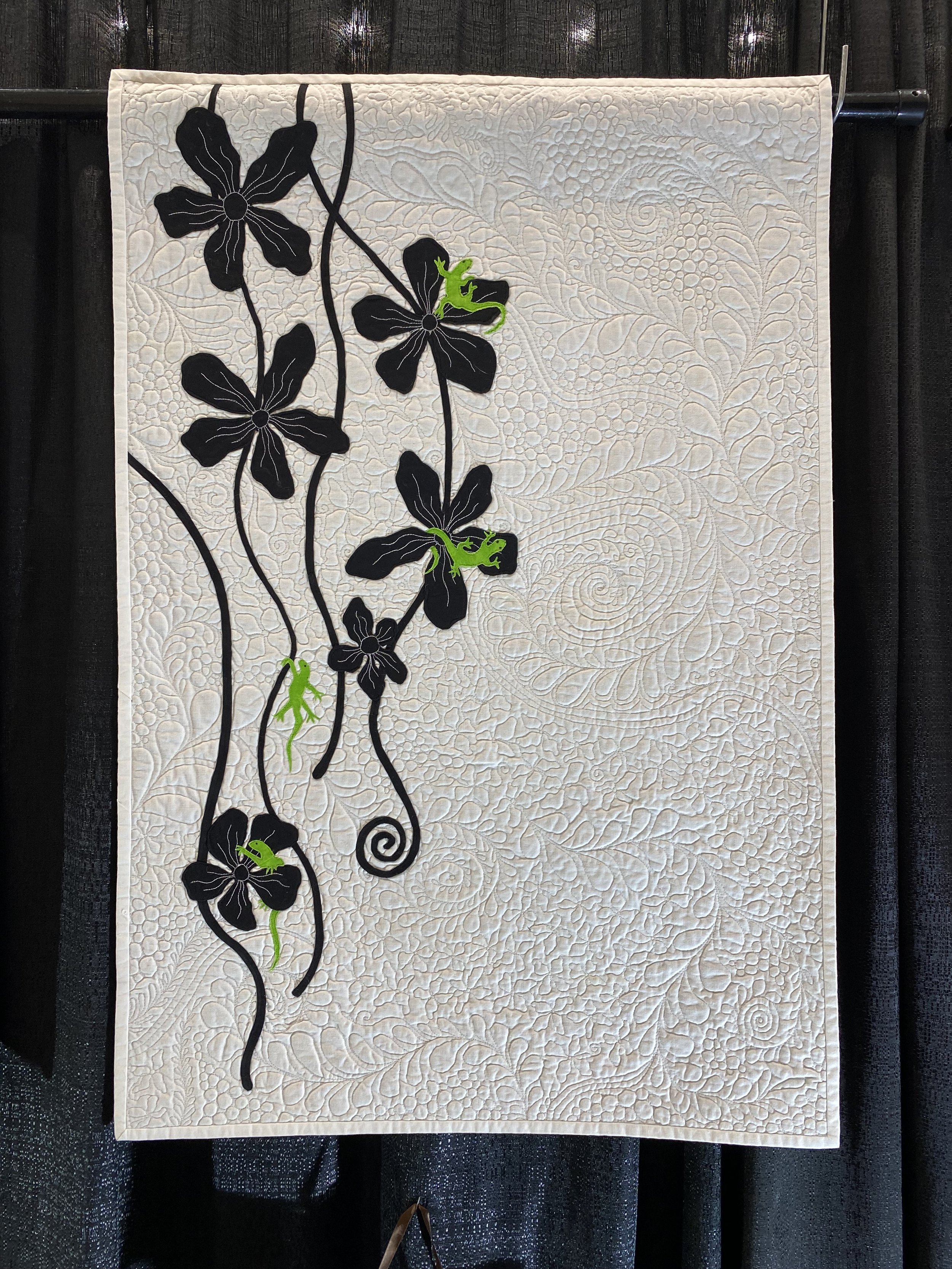
Chrysanthemum caught my eye because of the irregular edge, the entire shape is finished! At first glance it may look like a flower on a black background, but the background you see in the photo is the convention center curtain. Do You See What I See appealed to me for its strong graphic style.
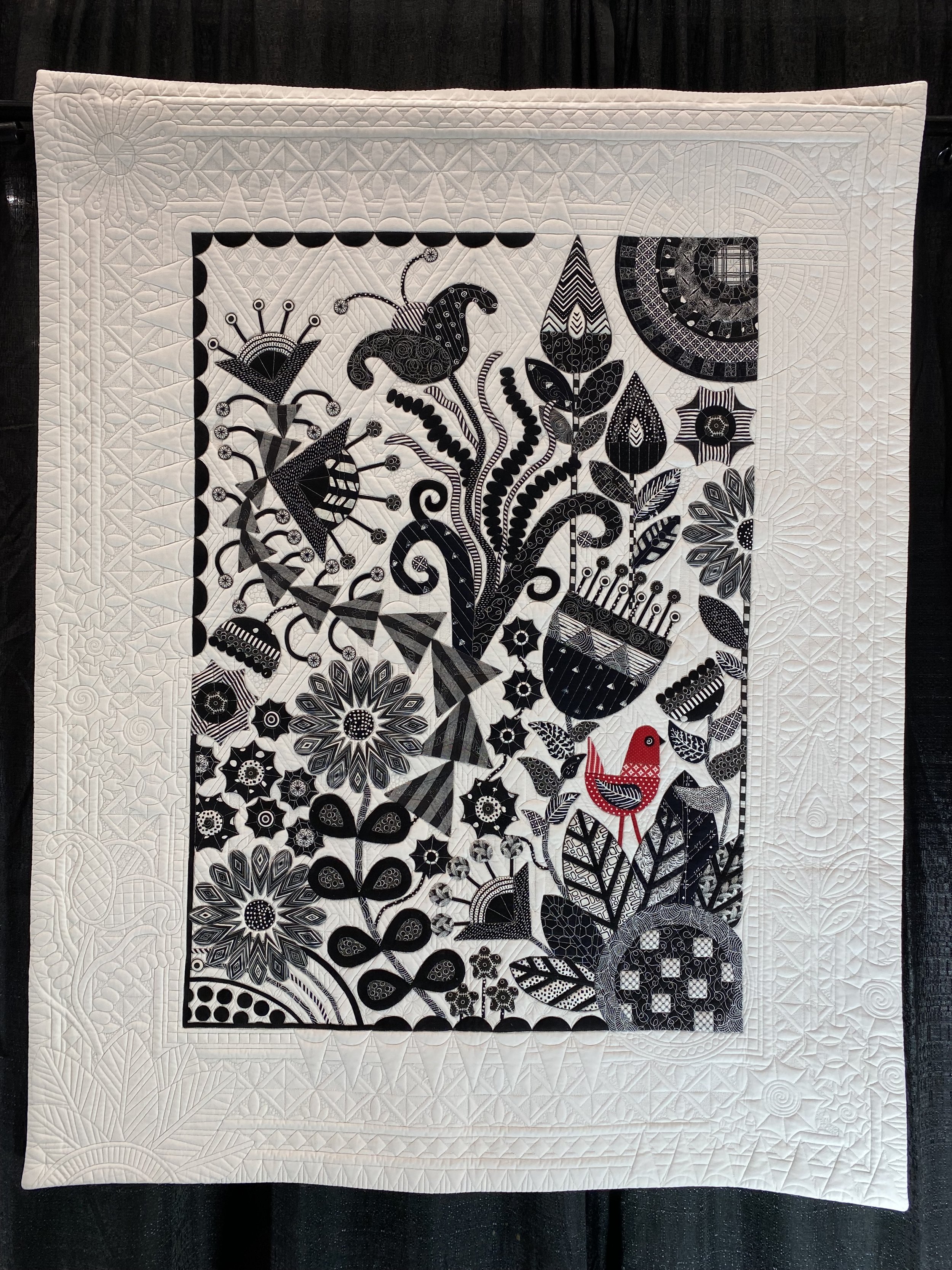
I am looking to up my game in terms of my quilting this year, so much of what I was drawn to was pictorial quilts that were well quilted. The 2 white/black quilts have lots of negative space making it easy to see the background quilting.
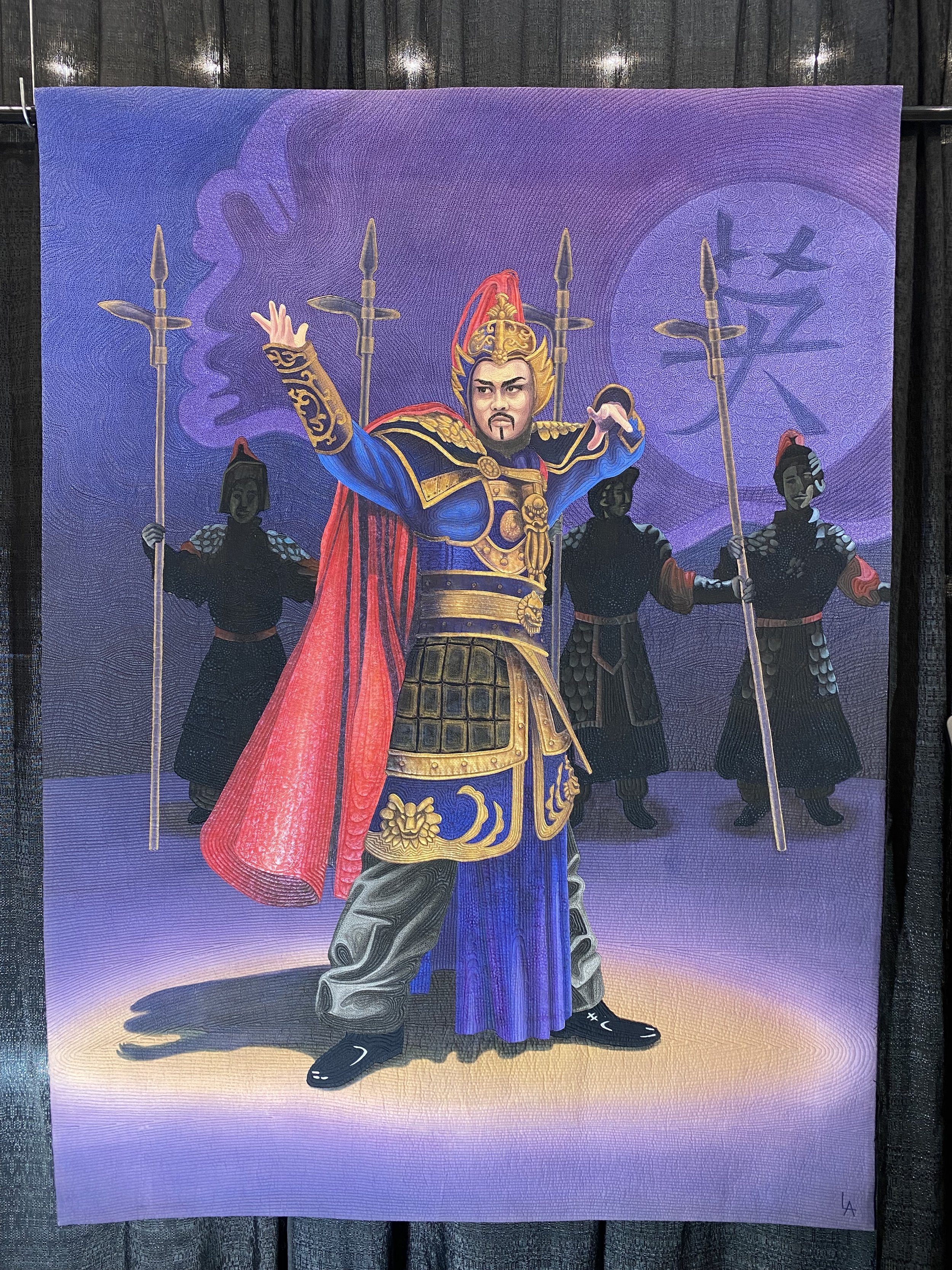
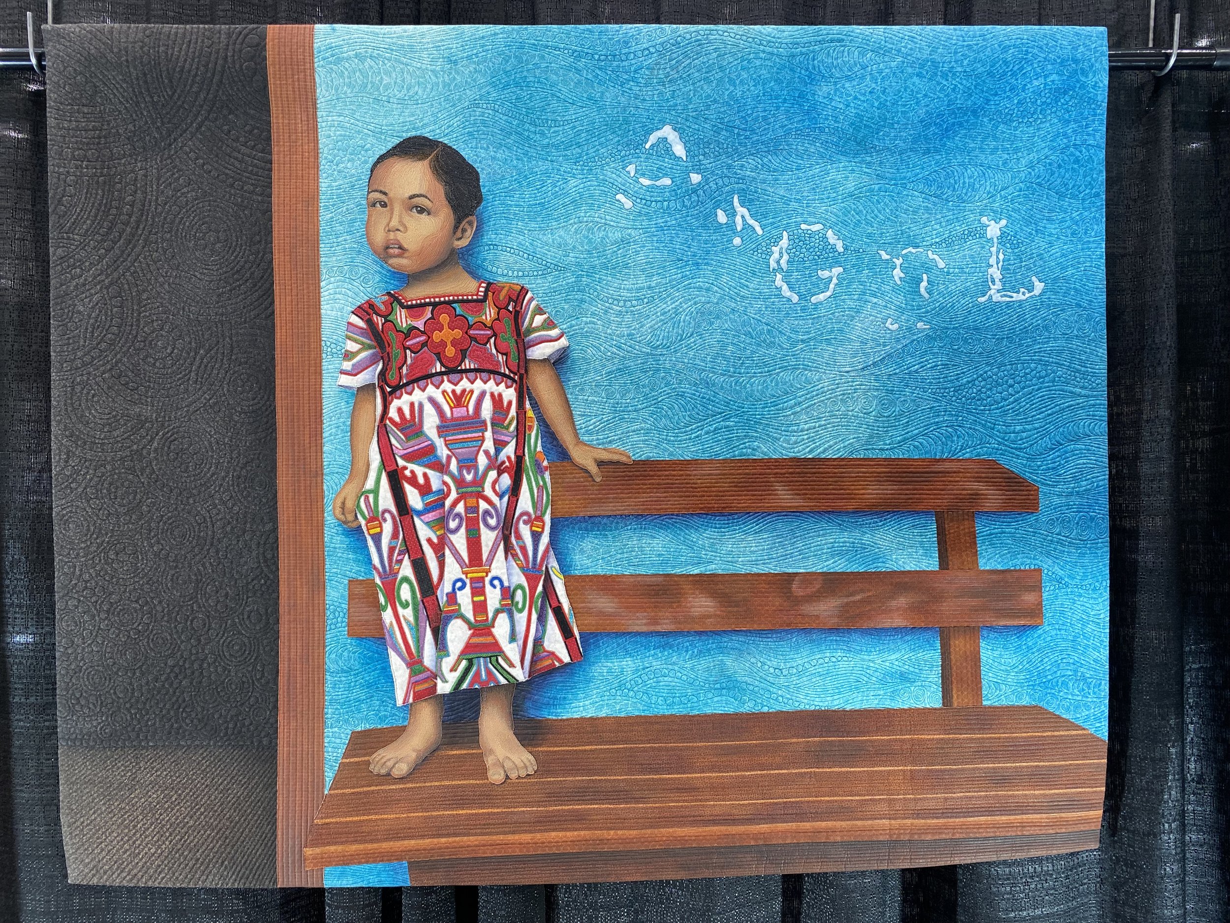
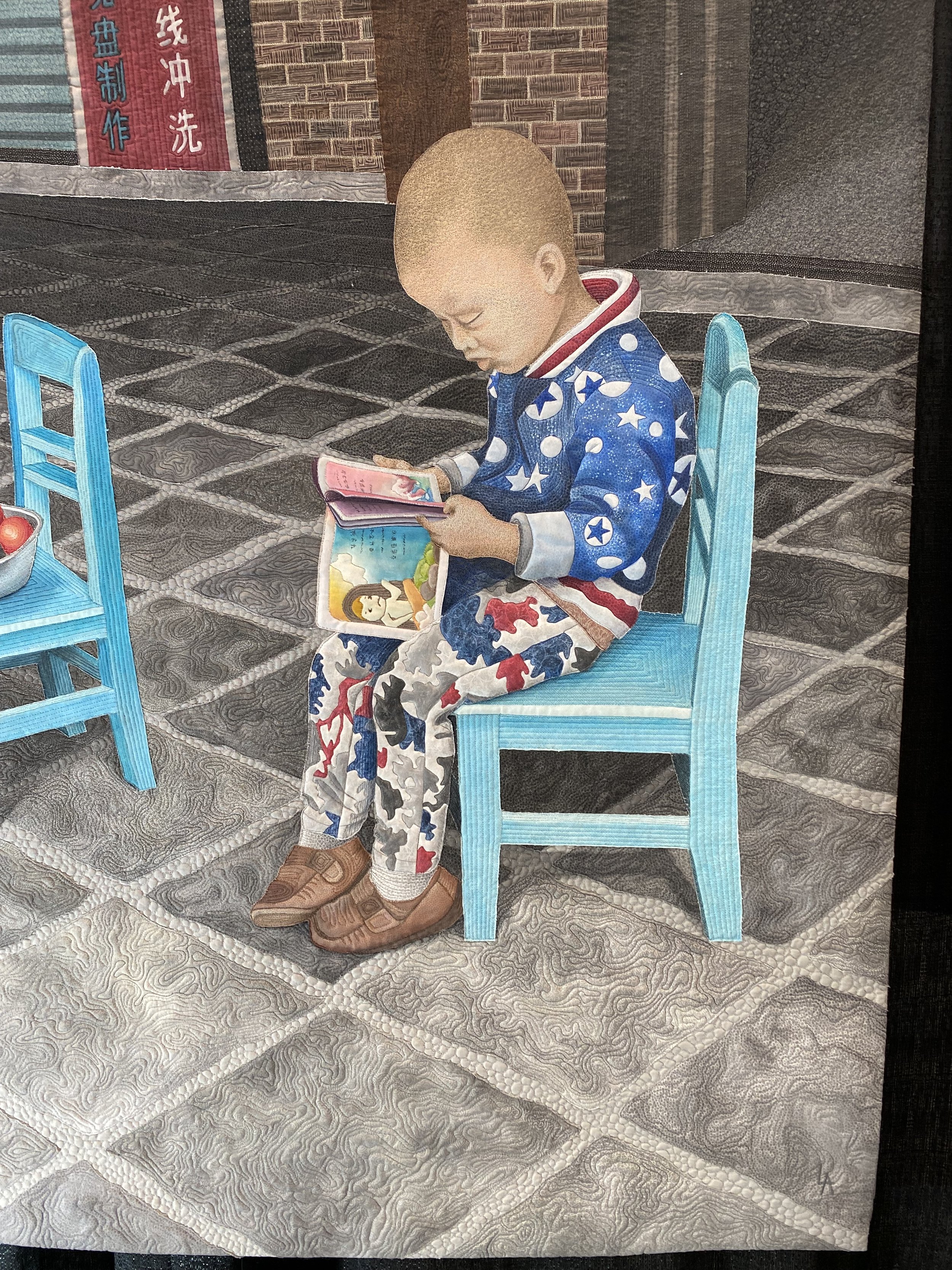
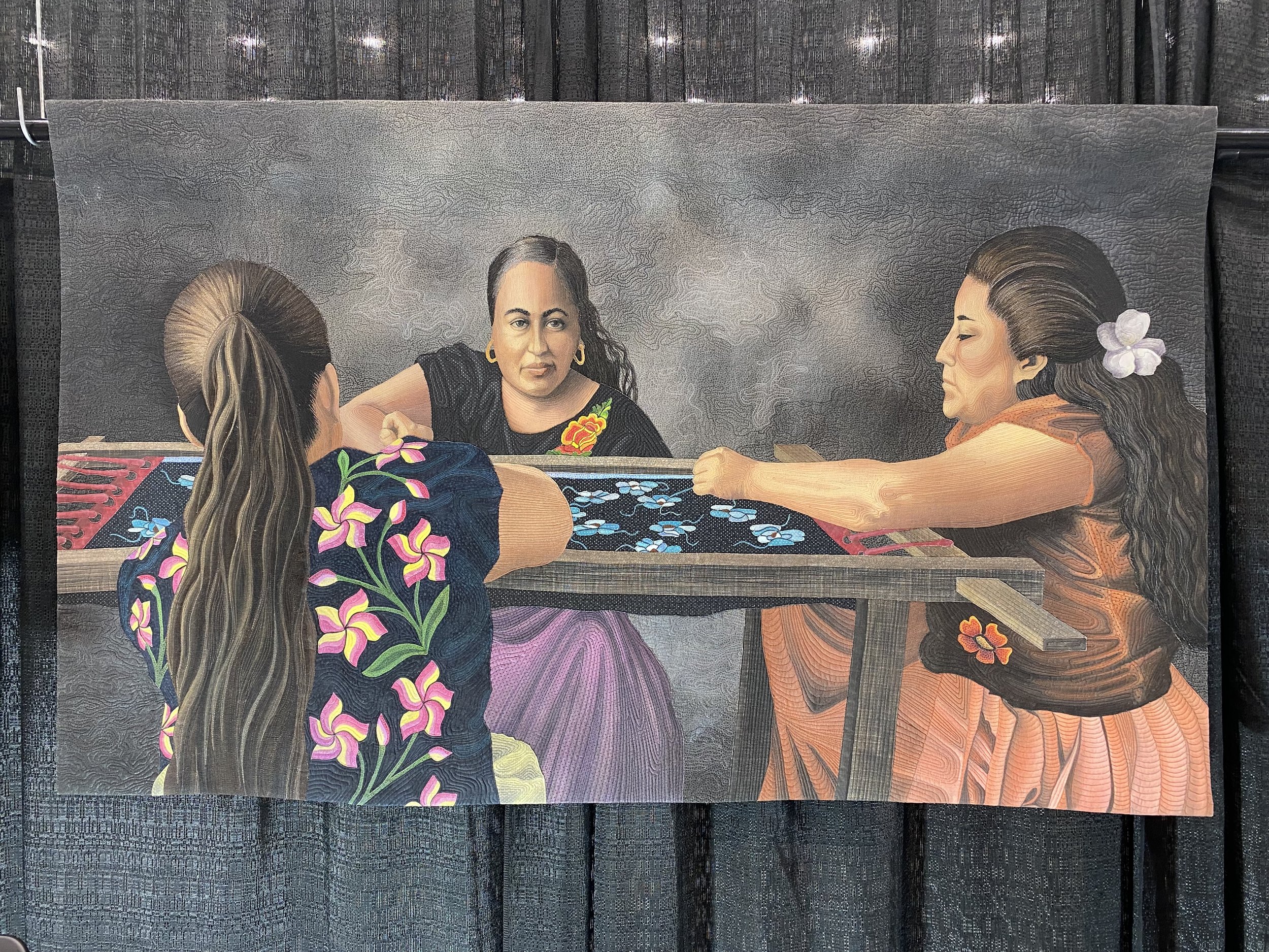

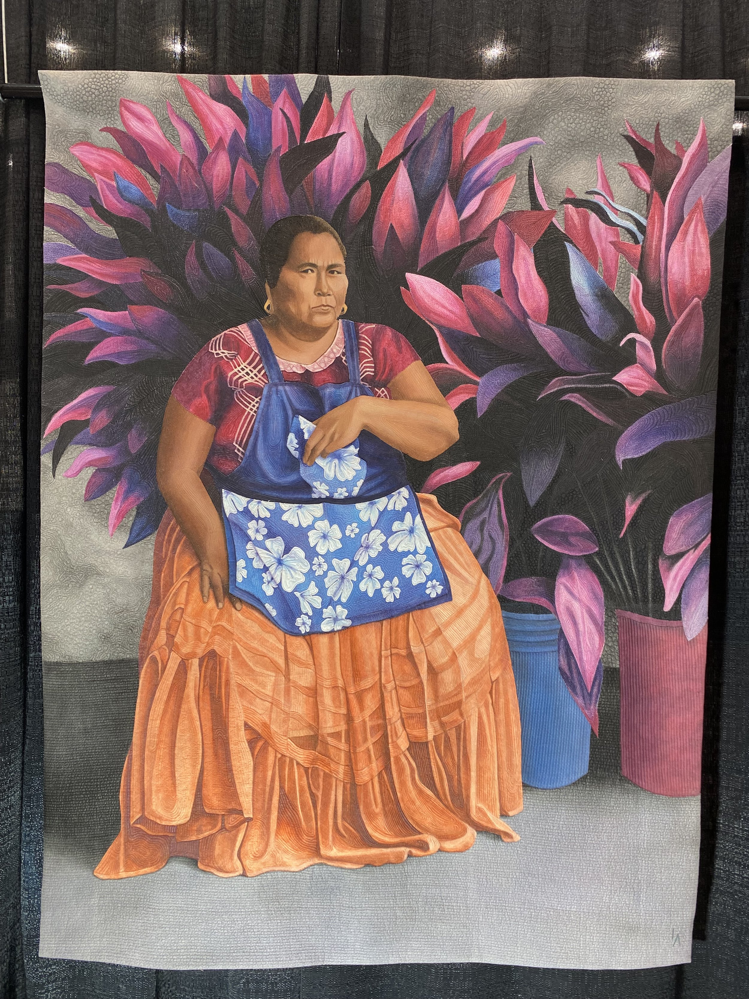
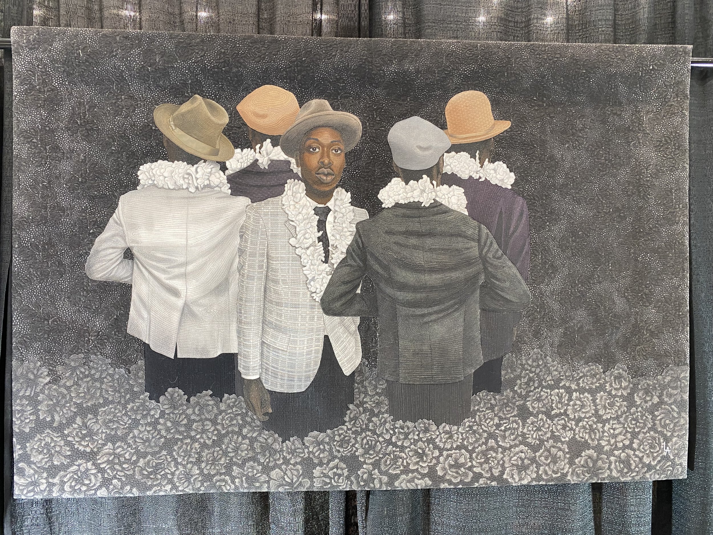

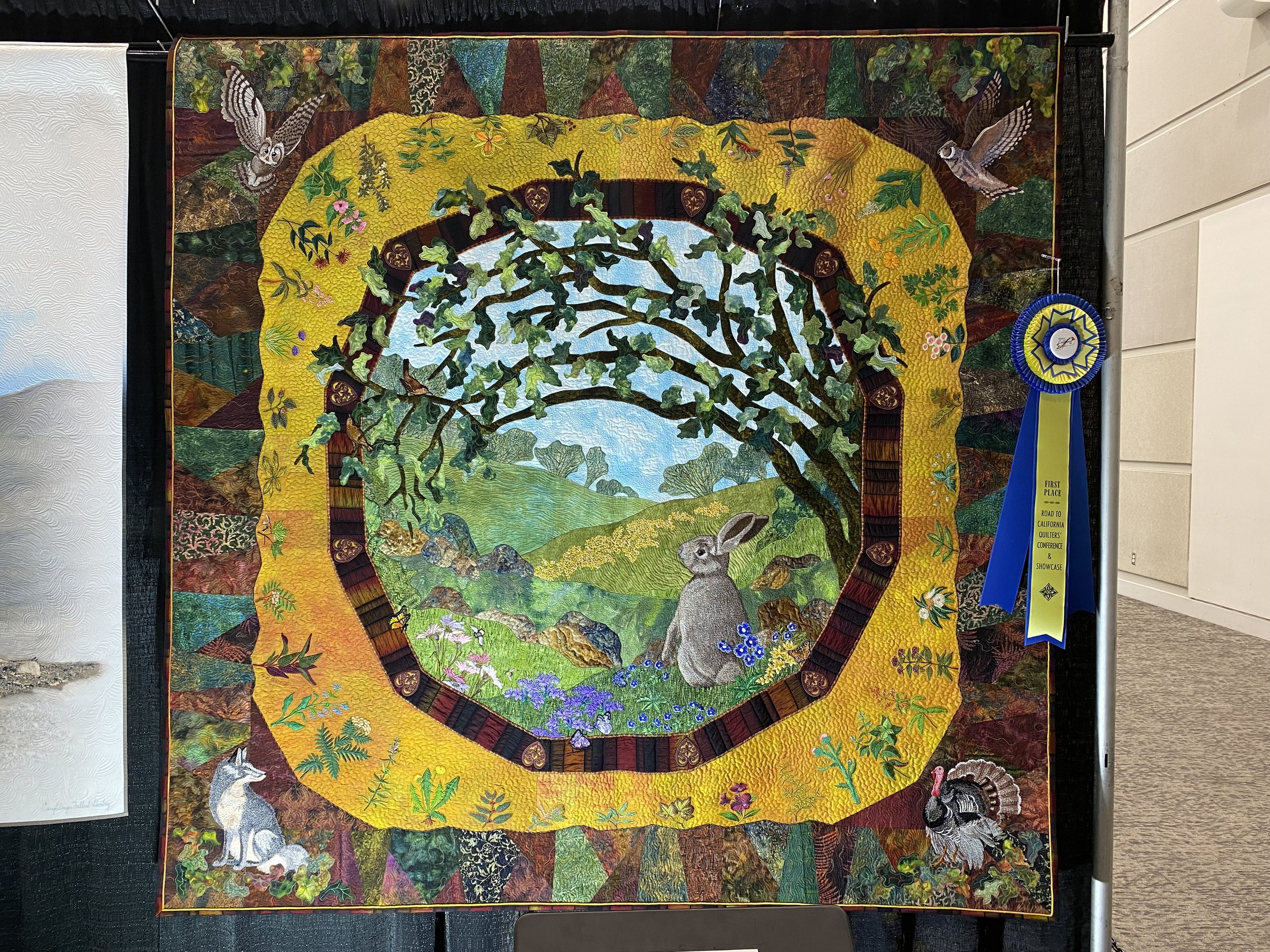
The selection above are quilts from the special exhibit of quilts by Linda Anderson, of La Mesa, CA. I am a longtime fan of Linda’s work, and it was really great to see so many of her pieces in one time and space. I’m afraid I did not make note of the titles of these pieces, for my own curiosity I would have liked to know which years they were made. I’m wondering if the style of quilting on the faces, for example, the toddler reading a book is done very differently than the one next to it of the little girl standing on the bench. Which came first?


And of course, what’s a quilt show without shopping? I was excited to see Janet Wicker-Frisch has brought back some of her She Who Sews fabric line, now with Riley Blake. I couldn’t resist this Asian theme panel from QT Fabrics, even though I pulled out my collection of un-quilted panels and this one brings the count to 17!! Despite my needing NOTHING a few more fabrics followed me home, a chunk of night sky, steam-punk spider fabric by Desire’s Designs (I used up all I bought last year), and some metallics that are companions to the panel.
The problem is, I have completely run out of fabric storage and am now creating towering piles on the floor - This year I aim to use more than I purchase, but I will never say I’m not buying fabric. I’m taking a cue from my friend Sam Hunter of Hunters Design Studio, she suggests we keep a tally of fabric in (purchased) and fabric out (used) and aim to use more than you purchase for the year, that way the stash reduces but we keep our quilt shops and vendors in business!
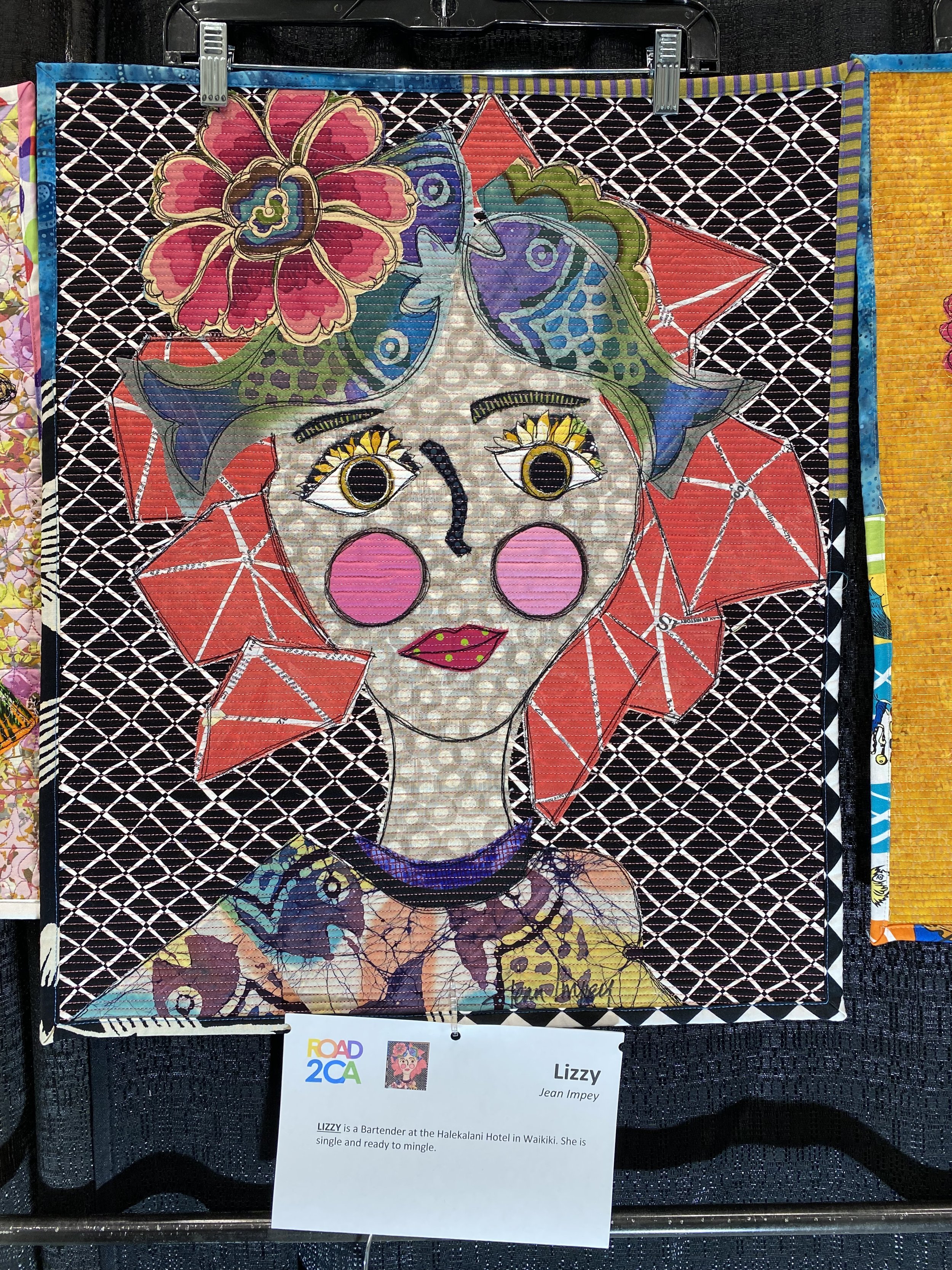
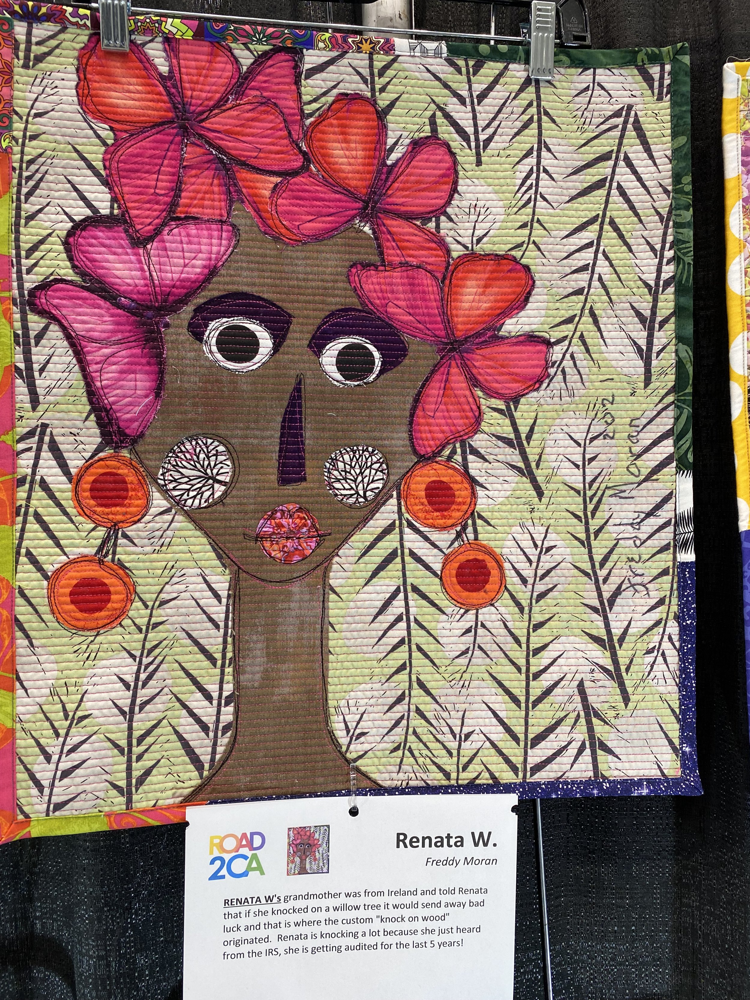
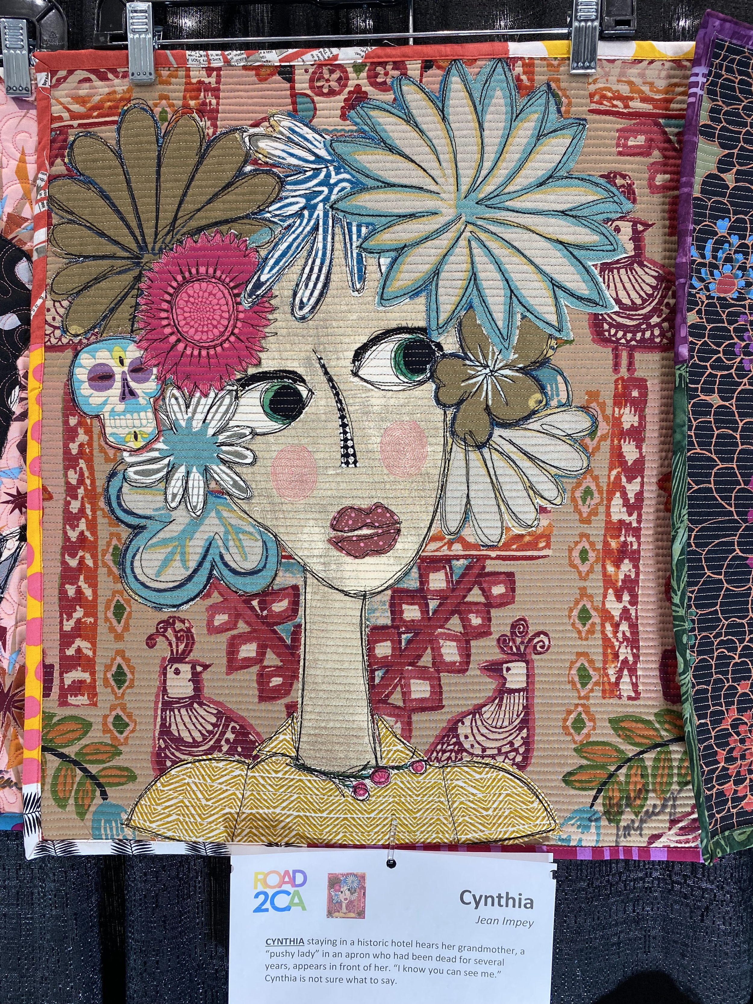
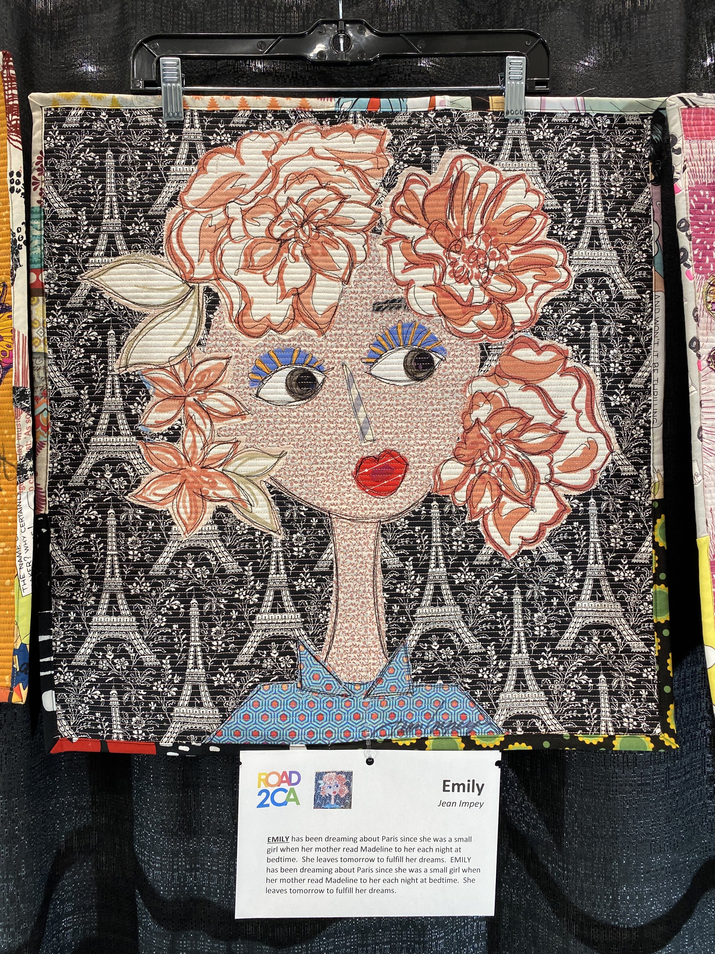
My friend, Jean Impey has been posting these portrait quilts, a collaborative project with Freddy Moran. Each portrait is accompanied by a fun characterization. What I didn’t realize was they would be on exhibit, displayed as a group. There must have been 50 of them altogether, I’m so sorry I didn’t get a shot of the row of them, each fun on its own, very impressive en masse
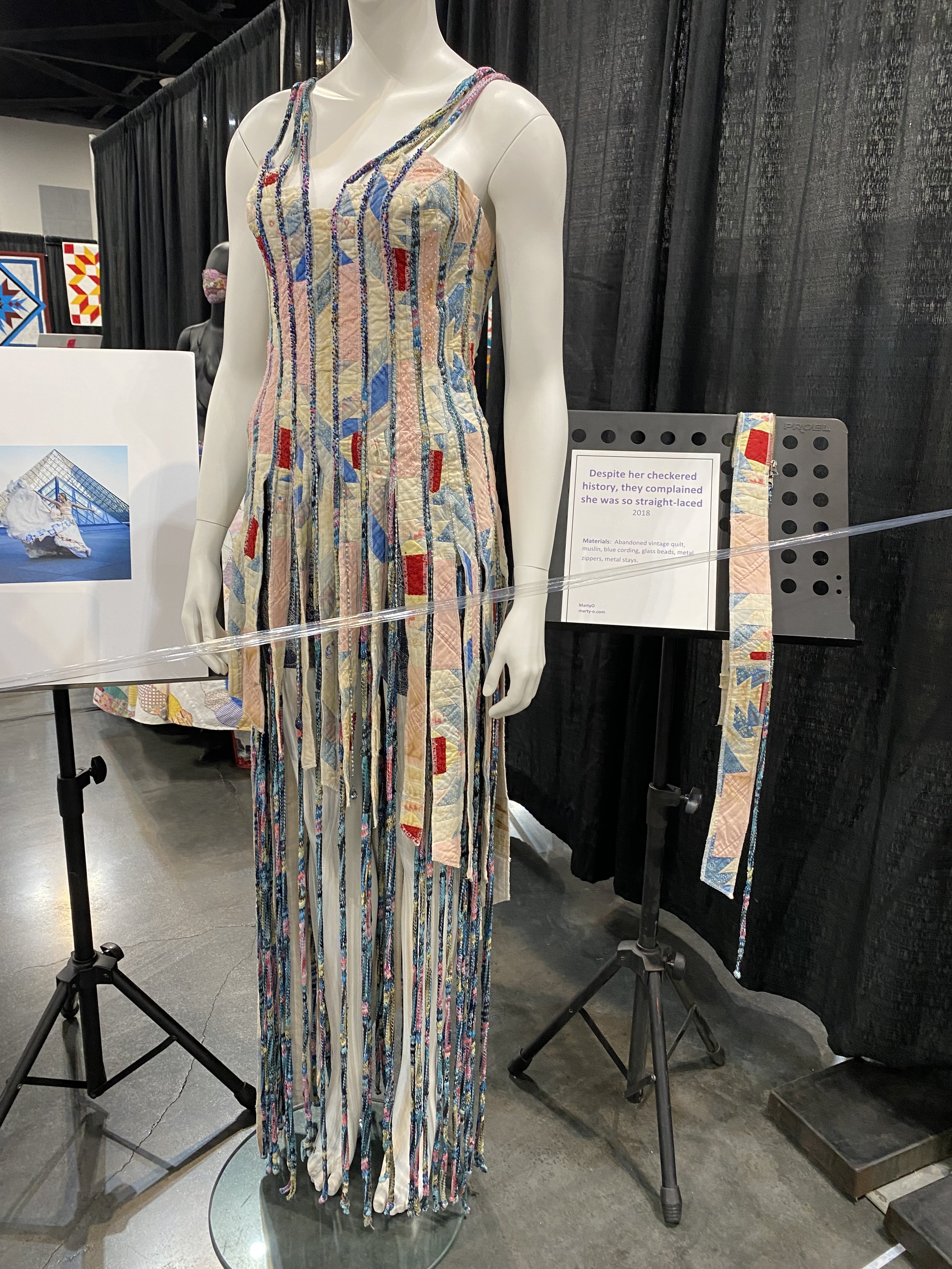
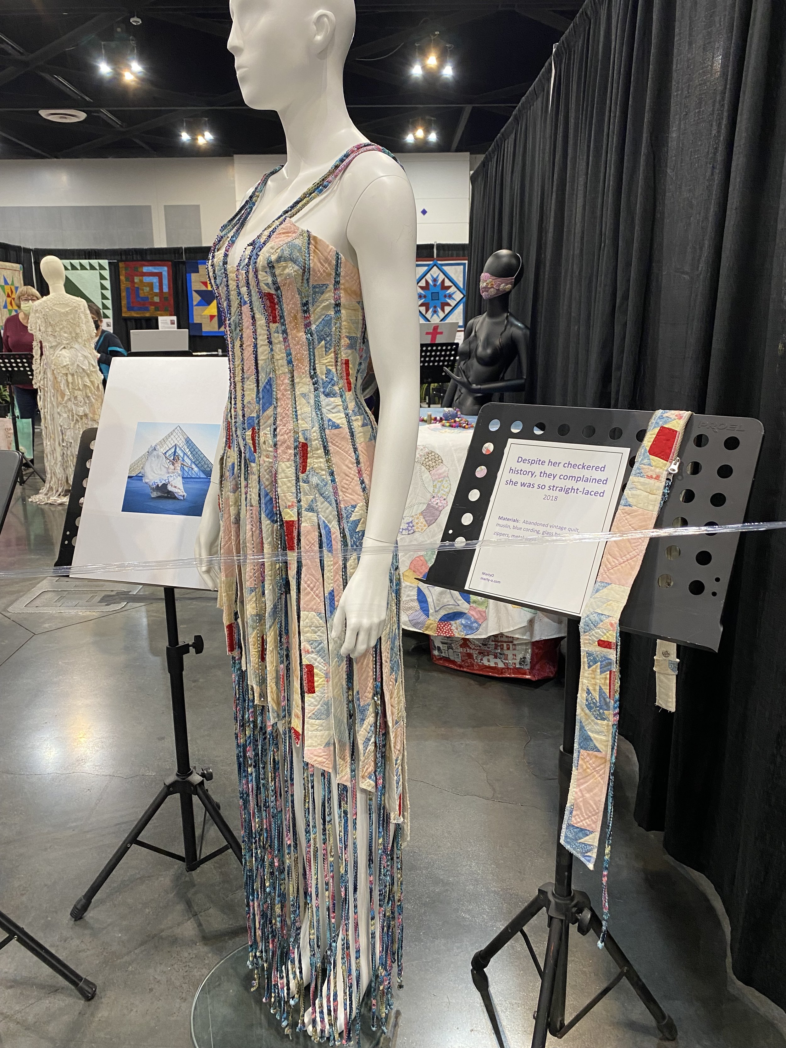
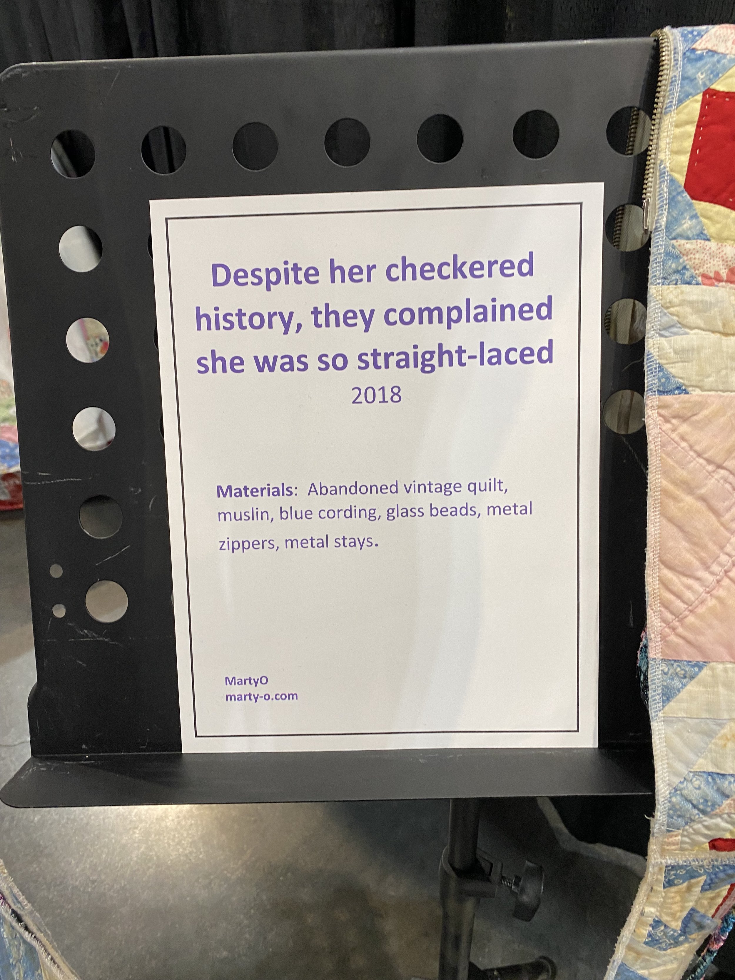
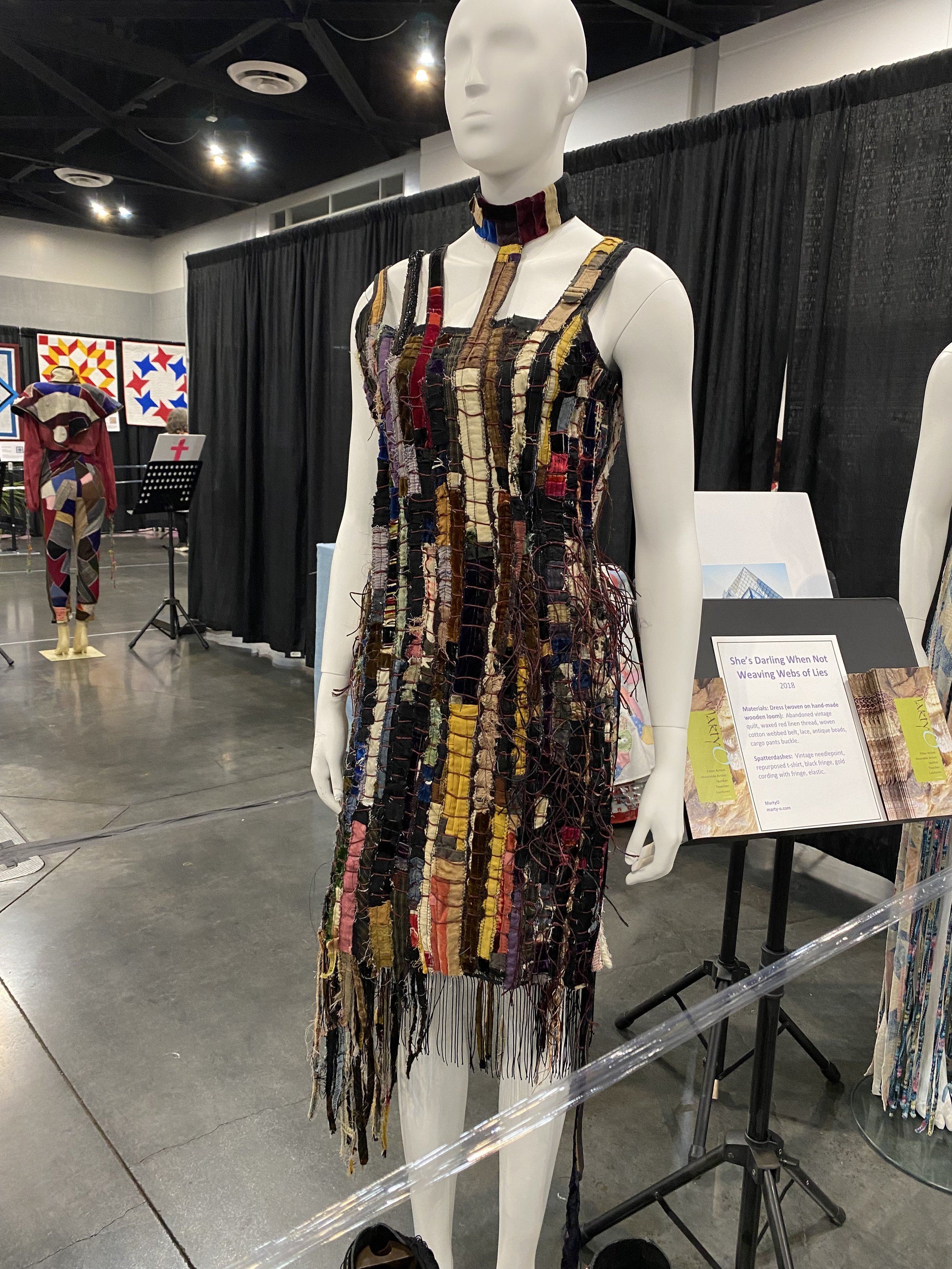
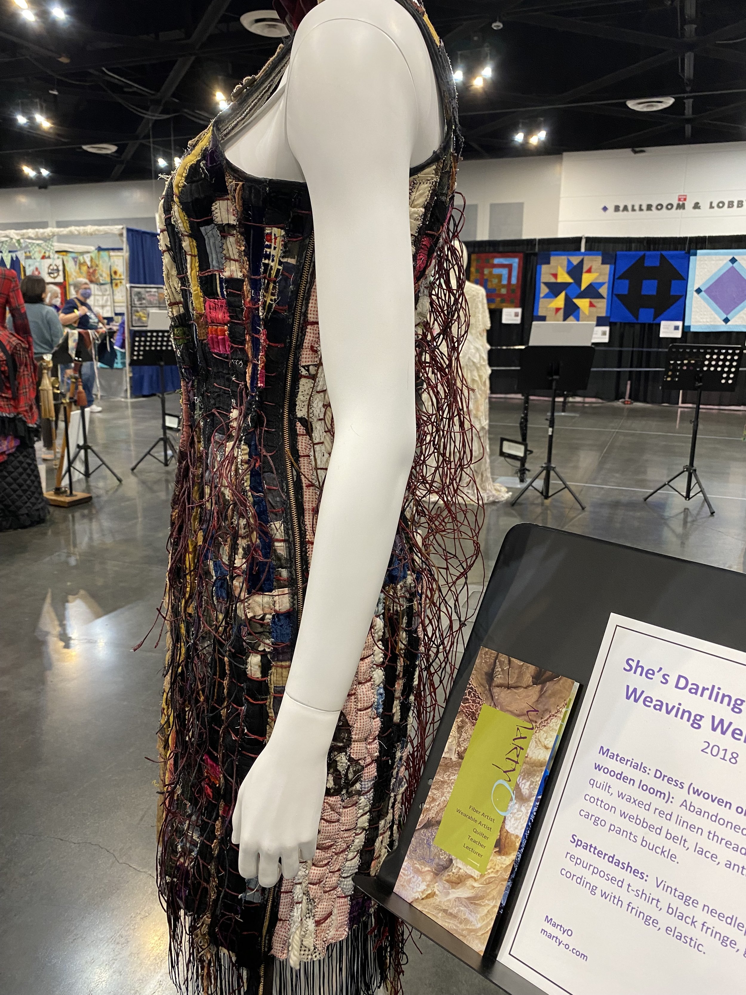
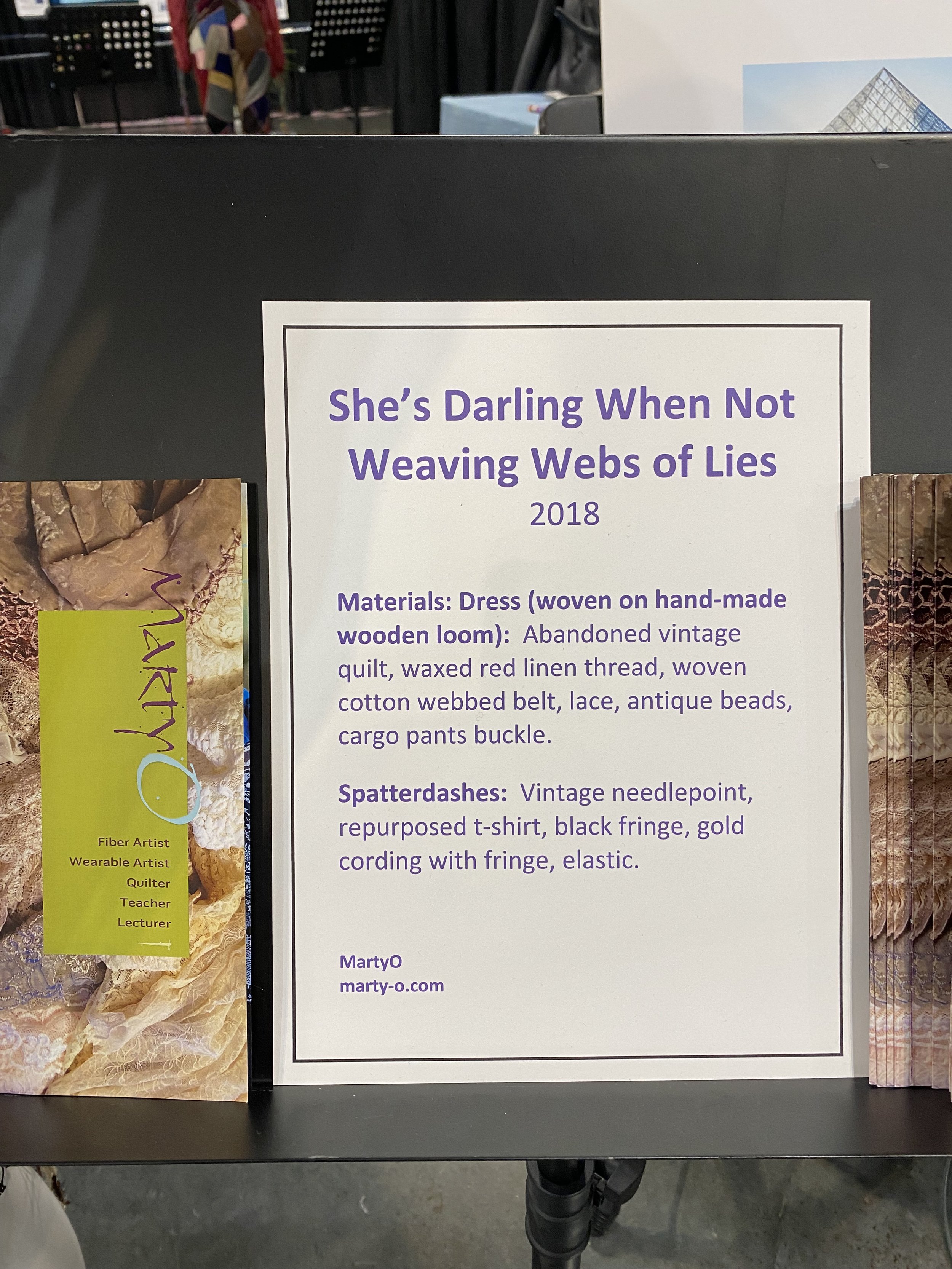
The costume designer in me was tickled by an exhibit of wearable art by Marty O, using repurposed vintage quilts
There was much more I didn’t include in this report, more products, more quilts, more garments, but I hope you enjoyed this taste of the Road to California Quilt show and I hope to see your there in 2023!